He even used the Kingdom Hearts font. Nice touch Jeebus.

-
Welcome to Smashboards, the world's largest Super Smash Brothers community! Over 250,000 Smash Bros. fans from around the world have come to discuss these great games in over 19 million posts!
You are currently viewing our boards as a visitor. Click here to sign up right now and start on your path in the Smash community!
It appears that you are using ad block :'(
Hey, we get it. However this website is run by and for the community... and it needs ads in order to keep running.
Please disable your adblock on Smashboards, or go premium to hide all advertisements and this notice.
Alternatively, this ad may have just failed to load. Woops!
Please disable your adblock on Smashboards, or go premium to hide all advertisements and this notice.
Alternatively, this ad may have just failed to load. Woops!
The All Stars House o' Sigs (OFFICIALLY CLOSED)
- Thread starter Roller
- Start date
- Status
- Not open for further replies.
Grandeza
Smash Master
Dinko get ranked in the ranking thread.
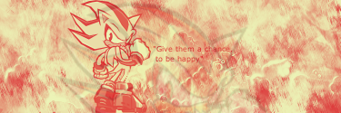
Dont treat me like Jeebs CnC my sigs.COuld someone CnC mah siggies!?
Grandeza
Smash Master
I did. lol at jeebus comment.
Grandeza
Smash Master
I never said any such thing about the shadow one as today was my first time seeing it. Maybe add some c4d's. on the bottom one, a better way for lighting(it's cheesy but it'll do better than what's been done so far). Take out a grunge brush. Use the color white. On a new layer, brush in the corner the light is coming from and motion blur it so that it's going in at the right angle. then just lower the opacity so it looks less forced or set it to screen(sometimes setting it to screen gets rid of it)
what exactly is a style?ok
now i have 1 question
what kind of style would u dserie?
look at my examples and tell me..or if u want a different one then yea tell me
im guessing its the background of the sig.
i like what u did with these

AzSvFeZ
Smash Lord
Sorry I was busy on my birthday, I'll go get ranked
TigerWoods
Smash Champion
Hi I have a request for AzSvFeZ (anyone can do it though, im not too picky)
Render;
Its a Shiek
http://planetrenders.net/renders/displayimage.php?pos=-29304
Colors: Black and Red(some white is ok, but Id rather have it dark =D)
Text/Font: Just TigerWoods somewhere small
Design: A bit like a misty kind of thing is ok, feel free to add what you think is best.
Border: Yes
Render;
Its a Shiek
http://planetrenders.net/renders/displayimage.php?pos=-29304
Colors: Black and Red(some white is ok, but Id rather have it dark =D)
Text/Font: Just TigerWoods somewhere small
Design: A bit like a misty kind of thing is ok, feel free to add what you think is best.
Border: Yes
Ummm.... On the sig, that is a grunge brush and i was trying to motion blur :-( guess I did it wrong also, with shadow, well.... ok I am going to redo it AGAIN! and take out the faded picture because you guys hate it so much :-PI never said any such thing about the shadow one as today was my first time seeing it. Maybe add some c4d's. on the bottom one, a better way for lighting(it's cheesy but it'll do better than what's been done so far). Take out a grunge brush. Use the color white. On a new layer, brush in the corner the light is coming from and motion blur it so that it's going in at the right angle. then just lower the opacity so it looks less forced or set it to screen(sometimes setting it to screen gets rid of it)
AlmightyJeebus
Smash Lord
- Joined
- Jun 12, 2008
- Messages
- 1,325
If fezzy don't take it, I will
Grandeza
Smash Master
If jeebus dont take it i will
AzSvFeZ
Smash Lord
I got it, too bad <3
AlmightyJeebus
Smash Lord
- Joined
- Jun 12, 2008
- Messages
- 1,325
Ignore This Post
AlmightyJeebus
Smash Lord
- Joined
- Jun 12, 2008
- Messages
- 1,325
But I will if fezzy don't, so you're pretty much too late  but on aim he said he wants it, so . . .
but on aim he said he wants it, so . . .The Dinkoman
Smash Lord
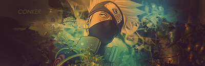
what do you guys think of mah new siggi?
Conker315
Smash Lord
yeswhat exactly is a style?
im guessing its the background of the sig.
i like what u did with these
those kinds of style
which one do u desire?
if u choose none of those then give me an idea
if not then ill come up with something
")
Grandeza
Smash Master
No flow. Random brushing. Ehhh text. No depth. Not much else to say. Read the list of tuts Gflare gave.
Grandeza
Smash Master
No can do dude. I'll explain why later but I have a reason that I can't go on.
The Dinkoman
Smash Lord
does it have an error? cuz thats why i cant get on.No can do dude. I'll explain why later but I have a reason that I can't go on.
Grandeza
Smash Master
Thats not my reason butt we can go with that.
AzSvFeZ
Smash Lord
I'm so off my game...
I can't make sigs, and my pika is all jacked up today
I can't make sigs, and my pika is all jacked up today
Follow or you die. Seriously y´all should follow at least half of all of those tuts, it should help you lots.Basic
Let's you know the basics:
http://sneaux125.deviantart.com/art/GIMP-Beginner-Tutorial-82673215
Pretty basic, and not overall pleasing to the eyes:
http://sneaux125.deviantart.com/art/Vector-Sig-Tut-77232101
A bit monotone and lacking effects:
http://sneaux125.deviantart.com/art/Scarlett-Johansson-quot-Bubble-quot-82672102
Although this almost earned a spot in the never-do's I felt it had some good pointers such as Ideas, and where to get resources:
http://jbeave.deviantart.com/art/Full-Anime-Sig-Tutorial-74317790
For a sprite signature its pretty lacking, but not omfgwtfbad:
http://crazysk8er21192.deviantart.com/art/GIMP-K-Tag-Tutorial-59820588
It did come out well, I can tell what he's saying to do without knowing the language, but the right side is messy and he renders a poor choice, otherwise this would be mid-level:
http://litlle-rafa.deviantart.com/art/Tutorial-Displace-K-Sign-63011850
Not bad, but not to good either, still pretty basic:
http://bruce-tothe-lee.deviantart.com/art/Mewtwo-Tag-Tutorial-54295767
With a little more work and effort this could have been better:
http://chooci.deviantart.com/art/Three-Strands-Tutorial-69171264
Decent vector, just lacking a little "oomph"
http://cobragfx.deviantart.com/art/Vector-Style-Sig-Tutorial-81614336
Missing something:
http://zenron.deviantart.com/art/GIMP-Asia-tag-tutorial-92057513
Mid-Level
Relatively basic, but nontheless good:
http://sneaux125.deviantart.com/art/Gorillaz-X-Tutorial-86803436
Has some high-then-basic techniques, but the outcome is messy and lacking flow:
http://sneaux125.deviantart.com/art/Sneaux125-Signature-Tutorial-72895036
Not to basic, and it looks decent, although monotone and lacking a lightsource:
http://cobragfx.deviantart.com/art/Streetwise-Signature-Tutorial-80355403
For how short, it's really to the point and pretty true, however their "dont" has a good spot on the left, but didn't erase it on the right, hence the ugly look:
http://cobragfx.deviantart.com/art/Basic-C4D-Usage-Tutorial-80325236
Pretty decent effects:
http://www.gimptalk.com/forum/viewtopic.php?f=14&t=22552&start=0
good blending:
http://www.gimptalk.com/forum/viewtopic.php?f=14&t=11612&start=0
Good LP abstract:
http://greentunic.deviantart.com/art/flower-tutorial-88899667
Good Blending, but the bottom right needs to be fixed, I can still see MC's visor:
http://so-sik.deviantart.com/art/SoSik-s-Halo-Tutorial-91393849
Pro-Level
Has some overdone stuff:
http://sneaux125.deviantart.com/art/Tony-Jaa-Prayer-Tutorial-80599482
A little messy:
http://sneaux125.deviantart.com/art/Stunna-Shade-Sig-Tutorial-82713794
Little bit above the mid class:
http://cobragfx.deviantart.com/art/Afro-Samurai-Sig-Tutorial-80353318
Master
The blending, effects, flow, and overall outcome of this is simply stunning:
http://sneaux125.deviantart.com/art/It-s-HPNOTIQ-Tutorial-81287997
List made by a friend of mine, +mw.Tails. I´m sure he won´t mind.
Conker315
Smash Lord
you should all listen to flare and thank him for posting this up here
the tuts really help u alot
and hes even nice enough to list them in order
the tuts really help u alot
and hes even nice enough to list them in order
i want the style from the first sig up there. and can u also make me 2 avatars? one of them sized 75x75 and the other sized 130x130what exactly is a style?
im guessing its the background of the sig.
i like what u did with these
AzSvFeZ
Smash Lord
Yea, I'm home alone for 2 days, so I'm gonna do all these tuts tonight.
or at least like 10 of them.
or at least like 10 of them.
lucky. i wish i was home alone for 2 daysYea, I'm home alone for 2 days, so I'm gonna do all these tuts tonight.
or at least like 10 of them.
Steel_Dragon
Smash Journeyman
pistolz just wondering how youre getting on with my sig sorry if im impatient
AlmightyJeebus
Smash Lord
- Joined
- Jun 12, 2008
- Messages
- 1,325
Ummm I hope pistolz doesn't get ****'d in the *** with a 7 meter spoon
lol
lol
Steel_Dragon
Smash Journeyman
Ummm I hope pistolz doesn't get ****'d in the *** with a 7 meter spoon
lol
me too lolHe won´t if he knows what´s good for him. *Shows spoon*pistolz just wondering how youre getting on with my sig sorry if im impatient
AlmightyJeebus
Smash Lord
- Joined
- Jun 12, 2008
- Messages
- 1,325
Cmpr94x came up with a name for Gflare, he calls you Grumption Flare man
AlmightyJeebus
Smash Lord
- Joined
- Jun 12, 2008
- Messages
- 1,325
Cmpr made it up, not me
Steel_Dragon
Smash Journeyman
PiSToLZ i did the font size big so you see my message hows my animatedsig coming alongreply if you see this please
Stealth Raptor
Smash Legend
Sigh you realise the worst thing you can do is to constantly ask how it is going? it will get done when it gets done.
Steel_Dragon
Smash Journeyman
...He won´t if he knows what´s good for him. *Shows spoon*
are you feeling ok today gflare?you keep mentioning spoons wat do u do to the spoons?
what are you hiding
- Status
- Not open for further replies.