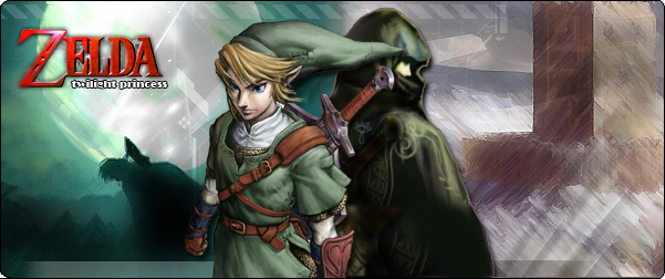
Skylink, for some reason I don't think your banners are very professional-looking. But everyone else seems satisfied with them, so I guess its okay. I'll admit, at first I thought this thread was a joke, after seeing the very first banner. I was like, what? I think you need to work on editing the banners a little more. They look kind of sloppy. Look at the Ice Climbers in post 72. Is it supposed to be like that? And in post 70, the banner on the bottom looks messy and pretty bad. LOL, sorry if that sounds mean, but I'm trying to be honest. To give you an idea of what a professional banner looks like, take a look at these ones that my younger brother (13 years old) created. He's not perfect either, but he's still trying to learn new techniques for making good banners. You should too:

Here's a neat thing - see the corners of the banner on top. They are transparent (of course, if you are using Internet Explorer, they might not be). You should try changing the shape of your banners by making some parts transparent. That will make them cool.
In these banners, the renders have been cut out neatly so that it looks good on top of the background. In some of your banners, I noticed the renders were choppy at some points and stuff like that. Hope you'll try and improve.


