• Welcome to Smashboards, the world's largest Super Smash Brothers community! Over 250,000 Smash Bros. fans from around the world have come to discuss these great games in over 19 million posts!

    You are currently viewing our boards as a visitor. Click here to sign up right now and start on your path in the Smash community!

Project M Visual Fixing/Updating Thread [Lastest Update: 10/03/15]

Layell

Smash Journeyman
Joined
Feb 3, 2014
Messages
369
Has anyone got a code to add team colours such as Dr.Mario, a dream I do have is that every character gets alt team colours some day in PM. I might as well bring it up here since we are discussing these alts as visual updates/fixes.

For the ZSS Fusion/Light jumpsuits and heck even the classic one, how hard would it be to give her the original hair?
 

HypnotizeOverdrive

Smash Ace
Joined
Apr 6, 2014
Messages
580
NNID
HypnoOverdrive
For the ZSS Fusion/Light jumpsuits and heck even the classic one, how hard would it be to give her the original hair?
I can imagine it wouldn't be too difficult, but it would also be highly inaccurate. It wouldn't make sense to give those alts the original hair, because Samus's hair prior to Brawl was indeed different.
 

Taiko

Smash Ace
Joined
Aug 25, 2010
Messages
564
I can imagine it wouldn't be too difficult, but it would also be highly inaccurate. It wouldn't make sense to give those alts the original hair, because Samus's hair prior to Brawl was indeed different.
I personally don't think the hair needs to match up to old artwork, it'd be a stylistic choice to go with the Brawl hair. Smash 4 kept the hair the same, and it feels much more natural. That, and it'd make the alts have a more consistent silhouette instead of having them all over.
 

MagicManNo9

A busy man with a busy schedule these days!
Joined
Nov 2, 2013
Messages
576
Location
Currently in USA
Thank you for the warm welcome! I've always wanted to join Smashboards, but never got around to it until this thread came along, so thank you for making this great thread! No need to apologize, I totally understand. Whenever you get a chance to read over my huge list is totally fine. It would be wonderful to get some feedback, so thank you in advance for that!

I believe the stock icons are actually in the result screen itself, but are in other places for other modes. Not 100% sure on that though.

Those new CSPs are wonderful by the way! They look extremely good! Keep up the great work!

For music, I would extremely like for Harmony of Heroes to be the official soundtrack for PM. Sure, some stages would have to be flipped around if there isn't enough music slots for a stage, but having Harmony of Heroes play in PM would be sweet.
I'll get to reading it in a bit then! After I reply to everyone and give a small update!

Also the stocks are in Class mode, which I use to find/screen cap any mistakes in the stocks for easier to understand.

Thanks! The remastered CSPs are much more difficult than my original stuff on my build but I'll keep at it!

Oh and as much as I like the Harmony of Heroes soundtrack, it doesn't work well as battle/game music, similar reason to the alt CSPs that 3.5 have, they're nice to listen/look at but they don't work well in game, with HoH the music builds up, changes back and forth, and would require a lot of time creating a loop for each of them I can imagine, with that said, that's my view on it haha, I'll put it down for the ideas though and see what others say though!

Has anyone got a code to add team colours such as Dr.Mario, a dream I do have is that every character gets alt team colours some day in PM. I might as well bring it up here since we are discussing these alts as visual updates/fixes.

For the ZSS Fusion/Light jumpsuits and heck even the classic one, how hard would it be to give her the original hair?
That's a good point, I'm not 100% sure, the debate over if you keep the hair or default is always going back and forth, (I'm thinking of making an optional hair pack, one for both sides) though I can imagine you can UV the original model so that the alt textures can fit on her, rather to editing her is one way of doing it.

I can imagine it wouldn't be too difficult, but it would also be highly inaccurate. It wouldn't make sense to give those alts the original hair, because Samus's hair prior to Brawl was indeed different.
True, that's certainly a good way to look at it, ZSS is a tricky due to the costumes, I can say her costumes are kind of the weakest in terms of quality/level of detail she has in comparison to everyone else, that and the models really need updating/fixing.


The fusion suit and light suit alts are missing the jetpack.
Wow that Fusion Suit haha, another one to the list in that case!

I personally don't think the hair needs to match up to old artwork, it'd be a stylistic choice to go with the Brawl hair. Smash 4 kept the hair the same, and it feels much more natural. That, and it'd make the alts have a more consistent silhouette instead of having them all over.
And this is also a very good point on keeping one hair style, I might end up doing a multi release with a hair pack so people can decide to add/switch out what's best overall.

UPDATE:

I decided to take a crack with Giga Bowser, was hoping to take an hour or less thinking it would be an easy fix here and there... boy I was way wrong...


Left side is the texture I found inside Giga Bowser, and right side is my fix, not only that I basically re-did every texture from scratch using the default Gigabowser as a template as this one was really bad to work with (I don't like to complain or bring up textures much but this was something that I couldn't believe my eyes at first)

Anyway I apologise for sounding really negative there so let's get to it!


Fixed up the chest and re-did everything, I took Taiko's advice and lowered the saturation on this, mainly for two reasons, the first was because this one was a bit too bright and secondly, Giga Bowser's skin is darker when transformed, I wanted to keep that vibe going for Giga Bowser.


Also the hair and various issues that was pointed out by squeakyboots13, to some people it may not seem like much, or may not notice anything but in either case I'll make a release for this when I go through the other Giga Bowser costumes and see what needs adjusting and release them as a whole.
 

HypnotizeOverdrive

Smash Ace
Joined
Apr 6, 2014
Messages
580
NNID
HypnoOverdrive
I personally don't think the hair needs to match up to old artwork, it'd be a stylistic choice to go with the Brawl hair. Smash 4 kept the hair the same, and it feels much more natural. That, and it'd make the alts have a more consistent silhouette instead of having them all over.
I'm just big on accuracy, especially with nostalgic alts like these. But keeping the same hairstyle for all the alts surely isn't a bad idea.

UPDATE:

I decided to take a crack with Giga Bowser, was hoping to take an hour or less thinking it would be an easy fix here and there... boy I was way wrong...


Left side is the texture I found inside Giga Bowser, and right side is my fix, not only that I basically re-did every texture from scratch using the default Gigabowser as a template as this one was really bad to work with (I don't like to complain or bring up textures much but this was something that I couldn't believe my eyes at first)

Anyway I apologise for sounding really negative there so let's get to it!


Fixed up the chest and re-did everything, I took Taiko's advice and lowered the saturation on this, mainly for two reasons, the first was because this one was a bit too bright and secondly, Giga Bowser's skin is darker when transformed, I wanted to keep that vibe going for Giga Bowser.


Also the hair and various issues that was pointed out by squeakyboots13, to some people it may not seem like much, or may not notice anything but in either case I'll make a release for this when I go through the other Giga Bowser costumes and see what needs adjusting and release them as a whole.
That Giga Bowser is gorgeous.
 

RadiantThunder4

Smash Cadet
Joined
Jan 11, 2015
Messages
33
I'll get to reading it in a bit then! After I reply to everyone and give a small update!

Also the stocks are in Class mode, which I use to find/screen cap any mistakes in the stocks for easier to understand.

Thanks! The remastered CSPs are much more difficult than my original stuff on my build but I'll keep at it!

Oh and as much as I like the Harmony of Heroes soundtrack, it doesn't work well as battle/game music, similar reason to the alt CSPs that 3.5 have, they're nice to listen/look at but they don't work well in game, with HoH the music builds up, changes back and forth, and would require a lot of time creating a loop for each of them I can imagine, with that said, that's my view on it haha, I'll put it down for the ideas though and see what others say though!


That's a good point, I'm not 100% sure, the debate over if you keep the hair or default is always going back and forth, (I'm thinking of making an optional hair pack, one for both sides) though I can imagine you can UV the original model so that the alt textures can fit on her, rather to editing her is one way of doing it.


True, that's certainly a good way to look at it, ZSS is a tricky due to the costumes, I can say her costumes are kind of the weakest in terms of quality/level of detail she has in comparison to everyone else, that and the models really need updating/fixing.


Wow that Fusion Suit haha, another one to the list in that case!


And this is also a very good point on keeping one hair style, I might end up doing a multi release with a hair pack so people can decide to add/switch out what's best overall.

UPDATE:

I decided to take a crack with Giga Bowser, was hoping to take an hour or less thinking it would be an easy fix here and there... boy I was way wrong...


Left side is the texture I found inside Giga Bowser, and right side is my fix, not only that I basically re-did every texture from scratch using the default Gigabowser as a template as this one was really bad to work with (I don't like to complain or bring up textures much but this was something that I couldn't believe my eyes at first)

Anyway I apologise for sounding really negative there so let's get to it!


Fixed up the chest and re-did everything, I took Taiko's advice and lowered the saturation on this, mainly for two reasons, the first was because this one was a bit too bright and secondly, Giga Bowser's skin is darker when transformed, I wanted to keep that vibe going for Giga Bowser.


Also the hair and various issues that was pointed out by squeakyboots13, to some people it may not seem like much, or may not notice anything but in either case I'll make a release for this when I go through the other Giga Bowser costumes and see what needs adjusting and release them as a whole.
You did a sweet job on fixing up that Giga Bowser!

I do agree with you about the Harmony of Heroes music though, rethinking it over. How about each stage getting two new songs? This wouldn't take up as much space compared to replacing each song in the game, which would defiantly go over the 2 GB limit. Also, it would kind of be a throw back to Melee if someone could figure out a code that when you hold a certain button, it plays the alternate track. I could defiantly find two new songs for each stage if you want. I have spent a ton of time on Brawl Custom Music, and already know a bunch of good music on there, so I could defiantly pick some songs to suggest to this thread. What do you guys think?
 

RadiantThunder4

Smash Cadet
Joined
Jan 11, 2015
Messages
33
Also, I have a few other suggestions. How about making a new Smash Ball? Having a purple Smash Ball would fit PM so well!

For character CSPs that have the blue background in the game, like in events, would it be possible to change the color to purple?

Have the time counter when playing a match look better.

Should Pit's bow be silver when he is using the dark color?

Should Green Hill Zone have an updated HD look?

Should Pokemon Stadium 1 be Pokemon Stadium X? I'm only suggesting this because Smash 4 had Flat Zone X, which combined Flat Zone 1 & 2, and seeing this idea used for Pokemon Stadium would be very cool!
 
Last edited:

MagicManNo9

A busy man with a busy schedule these days!
Joined
Nov 2, 2013
Messages
576
Location
Currently in USA
I'm just big on accuracy, especially with nostalgic alts like these. But keeping the same hairstyle for all the alts surely isn't a bad idea.

That Giga Bowser is gorgeous.
Thanks! And I'm on both sides when it comes to hair, or rather I can see why both sides are a good idea! It's nice to get a different perspective of it, specially when there's fair reasoning to it.

Also, I have a few other suggestions. How about making a new Smash Ball? Having a purple Smash Ball would fit PM so well!

For character CSPs that have the blue background in the game, like in events, would it be possible to change the color to purple?

Have the time counter when playing a match look better.

Should Pit's bow be silver when he is using the dark color?

Should Green Hill Zone have an updated HD look?

Should Pokemon Stadium 1 be Pokemon Stadium X? I'm only suggesting this because Smash 4 had Flat Zone X, which combined Flat Zone 1 & 2, and seeing this idea used for Pokemon Stadium would be very cool!
Those are okay suggestions but the idea of this is to fix up things in PM that's there, not change things that don't really need changing, otherwise this would come off as a custom build if anything at that point.

Though I will address them, I think there's already way too much purple in PM as it is with the Smashball and such.

I'm a tad bit confused at the time counter, there's already one in there isn't it? 8 minute timer?

Pit's bow could change to silver, I think the reason behind why it's like that is because the arrow itself can't be changed color so it was kept to keep consistency iirc (Someone correct me if I'm wrong)

I don't see a real reason that Green Hill needs a HD update, for Hyrule Temple 64 and Dreamland 64 case it was due to the fact that it was 64 stage which is why they updated that completely.

I probably won't be changing any stages, otherwise this wouldn't be tourney legal or rather, it'd just be a custom build again. Those are good points but they are geared towards a custom build (Sorry if that makes sense, I'm bad with wording times like this)

You did a sweet job on fixing up that Giga Bowser!

I do agree with you about the Harmony of Heroes music though, rethinking it over. How about each stage getting two new songs? This wouldn't take up as much space compared to replacing each song in the game, which would defiantly go over the 2 GB limit. Also, it would kind of be a throw back to Melee if someone could figure out a code that when you hold a certain button, it plays the alternate track. I could defiantly find two new songs for each stage if you want. I have spent a ton of time on Brawl Custom Music, and already know a bunch of good music on there, so I could defiantly pick some songs to suggest to this thread. What do you guys think?
I think people can do a music pack for that, my main aims right now is focusing on the visual aspects and any fixes that need to be done, music can be quite difficult as it's very subjective in it's own way it can vary a lot from person to person, I mean what I could do is have various music packs as an optional download so people can pick out what's best!

The new Giga Bowser looks great! Thank you!
Well I'm glad you like it! And thank you for pointing that out, whilst it did take a while to re-do it was certainly fun in it's own way!
 

MagicManNo9

A busy man with a busy schedule these days!
Joined
Nov 2, 2013
Messages
576
Location
Currently in USA
Right going through this now!

Title Screen:
- I mean, it's possible to replace the How to Play movie with a new one, but I can't/won't get rid of things becuase A. It's very difficult and B. There's not really a big reason too.
- I've seen that custom screen before! it's nice but it's not possible to switch it out, that's also HD so it won't work.

Menu:
- I can't really say much on these, it would be easier to take screenshots and show them, it's hard to tell so I'm not quite sure.
- I also don't think it's possible to get the announcer to say that, Roy and Mewtwo are special cases with the voices from my understanding.
- That wii mote idea is nice but I'm pretty sure everyone who plays PM uses a GC controller.
- Icons could be worked on.

Items:
- An energy drink would just look way out of place if you ask me, less professional if that was used (That and I personally already like the PM Turbo item)
- There's a code for disabling stickers I belive, will look into that!

HUD:
- I could look into that and see.
- I have no idea on how to do that sorry.

Character Select:
- Again, a lot of these things are hard to change, and a lot of these things are stuff that can be done for a custom build.
- Though some of the points I'll look into, it's possible to edit and clean the font and whatnot.

Stage Select:
- Ohhh okay, will fix that.
- I can't comment on these select screen things personally as I don't think too hugely on them.
- Iirc and I could be wrong, it's possible to change the logo but for some stages they can't, will have to see.

Pause Screen:
- I don't think that much effort should go into changing anything for that, it's fine as is.
- I mean, it's nice if someone could code that but again, no idea how to.

Results Screen:
- I'm probably not going to change most of these, PM will probably make a new update for these things like they did from 3.0 to 3.5

Solo/Versus/Online/Vault/Options/Data/
I'm sorry, but I feel like I'll be repeating points if I continue, I'm not going to change any of that as I expect future updates will deal with these, that and most of the stuff are very subjective and a lot of it can't be changed anyway, this thread/idea is mainly geared towards fixing PM whilst retaining it's style, not changing it entirely, I'm sorry if I'm coming off rude there but I wanted make that point clear haha.

First I wanna say I love this thread, I find it very respectful to the PM devs but also addresses some of the things I think should be and dunno if they have time to get to as they have so much on their plate already.
Second, those remastered CSP's are possibly the best I've ever seen. Before you go on with them I'd really really want to emphasize how good it would be to also put out higher-res versions of the CSP for those of us who use the HD Texture Pack for PM on dolphin. Would that be possible?
Oh my goodness, I'm so sorry! I completely passed this comment without notice! Firstly thanks! At the end of the day I'm not trying to be disrespectful but mainly want to help out what I can in areas left untouched/need working on! And second it's very possible to do high Quality ones, but I'm not doing a dolphin build myself, that however, doesn't mean I won't do it, if anyone wants to do the High Quality CSPs message me and I can send over my renders for the current ones to work on! If I had more time I would do it myself but working on so many things right now. (I'll say it like this, if no one wants to I'll still do it! I'll just be a later date with the current fixes being done right now!)
 

squeakyboots13

Smash Journeyman
Joined
Oct 4, 2013
Messages
381
Pit's bow could change to silver, I think the reason behind why it's like that is because the arrow itself can't be changed color so it was kept to keep consistency iirc (Someone correct me if I'm wrong)
In Kid Icarus Uprising and Smash 4, Dark Pit uses a silver bow as opposed to Pit's gold one and it fires purple arrows instead of blue ones. I don't know if it's possible to change the color of the arrows for that one slot, but changing his bow would be a simple texture edit that I can do later if someone doesn't beat me to it first.
 

MagicManNo9

A busy man with a busy schedule these days!
Joined
Nov 2, 2013
Messages
576
Location
Currently in USA
In Kid Icarus Uprising and Smash 4, Dark Pit uses a silver bow as opposed to Pit's gold one and it fires purple arrows instead of blue ones. I don't know if it's possible to change the color of the arrows for that one slot, but changing his bow would be a simple texture edit that I can do later if someone doesn't beat me to it first.
Ahhh right, thanks for clearing that up! I already have one read if that helps!
 

HypnotizeOverdrive

Smash Ace
Joined
Apr 6, 2014
Messages
580
NNID
HypnoOverdrive
Hi there! I'm brand new to this forum, and I did plan to post something similar to this, but it was pretty much all about the menu, and I think it would fit pretty well in this thread. The menu is just Brawl's with a darker vibe to it, and I'm fine with that, but a lot of stuff should be changed. I have a list below if anyone wants to look at it! Also, when looking at my suggestions, please keep in mind that it is possible to make parts of the menu go to another spot. Just like how Subspace went to training in 3.0.
I feel like a lot of these are changes for personal preference as opposed to actual useful changes. A lot of the things that could be changed really don't impact gameplay and aren't as distracting.
Also, editing this post on my phone was an utter nightmare.
 
Last edited:

Juken

Smash Ace
Joined
Mar 31, 2014
Messages
590
Just noticed that Virtual Boy ROB doesn't have any trail when doing his side-b, despite his arms basically being the same color as the default costume. But then Sonic's new alt costumes have the default costume's red and blue run-trail.


Taiko

Smash Ace
Joined
Aug 25, 2010
Messages
564
One thing that should be noted with the silver bow is that the sword trail would still be gold, so you'd have a silver weapon turn gold when it's swung.

Just noticed that Virtual Boy ROB doesn't have any trail when doing his side-b, despite his arms basically being the same color as the default costume. But then Sonic's new alt costumes have the default costume's red and blue run-trail.

I remember this, I think there was another character with this issue as well...
 

RadiantThunder4

Smash Cadet
Joined
Jan 11, 2015
Messages
33
Right going through this now!

Title Screen:
- I mean, it's possible to replace the How to Play movie with a new one, but I can't/won't get rid of things becuase A. It's very difficult and B. There's not really a big reason too.
- I've seen that custom screen before! it's nice but it's not possible to switch it out, that's also HD so it won't work.

Menu:
- I can't really say much on these, it would be easier to take screenshots and show them, it's hard to tell so I'm not quite sure.
- I also don't think it's possible to get the announcer to say that, Roy and Mewtwo are special cases with the voices from my understanding.
- That wii mote idea is nice but I'm pretty sure everyone who plays PM uses a GC controller.
- Icons could be worked on.

Items:
- An energy drink would just look way out of place if you ask me, less professional if that was used (That and I personally already like the PM Turbo item)
- There's a code for disabling stickers I belive, will look into that!

HUD:
- I could look into that and see.
- I have no idea on how to do that sorry.

Character Select:
- Again, a lot of these things are hard to change, and a lot of these things are stuff that can be done for a custom build.
- Though some of the points I'll look into, it's possible to edit and clean the font and whatnot.

Stage Select:
- Ohhh okay, will fix that.
- I can't comment on these select screen things personally as I don't think too hugely on them.
- Iirc and I could be wrong, it's possible to change the logo but for some stages they can't, will have to see.

Pause Screen:
- I don't think that much effort should go into changing anything for that, it's fine as is.
- I mean, it's nice if someone could code that but again, no idea how to.

Results Screen:
- I'm probably not going to change most of these, PM will probably make a new update for these things like they did from 3.0 to 3.5

Solo/Versus/Online/Vault/Options/Data/
I'm sorry, but I feel like I'll be repeating points if I continue, I'm not going to change any of that as I expect future updates will deal with these, that and most of the stuff are very subjective and a lot of it can't be changed anyway, this thread/idea is mainly geared towards fixing PM whilst retaining it's style, not changing it entirely, I'm sorry if I'm coming off rude there but I wanted make that point clear haha.


Oh my goodness, I'm so sorry! I completely passed this comment without notice! Firstly thanks! At the end of the day I'm not trying to be disrespectful but mainly want to help out what I can in areas left untouched/need working on! And second it's very possible to do high Quality ones, but I'm not doing a dolphin build myself, that however, doesn't mean I won't do it, if anyone wants to do the High Quality CSPs message me and I can send over my renders for the current ones to work on! If I had more time I would do it myself but working on so many things right now. (I'll say it like this, if no one wants to I'll still do it! I'll just be a later date with the current fixes being done right now!)
I totally understand. Your're not coming off rude at all. When I was making that list, I did notice that a lot of the stuff I was typing would probably eventually be fixed by the PMDT down the road (and a lot of it could be taken as a custom build idea), but I did want to address them to see what you and others thought. Thank your for addressing my suggestions though!

To respond to some of the points that you addressed, I believe a lot of stages share logos to save space. While messing around in Brawlbox this summer, I did notice that you can make each stage have a separate logo, but there is a process to it which I can't remember.

For the turbo item, I really like the design as well, but the eating animation played with it is really weird hahaha. I was just throwing the energy drink idea out there for the sake of possibly keeping the eating animation and that the item doesn't have a 3D model like the Franklin Badge, for example.

For the music, I totally agree with you that if something like that was going to happen, having different packs available would really be the best idea. If you want me to make an optional pack, I can for sure do it!

I don't know if you saw these things in my huge list or not, but could you possibly look at these three things? They have to deal with stock icons.
  • For Toon Link’s Outset look, it seems the icons don’t change to show what color you are using.
  • For Falco’s classic look, the blue vest icon looks green. Is this just me?
  • For Ness’s pajamas, his regular blue pajamas icon doesn’t have a collar.

Once again, thank you very much! Can't wait for the future of this thread!
 

squeakyboots13

Smash Journeyman
Joined
Oct 4, 2013
Messages
381
For the turbo item, I really like the design as well, but the eating animation played with it is really weird hahaha. I was just throwing the energy drink idea out there for the sake of possibly keeping the eating animation and that the item doesn't have a 3D model like the Franklin Badge, for example.
How hard would it be to just make it use a different animation instead of the eating one?
 

MagicManNo9

A busy man with a busy schedule these days!
Joined
Nov 2, 2013
Messages
576
Location
Currently in USA
It's 4am over here so I'll reply to everyone when I wake up, also I was spending the night re-working a few things, here's a quick teaser and I'll go into detail tomorrow:


MagicManNo9

A busy man with a busy schedule these days!
Joined
Nov 2, 2013
Messages
576
Location
Currently in USA
I feel like a lot of these are changes for personal preference as opposed to actual useful changes. A lot of the things that could be changed really don't impact gameplay and aren't as distracting.
Also, editing this post on my phone was an utter nightmare.
Oh man, on the phone editing, it's so a nightmare I could never risk type a message on Smashboard on my phone.

Just noticed that Virtual Boy ROB doesn't have any trail when doing his side-b, despite his arms basically being the same color as the default costume. But then Sonic's new alt costumes have the default costume's red and blue run-trail.

Ohhh, I'll look into that tonight then! Want to see this myself and see.

I totally understand. Your're not coming off rude at all. When I was making that list, I did notice that a lot of the stuff I was typing would probably eventually be fixed by the PMDT down the road (and a lot of it could be taken as a custom build idea), but I did want to address them to see what you and others thought. Thank your for addressing my suggestions though!

To respond to some of the points that you addressed, I believe a lot of stages share logos to save space. While messing around in Brawlbox this summer, I did notice that you can make each stage have a separate logo, but there is a process to it which I can't remember.

For the turbo item, I really like the design as well, but the eating animation played with it is really weird hahaha. I was just throwing the energy drink idea out there for the sake of possibly keeping the eating animation and that the item doesn't have a 3D model like the Franklin Badge, for example.

For the music, I totally agree with you that if something like that was going to happen, having different packs available would really be the best idea. If you want me to make an optional pack, I can for sure do it!

I don't know if you saw these things in my huge list or not, but could you possibly look at these three things? They have to deal with stock icons.
  • For Toon Link’s Outset look, it seems the icons don’t change to show what color you are using.
  • For Falco’s classic look, the blue vest icon looks green. Is this just me?
  • For Ness’s pajamas, his regular blue pajamas icon doesn’t have a collar.

Once again, thank you very much! Can't wait for the future of this thread!
Oh why thank you! I always try to reply to everyone when I can so I was worried some backlash might happen at times so it's good to know everyone here is really good in discussing these things!

And ahhhhhhh, so that's how the logo's work, makes sense if they're trying to save space, I'll put that on the list though! Mainly because I was also planning to do that myself as well at some point!

I understand the Turbo item thing, I do belive it would require a new animation but I belive it's a split second animation or so isn't it? (I don't play with items at times but only when checking Final Smash stuff and whatnot so I could be wrong)

As for music, I'll place that on the list for after the graphical updates, I'll be working on the SFX issues shortly after as well as a couple of neat suprises~

And sure! Sorry, I was replying with a lot of things going on in the background so I'll look into these things thanks! I'll fix up the icons, seems there's a lot of visual issues in that area that need working on.

How hard would it be to just make it use a different animation instead of the eating one?
I imagine doing animation itself is quite a hefty challenge as a whole from what I can assume.

The Outset Link icons have different eyes
For some reason I heard the "They can't have my brand! I have special eyes." video popped to mind haha, also okie dokies! I'll fix that!


But you forgot to show the most important part...
Oh God, I was suppose to post that side as well. *Curses my 4am self for being so silly*


Here we go! I'm much more awake now so I can go into detail of what I did, before people ask, yes, there will be an optional download for the original back of Dedede, I also had to update the green and blue coat making it cleaner.

I don't think many people noticed but 'Shogun Dedede's main body texture was cut down in half of the original size (The original size Dedede's main body is 512x512, Shogun), because of that you get things like:


I restored the original size and updated the texture to match up next to the original Dedede. (All tested in game and it's working perfectly fine in case people are also wondering if was due to file size limits, I also worked a few things to make sure it's okay file size wise)


I don't have much else to say in regards to Shogun Dedede, there's another thing but it's more on something that I found a tiny bit offensive or rather misinformed (I say tiny it's something I don't think many people will notice or care) and that's this:


Nothing wrong with the hammer itself (Well maybe the Spec) but a little lesson to people is that a Shogun is literally a Japanese general, and doesn't really have much of a link to a Dragon, I know it looks cool and all but it's the same as getting the Japanese text on Sonic's Jet Set shirt incorrect, it just feels like it was googled up and slapped on for the sake of trying to look good and comes off as being very inaccurate.

EDIT: Apologies I jumped the gun and assumed it was the Chinese dragon when the possibility that this could be a Japanese one.

Haha I apologise for the rant on that end, again I imagine people would consider this a very little thing and as I've said, it's more of a personal taste thing.
 
Last edited:

Crixler

Smash Journeyman
Joined
Dec 23, 2013
Messages
238
Location
Archanea
I'm not an expert on Chinese or Japanese dragons, but just from a little Googling, Japanese dragons don't seem all that different than Chinese ones. Is there something about this dragon hammer that's distincy Chinese that doesn't appear in Japanese dragons? Legitimately curious.
 

MagicManNo9

A busy man with a busy schedule these days!
Joined
Nov 2, 2013
Messages
576
Location
Currently in USA
I'm not an expert on Chinese or Japanese dragons, but just from a little Googling, Japanese dragons don't seem all that different than Chinese ones. Is there something about this dragon hammer that's distincy Chinese that doesn't appear in Japanese dragons? Legitimately curious.
Well it's more on the fact that Dedede doesn't even use a Dragon Hammer at all, and Dragons are more associated with Chinese is what I meant to say, if I'm honest I just feel it's out of place considering they're calling him "Shogun" Dedede haha.

Edit: I apologize for not being entirely clear, first thought that came to mind was the Chinese dragon when I saw it.
 
Last edited:

RadiantThunder4

Smash Cadet
Joined
Jan 11, 2015
Messages
33
How hard would it be to just make it use a different animation instead of the eating one?
Oh man, on the phone editing, it's so a nightmare I could never risk type a message on Smashboard on my phone.


Ohhh, I'll look into that tonight then! Want to see this myself and see.


Oh why thank you! I always try to reply to everyone when I can so I was worried some backlash might happen at times so it's good to know everyone here is really good in discussing these things!

And ahhhhhhh, so that's how the logo's work, makes sense if they're trying to save space, I'll put that on the list though! Mainly because I was also planning to do that myself as well at some point!

I understand the Turbo item thing, I do belive it would require a new animation but I belive it's a split second animation or so isn't it? (I don't play with items at times but only when checking Final Smash stuff and whatnot so I could be wrong)

As for music, I'll place that on the list for after the graphical updates, I'll be working on the SFX issues shortly after as well as a couple of neat suprises~

And sure! Sorry, I was replying with a lot of things going on in the background so I'll look into these things thanks! I'll fix up the icons, seems there's a lot of visual issues in that area that need working on.


I imagine doing animation itself is quite a hefty challenge as a whole from what I can assume.


For some reason I heard the "They can't have my brand! I have special eyes." video popped to mind haha, also okie dokies! I'll fix that!


Oh God, I was suppose to post that side as well. *Curses my 4am self for being so silly*


Here we go! I'm much more awake now so I can go into detail of what I did, before people ask, yes, there will be an optional download for the original back of Dedede, I also had to update the green and blue coat making it cleaner.

I don't think many people noticed but 'Shogun Dedede's main body texture was cut down in half of the original size (The original size Dedede's main body is 512x512, Shogun), because of that you get things like:


I restored the original size and updated the texture to match up next to the original Dedede. (All tested in game and it's working perfectly fine in case people are also wondering if was due to file size limits, I also worked a few things to make sure it's okay file size wise)


I don't have much else to say in regards to Shogun Dedede, there's another thing but it's more on something that I found a tiny bit offensive or rather misinformed (I say tiny it's something I don't think many people will notice or care) and that's this:


Nothing wrong with the hammer itself (Well maybe the Spec) but a little lesson to people is that a Shogun is literally a Japanese general, and doesn't really have much of a link to a Dragon, I know it looks cool and all but it's the same as getting the Japanese text on Sonic's Jet Set shirt incorrect, it just feels like it was googled up and slapped on for the sake of trying to look good and comes off as being very inaccurate.

EDIT: Apologies I jumped the gun and assumed it was the Chinese dragon when the possibility that this could be a Japanese one.

Haha I apologise for the rant on that end, again I imagine people would consider this a very little thing and as I've said, it's more of a personal taste thing.
Your welcome! I'm glad as well that the people here are great about discussing things!

For the turbo animation thing, it might be a good idea for the PMDT to tackle it, as they probably are going to fix it down the road. But, if someone could figure it out, that would be awesome!

Also, about the time counter that I mentioned earlier, I saw that in your custom build that your time counter has a nice outline to it, which makes it look a lot better.
 

Taiko

Smash Ace
Joined
Aug 25, 2010
Messages
564
hi, good that i found this thread, because i pointed this out soooo long ago but seems like it went by unaknowledged or something, but here it is (Thread i myself posted long ago)
http://smashboards.com/threads/toon-links-outset-costume-sword-trail-and-glow-glitch.345762/
I don't think this can be fixed, the outline model is loaded from FitToonlink.pac and I'm not sure it could be loaded on a costume-by-costume basis. The Outset sword would have to be reworked to take the trails into consideration, or just swapped out entirely.
 

MagicManNo9

A busy man with a busy schedule these days!
Joined
Nov 2, 2013
Messages
576
Location
Currently in USA


I attempted to make a default Shinobi Squirtle, used the original default colors and based the costume color on Koga... now I'm dead tired. (Basically really sleepy haha)
 
Last edited:

RadiantThunder4

Smash Cadet
Joined
Jan 11, 2015
Messages
33


I attempted to make a default Shinobi Squirtle, used the original default colors and based the costume color on Koga... now I'm dead tired. (Basically really sleepy haha)
That looks really nice! Do you plan on making team colors for Shinobi squirtle?

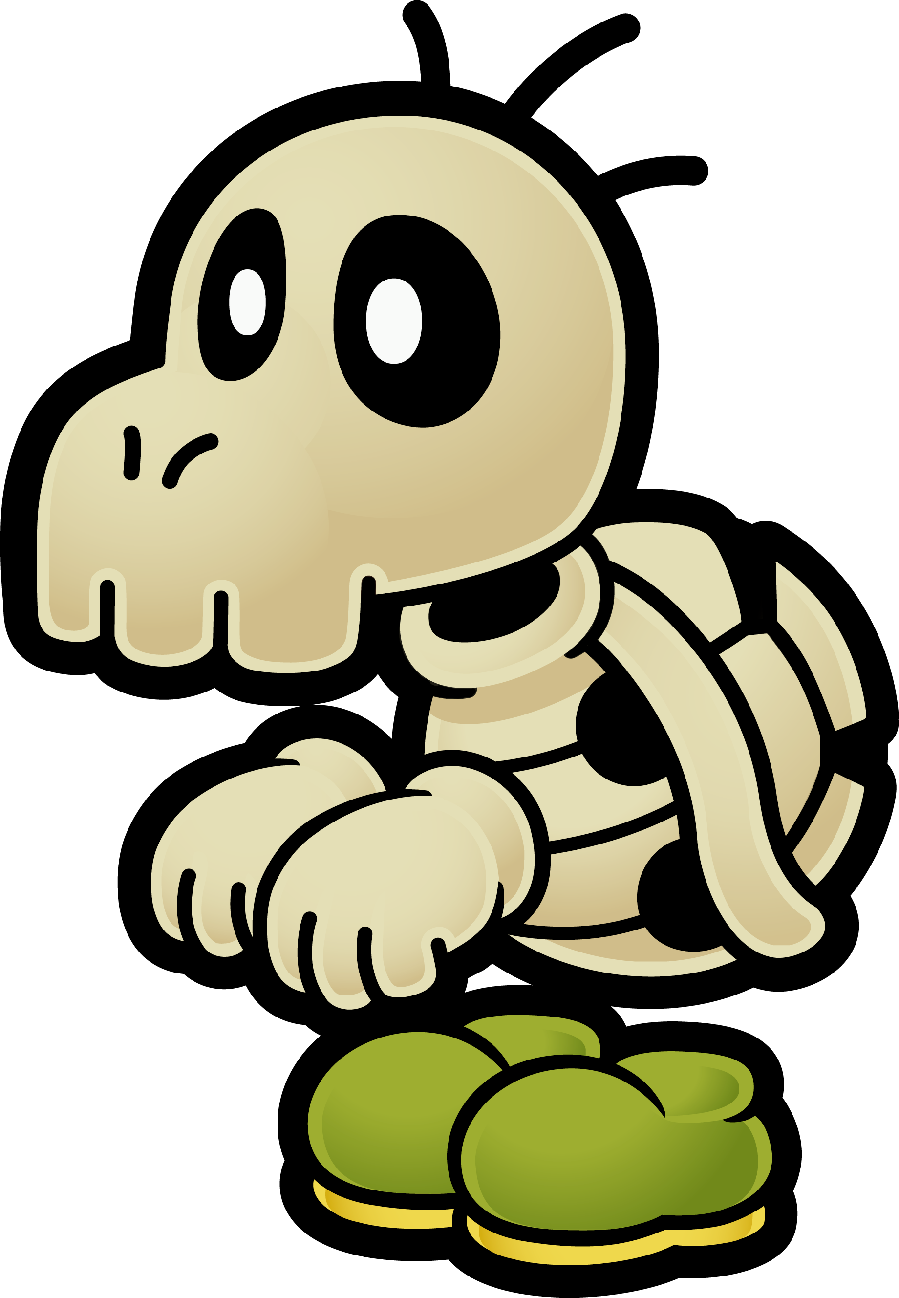
Also, about more re-colors for alternate costumes, how about Dry Bowser? The Paper Mario series had different colored Dry Bones, like seen below. Would work great for team colors!


MagicManNo9

A busy man with a busy schedule these days!
Joined
Nov 2, 2013
Messages
576
Location
Currently in USA
That looks really nice! Do you plan on making team colors for Shinobi squirtle?

Also, about more re-colors for alternate costumes, how about Dry Bowser? The Paper Mario series had different colored Dry Bones, like seen below. Would work great for team colors!


Thanks! and yeah, I'm planning to do all of the above exactly as you said funny enough.
 

RadiantThunder4

Smash Cadet
Joined
Jan 11, 2015
Messages
33
Thanks! and yeah, I'm planning to do all of the above exactly as you said funny enough.
Hahaha, that's cool. Can't wait to see what magic you do to the alternate costumes!

Have you thought about different colored alternate costumes for the rest of the batch? For example, Mr. L, Polar Bear Ice Climbers, Butterfly Meta Knight, etc.?
 

MagicManNo9

A busy man with a busy schedule these days!
Joined
Nov 2, 2013
Messages
576
Location
Currently in USA
I need this. When will we have a chance to use it?
In about a day or two? I need to work on a couple more things before I can get this out!

Hahaha, that's cool. Can't wait to see what magic you do to the alternate costumes!

Have you thought about different colored alternate costumes for the rest of the batch? For example, Mr. L, Polar Bear Ice Climbers, Butterfly Meta Knight, etc.?
I belive I already said I'm going to do all the alts in the previous parts of the thread haha, shall be doing them all so no worries!
 
Last edited:

HypnotizeOverdrive

Smash Ace
Joined
Apr 6, 2014
Messages
580
NNID
HypnoOverdrive
"Dead tired." Lmao
I got the slang before I read the explanation.
Nice work on that Squirtle! And please do those Dry Bowser alts, the Bloody variant would be wonderful.
 

RadiantThunder4

Smash Cadet
Joined
Jan 11, 2015
Messages
33
In about a day or two? I need to work on a couple more things before I can get this out!


I belive I already said I'm going to do all the alts in the previous parts of the thread haha, shall be doing them all so no worries!
Oh! Sorry about that! Just wanted to make sure hahaha.
 

MagicManNo9

A busy man with a busy schedule these days!
Joined
Nov 2, 2013
Messages
576
Location
Currently in USA
"Dead tired." Lmao
I got the slang before I read the explanation.
Nice work on that Squirtle! And please do those Dry Bowser alts, the Bloody variant would be wonderful.
I'll get to working on those right after Squirtle!

Oh! Sorry about that! Just wanted to make sure hahaha.
No worries! I do the same quite often so it's all good haha!

UPDATE:

A quick update and explanation in regards to the Squirtle costume, it's always been debated on what squirtle's alt costume is based on and it's been said it's an original costume which actually isn't based on anything.

So I decided to try and make the costume relevant by creating an alt related to Pokémon, which lead to creating a Koga theme'd Squirtle:


Had to tweek him here and there but went with the original shell and skin color to give off the default vibe, and changed the scroll pattern to one of Magikarp I whipped up, I hope people like this one, it was quite difficult to work with all things considered.
 

Crixler

Smash Journeyman
Joined
Dec 23, 2013
Messages
238
Location
Archanea
Apparently, the Pokemon anime gave Koga a sister named Aya, who could be useful for a hypothetical red team recolor. Looks like she has two different outfits that could be used as inspiration: http://www.pokewiki.de/images/0/0e/Aya.jpg and http://media.pocketmonsters.net/imageboard/54/1229614149005.jpg
Unfortunately, Janine isn't really distinct enough, I don't think. Pokemon Conquest might be a good source of inspiration for blue and green recolors, maybe. Not sure. Assuming you're planning to do team colors in the first place, of course.
 

MagicManNo9

A busy man with a busy schedule these days!
Joined
Nov 2, 2013
Messages
576
Location
Currently in USA
Apparently, the Pokemon anime gave Koga a sister named Aya, who could be useful for a hypothetical red team recolor. Looks like she has two different outfits that could be used as inspiration: http://www.pokewiki.de/images/0/0e/Aya.jpg and http://media.pocketmonsters.net/imageboard/54/1229614149005.jpg
Unfortunately, Janine isn't really distinct enough, I don't think. Pokemon Conquest might be a good source of inspiration for blue and green recolors, maybe. Not sure. Assuming you're planning to do team colors in the first place, of course.
Ohhh good idea, still debating if I should use the Pink or create a red texture for the red costume, we'll have to see! Pokémon conquest is a really good idea, I'll need to give that a look!

I do want to do the Green and Red one but I realised that if I did that would mean 11 costumes, which isn't a problem if CBliss came out so I'm unsure on what to do there.
 

RadiantThunder4

Smash Cadet
Joined
Jan 11, 2015
Messages
33
Ohhh good idea, still debating if I should use the Pink or create a red texture for the red costume, we'll have to see! Pokémon conquest is a really good idea, I'll need to give that a look!

I do want to do the Green and Red one but I realised that if I did that would mean 11 costumes, which isn't a problem if CBliss came out so I'm unsure on what to do there.
If you can't figure out a way, getting rid of one regular Squirtle color wouldn't be terrible. Project M had to do that to Mario.
 

squeakyboots13

Smash Journeyman
Joined
Oct 4, 2013
Messages
381
I wouldn't want to get rid of one of the regular Squirtle alts since they're all Project M made and are really nice looking. I would just add the black and possibly red ninja alts for now and worry about a green one once the new Cbliss tool comes out.
 
Top Bottom