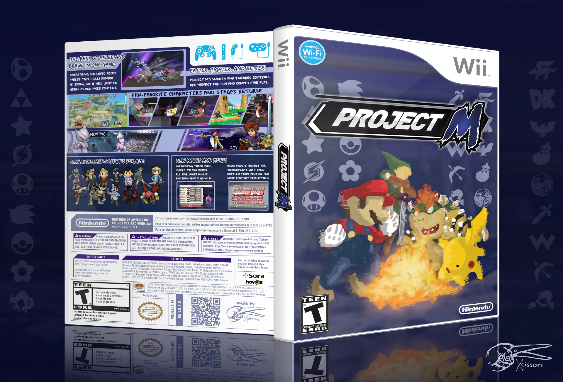
Sure! I started with a Wii Cover Template from
DeviantArt, which I edited to look like Brawl's cover art. This basically meant choosing what I wanted from what the template had. I then modified it to be fit better with the dark blue theme I was going for. The lines and text have all been made a nice shade of greyish blue, and what was normally red was changed to a less impactful shade of purple. I also added credits, links, and instructions to the piece. Unfortunately, this also meant that the box art is very English. I hope that's not a problem, but I can always make another version for other languages. The place where barcodes go was replaced with a QR code to my VGBoxArt profile. No shame in self-promotion, right?
After I finished all the base stuff, I started on the front cover. I first was going to try and replicate Brawls 'walking away from light' cover, but it was pretty hard to do. It didn't look good, and I couldn't find any nice renders to go with it. I decided that replicating Melee's cover with Brawl's aesthetic would be better. Renders restricted how good it looked and the angles from which I present the picture, so I used a more artsy, handmade look. The four characters were all mouse-painted using photoshop over the original Melee artwork. Bowser was given a more Brawlish look, and Pikachu's ears were changed to his ears in Brawl's cover. Link was also a major change, as I basically had to repaint Twilight Princess link onto adult link from Oot. Mario basically stayed the same. Every character was then accented with quick brushstrokes to give a sense of movement. I didn't include eyes because artistic license, I guess.
The background is a very blurred Battlefield, and I added a deep shade of blue and a hexagonal patterned texture. The blandness of the background, I find, helps the eyes focus on the characters and went well with the logo. The icons were then added in place of melee's eyes. They're nice and aesthetically pleasing and not very distracting. I added a few more to reflect the entire roster as well as to fill some space. Shadows and dust were also added to give some extra grit and cement the characters onto the background. Otherwise they looked very paper pop-up like. The characters are also smaller than Melee's, but that's only because of my preference.
The back is based heavily on Brawl's back. I found the font Project M used for the menus, and found another font I liked for the rest. I made a color scheme based on light blue and dark blue. It's sort of an opposite of Brawl's Black and White-yellow color scheme. I found some screenshots and put them together with words I think would be used to advertise Project M. For Mewtwo and Roy, I had to find a nice horizontal picture and the official renders. Extracting them from the background was a little bit tiring, but it paid off. You'll notice that Roy's example image is of his yellow alternate color, because that was the best one I could find. Mewtwo's screenshot was taken from his Turbo video.
Alternate costumes were a little harder to pin down. I didn't really know how I wanted to present it. First, I took them and had them with backgrounds, all nice and horrid looking. Scrapped that pretty quickly. In the end I decided the characters with some shadows in some sort of organization would be nicer, and it worked. The rest was just finding the pictures, writing the words, and making small adjustments such as adding backgrounds and such.
That's about it. There are some other small touches here and there, but it's pretty boring. I also had to create a 3D mockup of the cover art using Photoshop, which resulted in the pretty looking thing you see above.
If you want to create your own box art, VG Box Art is a good place to go. You should probably have a good understanding of photoshop or another image editor though.


")


