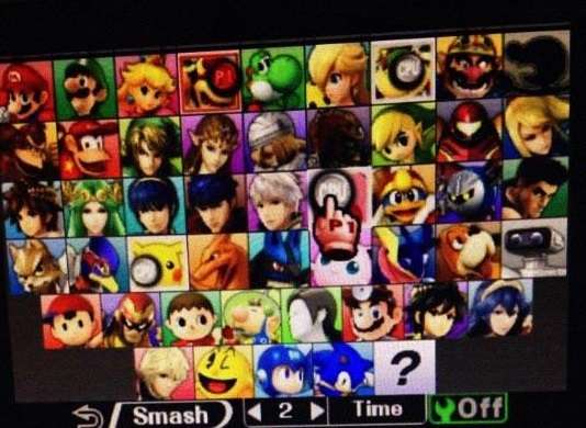
Crap. I've been posting in the
wrong thread. Here are some things I pointed out in the other thread:
The bottom row of the stage select screen is not centered. The bottom rows for the character select screen are.
To the left of the duck's head you can see his neck. The bottom of his head, however, is on the right which would make his neck longer than his head.
That person on 4chan saying that they modified it in order to make it more controversial could be saying that to just cover up all the mistakes.
No, no, no. I can see that the blue part on the right of his head is his other wing, On the left of his head you can see some white. That is his neck. But his head is facing left, making the bottom of his head on the right. Here's an image I made real quick to show what I mean:
The light white part that I added is where his neck would have to be in order to connect to the bottom of his head. That's a really long neck. I don't know what the source image is for this duck, but it seems as though someone just horizontally flipped the head in order to keep the head inside the frame. Otherwise, the head should be farther left and up, covering up his neck.
---
Another thing I noticed while looking closer at this image is the perspective. I could be wrong here, but something seems wrong with it. Towards the top:
The bottom part is almost a straight line across, but the top part is at more of an angle. It's also drastically different from the bottom part:
I understand the picture was taken at an angle, but the differences here are pretty dramatic. Again, the bottom part of where it says "Lv. 3, Lv. 8, Lv. 4" is almost straight, and the bottom part is at an extremely different angle. I know it's just perspective, but it seems off to me. Especially the difference between the top and bottom part of the "Lv. 3, Lv. 8, Lv. 4" boxes.
Not sure if it means anything, but the colors that they changed to are the same background colors as on the smashbros.com website. Which, if it was fake then the faker would have had to have gotten the pictures from the website. Also, all the character icons are more zoomed out in the "leak" than they are in the e3 demo, except for Kirby who is actually more zoomed in.
Oh, ducks have long necks. Well, these are ducks based off the NES game Duck Hunt. Specifically, this duck here:
Does that look like a long neck to you? Specifically the white part.
---
I've seen people point out the one about the stage select screen random icon, but I don't think I've seen someone mention the one on the character select screen.
It overlaps the wrench icon box, which makes no sense. The wrench icon is on the bottom screen and the random icon is on the top screen. It should be impossible for that to happen.


 >
>


