-
Welcome to Smashboards, the world's largest Super Smash Brothers community! Over 250,000 Smash Bros. fans from around the world have come to discuss these great games in over 19 million posts!
You are currently viewing our boards as a visitor. Click here to sign up right now and start on your path in the Smash community!
It appears that you are using ad block :'(
Hey, we get it. However this website is run by and for the community... and it needs ads in order to keep running.
Please disable your adblock on Smashboards, or go premium to hide all advertisements and this notice.
Alternatively, this ad may have just failed to load. Woops!
Please disable your adblock on Smashboards, or go premium to hide all advertisements and this notice.
Alternatively, this ad may have just failed to load. Woops!
master plan
- Thread starter Alzi
- Start date
I sent a Pm with my decisions. Gl everyone.
Diddyknight
Smash Lord
lol This died for a while lol xD
Black Waltz
Smash Champion
- Joined
- Jan 27, 2007
- Messages
- 2,243
Oh god, not one of these again...-_____-
How are you voting on these? Popular vote? Because the public is stupid.
How are you voting on these? Popular vote? Because the public is stupid.
Diddyknight
Smash Lord
I can choose the render option right? if so, I'll choose a worthwhile one thats not LQ >_>
Black Waltz
Smash Champion
- Joined
- Jan 27, 2007
- Messages
- 2,243
No, public votes are stupid because the public doesn't know what looks nice and who has spent more time and effort in a piece. The public thinks "SHINY COLORS" is auto-win, and they are wrong. The public will choose a neon piece of **** over an excellently composed abstract tag. I've run SOTW's before and the public has only shown its stupidity over time.Suggestion: public votes are pretty good, or at least overall better critiques during judging process.
Btw I did not use Iwarp so whomever thought that...
Please choose something not LQ and at least original.I can choose the render option right? if so, I'll choose a worthwhile one thats not LQ >_>
Diddyknight
Smash Lord
Whats considered orginal lol. Something that isnt brawl related? xD
EDIT: ill post up the render tommorow and the requirements
EDIT: ill post up the render tommorow and the requirements
Diddyknight
Smash Lord

Theme: Christmas
Text(optional)
Waltz, you can judge this, I'm gonna enter this one. ^_^
Diddyknight
Smash Lord
As will I shall be entering this =D
Black Waltz
Smash Champion
- Joined
- Jan 27, 2007
- Messages
- 2,243
Just PM me when you guys need me for judging.
Original render, but I don't really see how you can do much with it...
Original render, but I don't really see how you can do much with it...
- Joined
- Aug 31, 2005
- Messages
- 8,189
Here are the Results for the first competition.
Third
crismas

Wait what? This one doesn't have ANY blending. It has multiple focal points. The colors don't blend. Its just puke into a computer screen. Just because you use a few filters, and a glow. Does NOT make it a good tag. Twirl is not a good filter btw. And the C4D in the background is detracting from the focal point.
Ok, this one is actually good. Its got decent blending. Good text. Decent lighting, only one focal point. The coloring works.Second
KawaiixxWings
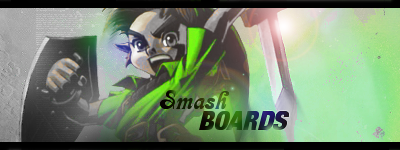
Wait, why did this one win? Because of excessive brushing? Putting on a cyan photo filter? missing the s in Smashboards? The mediocre blending? Because it is so **** bright? There is no wow factor in this. The bubble is just weird. However the focal point is clear and defined. Think that for lighting, you could have toned it down a bit. But, other than that its an alright tag if your just starting.First
Diddyknight

Congrats Diddyknight. As the winner you get to choose the next rules for the rule set and you have a choice of being Judge.
Actually, I'll just judge this one. I can't really work with this render, for some reason. XD
Not much you can really do with it.
Not much you can really do with it.
Black Waltz
Smash Champion
- Joined
- Jan 27, 2007
- Messages
- 2,243
Starts slow clap.Wait what? This one doesn't have ANY blending. It has multiple focal points. The colors don't blend. Its just puke into a computer screen. Just because you use a few filters, and a glow. Does NOT make it a good tag. Twirl is not a good filter btw. And the C4D in the background is detracting from the focal point.
Ok, this one is actually good. Its got decent blending. Good text. Decent lighting, only one focal point. The coloring works.
Wait, why did this one win? Because of excessive brushing? Putting on a cyan photo filter? missing the s in Smashboards? The mediocre blending? Because it is so **** bright? There is no wow factor in this. The bubble is just weird. However the focal point is clear and defined. Think that for lighting, you could have toned it down a bit. But, other than that its an alright tag if your just starting.
[/SIZE]
- Joined
- Aug 31, 2005
- Messages
- 8,189
But, I couldn't resist the urge to troll this guy who was stupid.Diddyknight what a nice pic. Are you sure some people might not get distracted from it. I will add it to the first post once i have time.
And Sinz if you never got banned and if dragon doom sent me a pm in time i agree aswell that those top 3 will not be in that certain order.
Also @ that image. This site is for 13-17 year olds. That image is near pornography(it isn't I know. But, you can still get in trouble... believe me I know.). You really need to get a different image.
Diddyknight
Smash Lord
I'll post up a new render for more use lol I kinda picked of the first render in my folder thats related to christmas lolol
Diddyknight
Smash Lord
New render, new theme
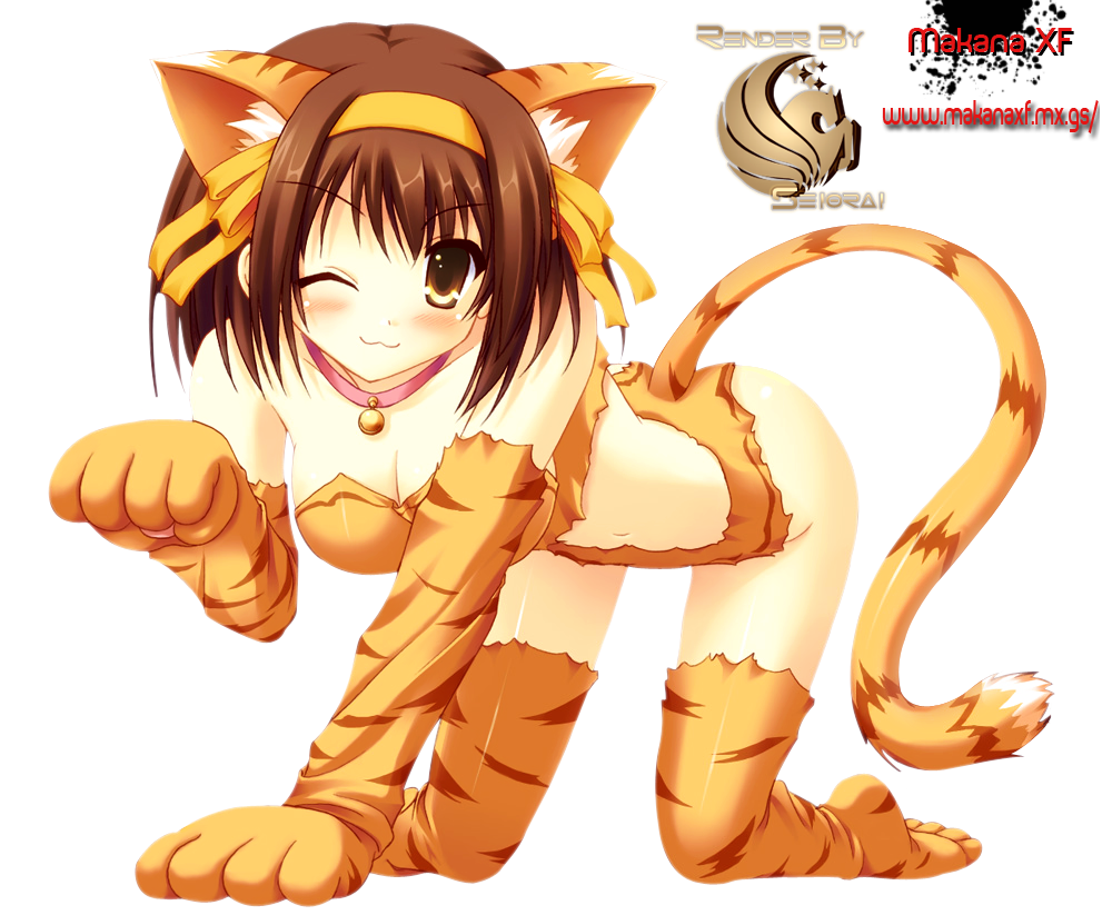
Theme: Whatever works well with the render
Text: Optional

Theme: Whatever works well with the render
Text: Optional
Technodeath
Smash Champion
lol good job on the contest thread alzi.
on a side note, i shall win at least one match against you :o next time that is
on a side note, i shall win at least one match against you :o next time that is
Diddyknight
Smash Lord
-.-
.....That takes away all the fun D: fine ill bring something more "safe" and expect a pm tonight
.....That takes away all the fun D: fine ill bring something more "safe" and expect a pm tonight
