InfiniteThoronz
Smash Cadet
It's a hard one for me, but I have to say the newcomers. What is yours?

Welcome to Smashboards, the world's largest Super Smash Brothers community! Over 250,000 Smash Bros. fans from around the world have come to discuss these great games in over 19 million posts!
You are currently viewing our boards as a visitor. Click here to sign up right now and start on your path in the Smash community!
 .
.Rar? Mario was one of the best characters in 64.
And the fact that, for the first time ever, Mario is actually usable. His least rough incarnation before this was in Melee and he still wasn't exactly awesome there.
The reason I said two and not one is because that's the entire list of things I like about Smash 4.
Well he wasn't bad, no character was bad in 64, but he doesn't compare to Falcon, Pikachu, Yoshi or Kirby. Being 7th place out of only 12 isn't impressive.Rar? Mario was one of the best characters in 64.
I don't know, Link was pretty bad. At any rate, I'm not talking tiers, I mean as a character, Mario was good in 64.Well he wasn't bad, no character was bad in 64, but he doesn't compare to Falcon, Pikachu, Yoshi or Kirby. Being 7th place out of only 12 isn't impressive.


 ), but most of Brawl's just look fugly (, could list a great amount of them tbh), Smash 4 having that drop shadow and having proper shading on all the character heads just outright looks great. It's the little things that make you appreciate something more.
That's fine m8. Great read.I'm gonna talk about one thing not many people seem to talk about when it comes to\ Sm4sh:
The art style. This game is ****ing gorgeous. Not from just the attention to detail in most of the stages, but just how the colors pop out in nearly damn everything. From the character artwork, the models, the menu (even if the way it's organized is still a mess), and even the character heads. It's a hell of a lot more appealing to look at than Brawl, where most of the characters looked like they rolled in dirt or in general just didn't mold well at all with the realistic art direction.
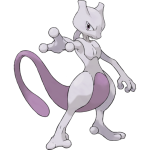
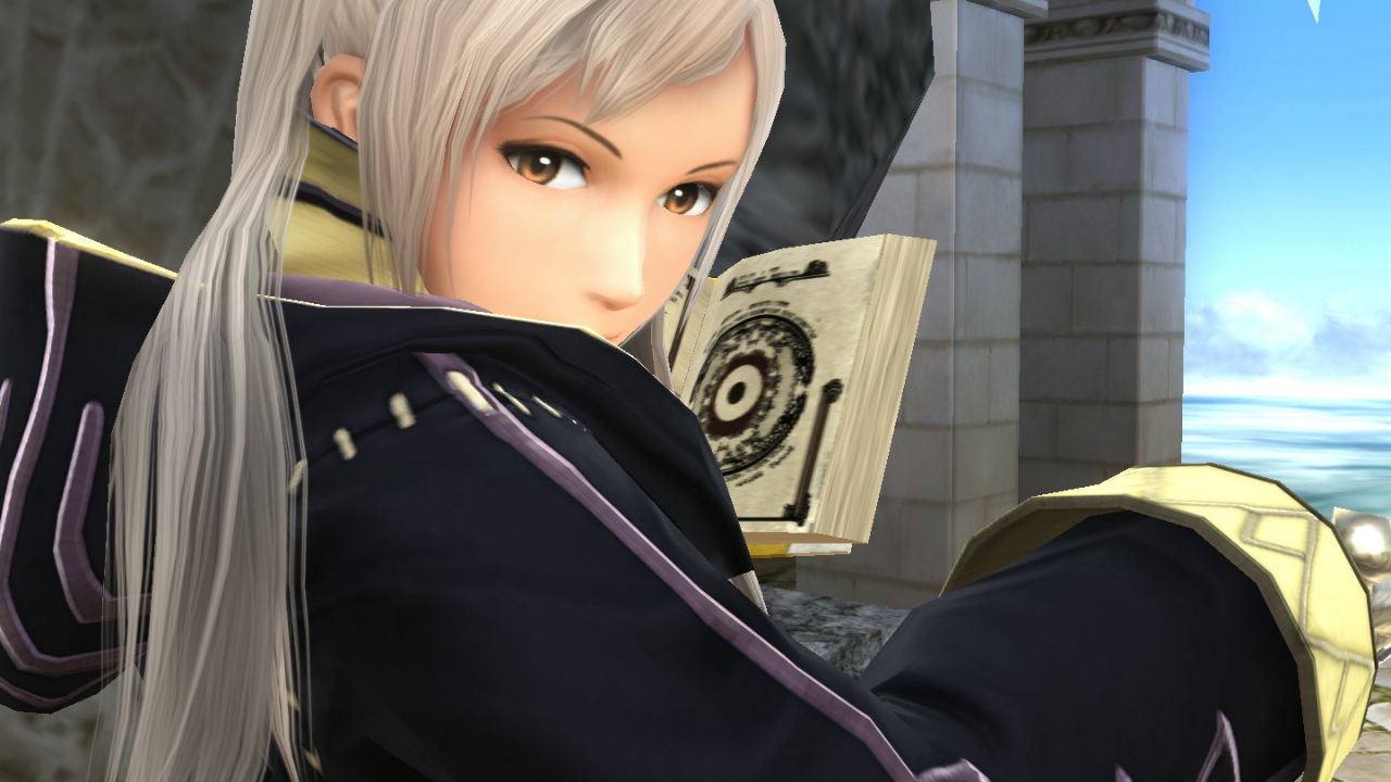
In general, the art direction in this game is where I feel like they got it "right", if you get what I'm saying. Almost all the characters look as closest as they do to their home series, which isn't something I can really say for Melee or Brawl. 64 more or less gets a pass since it had its own stylistic spin anyway, and the comic book artstyle for it is something I find immensely charming. Thing is, Smash 4 is a game I can see still holding up well as the years pass, time hasn't been so kind to Melee or Brawl's visuals. Time for me to show some examples:
Looking at you, Toon Link.
B O O Z E R
![]()
![]()
![]()
moo^2
![]()
![]()
hat kid
![]()
![]()
![]()
red luigi
ok Melee Mario's render is actually alright but still
![]()
![]()
![]()
all four characters in official renders in their home games
![]()
![]()
![]()
![]()
See what I'm getting at? It's a very pleasing look and fits most of the characters. I really hope future Smash games follow the same aesthetic Smash 4 does. The same thing can even be seen in the character heads like I mentioned before. Let's take a look at Jigglypuff:
I'll actually give it that most of Melee's head icons have aged fairly well (
man this went on too long, lol
Change color to RedI love
My waifu
I find it kinda weird to waifu an SI character but OK.I love
My waifu
This, I can agree with.I find it kinda weird to waifu an SI character but OK.
Anna is legit cute in Smash.

IMO she looks far cuter here in Smash than she does in FE.This, I can agree with.
Imagine whatAnnaRobin would look like in Smash 64's Artstyle
That game made Mario look like a Cinnamon Roll
Imagine what they would makeAnnaRobin look like
It's basically a cutesy way of calling a girl from a videogame or show your favourite. Some people only have one waifu, which is their favourite girl ever, some people have many. Most people don't take this seriously, some other people legit act as if their waifu is their actual wife.No clue what Waifu means, but I love Anna so
We know that Sheik is your waifu.Incredibly enough, Lucina isn't my waifu. Far from it.
Bloody hell.We know that Sheik is your waifu.
There's plenty of reasons.
- The amount of characters—clones or not—is amazing in my eyes.
- The third-party characters we have received has been mindblowing, honestly. Cloud is a huge deal, whether people want to believe it or not. Ryu is not a small thing either.
- Despite Sakurai's view towards the competetive scene, he has done quite a lot for it, as a nod that he acknowledge us. That being the online mode(s), the balancing patches and even Gamecube controllers and adapter.
- Palutena.
- Robin
And I approve of it.Fixed the list.
I approve.Fixed the list.
I still thank sakurai every day! Just for the pure fan service. I don't ever main any of these guys but I just feel happy to have them be a part of sm4sh.Hail Master Hero Soccer Guy

I completely agree. This is my pick too.I'm gonna talk about one thing not many people seem to talk about when it comes to\ Sm4sh:
The art style. This game is ****ing gorgeous. Not from just the attention to detail in most of the stages, but just how the colors pop out in nearly damn everything. From the character artwork, the models, the menu (even if the way it's organized is still a mess), and even the character heads. It's a hell of a lot more appealing to look at than Brawl, where most of the characters looked like they rolled in dirt or in general just didn't mold well at all with the realistic art direction.
In general, the art direction in this game is where I feel like they got it "right", if you get what I'm saying. Almost all the characters look as closest as they do to their home series, which isn't something I can really say for Melee or Brawl. 64 more or less gets a pass since it had its own stylistic spin anyway, and the comic book artstyle for it is something I find immensely charming. Thing is, Smash 4 is a game I can see still holding up well as the years pass, time hasn't been so kind to Melee or Brawl's visuals. Time for me to show some examples:
Looking at you, Toon Link.
B O O Z E R
![]()
![]()
![]()
moo^2
![]()
![]()
hat kid
![]()
![]()
![]()
red luigi
ok Melee Mario's render is actually alright but still
![]()
![]()
![]()
all four characters in official renders in their home games
![]()
![]()
![]()
![]()
See what I'm getting at? It's a very pleasing look and fits most of the characters. I really hope future Smash games follow the same aesthetic Smash 4 does. The same thing can even be seen in the character heads like I mentioned before. Let's take a look at Jigglypuff:
I'll actually give it that most of Melee's head icons have aged fairly well (
man this went on too long, lol
AMEN to every single letter of this post. I hated Brawl's art direction since day 1, when they revealed the trailer at E3 2006. Everyone looks hideous, ESPECIALLY Mario.I'm gonna talk about one thing not many people seem to talk about when it comes to\ Sm4sh:
The art style. This game is ****ing gorgeous. Not from just the attention to detail in most of the stages, but just how the colors pop out in nearly damn everything. From the character artwork, the models, the menu (even if the way it's organized is still a mess), and even the character heads. It's a hell of a lot more appealing to look at than Brawl, where most of the characters looked like they rolled in dirt or in general just didn't mold well at all with the realistic art direction.
In general, the art direction in this game is where I feel like they got it "right", if you get what I'm saying. Almost all the characters look as closest as they do to their home series, which isn't something I can really say for Melee or Brawl. 64 more or less gets a pass since it had its own stylistic spin anyway, and the comic book artstyle for it is something I find immensely charming. Thing is, Smash 4 is a game I can see still holding up well as the years pass, time hasn't been so kind to Melee or Brawl's visuals. Time for me to show some examples:
Looking at you, Toon Link.
B O O Z E R
![]()
![]()
![]()
moo^2
![]()
![]()
hat kid
![]()
![]()
![]()
red luigi
ok Melee Mario's render is actually alright but still
![]()
![]()
![]()
all four characters in official renders in their home games
![]()
![]()
![]()
![]()
See what I'm getting at? It's a very pleasing look and fits most of the characters. I really hope future Smash games follow the same aesthetic Smash 4 does. The same thing can even be seen in the character heads like I mentioned before. Let's take a look at Jigglypuff:
I'll actually give it that most of Melee's head icons have aged fairly well (
man this went on too long, lol
This exactlyI'm gonna talk about one thing not many people seem to talk about when it comes to\ Sm4sh:
The art style. This game is ****ing gorgeous. Not from just the attention to detail in most of the stages, but just how the colors pop out in nearly damn everything. From the character artwork, the models, the menu (even if the way it's organized is still a mess), and even the character heads. It's a hell of a lot more appealing to look at than Brawl, where most of the characters looked like they rolled in dirt or in general just didn't mold well at all with the realistic art direction.
In general, the art direction in this game is where I feel like they got it "right", if you get what I'm saying. Almost all the characters look as closest as they do to their home series, which isn't something I can really say for Melee or Brawl. 64 more or less gets a pass since it had its own stylistic spin anyway, and the comic book artstyle for it is something I find immensely charming. Thing is, Smash 4 is a game I can see still holding up well as the years pass, time hasn't been so kind to Melee or Brawl's visuals. Time for me to show some examples:
Looking at you, Toon Link.
B O O Z E R
![]()
![]()
![]()
moo^2
![]()
![]()
hat kid
![]()
![]()
![]()
red luigi
ok Melee Mario's render is actually alright but still
![]()
![]()
![]()
all four characters in official renders in their home games
![]()
![]()
![]()
![]()
See what I'm getting at? It's a very pleasing look and fits most of the characters. I really hope future Smash games follow the same aesthetic Smash 4 does. The same thing can even be seen in the character heads like I mentioned before. Let's take a look at Jigglypuff:
I'll actually give it that most of Melee's head icons have aged fairly well (
man this went on too long, lol