• Welcome to Smashboards, the world's largest Super Smash Brothers community! Over 250,000 Smash Bros. fans from around the world have come to discuss these great games in over 19 million posts!

    You are currently viewing our boards as a visitor. Click here to sign up right now and start on your path in the Smash community!

Victory Screen

batistabus

Smash Journeyman
Joined
Apr 8, 2012
Messages
488
Location
New England
First, I want to preface this by saying this is not a big deal. This does not bother me, and this does not make me think less of PM. This is just something I think would make it look better and have a more cohesive style.

I know that the victory screen in PM is meant to look more like the Melee one, but I feel it is a bad compromise between the two. In my opinion it is a clash between two different styles, and here are the problems I see with it.

-Characters stand in a big black void, but the camera moves as if it is a 3D world (as opposed to Melee where the camera was stationary and characters just moved in front of the camera). In Brawl, the 3D looked "fine" because it seemed like a plausible space to exist in. In Melee, the black worked because it was a 2D space, and it didn't actually look as if characters were existing in that place; they seemed more like the photo renders that would be used for basketball players or something like that.

-The music. The music is very cheery and up-beat (and annoying, but that's beside the point), and it doesn't go well with a blank background. Also, in Melee when I want to take a break from Smash, my friends and I tend to leave the TV on so we can just pick up controllers and play again whenever we want. For PM(/Brawl), the TV needs to be muted or turned off because we don't want to hear that song constantly, so that's just an extra step away from playing again. This also creates extra noise pollution at tournaments, since after matches, TVs tend to be left on this screen.

I have 3 suggestions:

1. Make it as closer to Melee: Make the camera stationary (not zoom in, not move around the character), make the characters stand in a 2D line next to eachother (not like in the 3D space where the winner is closest to the screen and the loser is farther) because I doubt it would be possible to put them in a small box like Melee, and turn off the music.

2. Do the above, but add more PM flair. Instead of just plain black background, use the blue/purple/black PM texture that appears in the loading screens. http://i208.photobucket.com/albums/bb218/justinbatista12/background_zpsaf9a8476.png

3. Leave it 3D, but make the background less of an eyesore than the Brawl one (also turn off the music). Maybe something like Smash 64?

What do you think? Are there any changes you would like to see in the victory screen?
 

yogurtgun1245

Smash Apprentice
Joined
Dec 13, 2009
Messages
183
Location
Delaware
I like the idea of the Smash 64 background. I've been using it on my build over the black Project M victory background for the same reasons you've posted.
 

hotdogturtle

Smash Master
Joined
Feb 15, 2007
Messages
3,503
I don't like the P:M victory screen because, like you said, they retextured a 3D open space to be all black, which does not look the same as a 2D "portrait" style with a blank background from Melee. I always use a custom one in its place.
 

DrinkingFood

Smash Hero
Joined
May 5, 2012
Messages
5,600
Location
Beaumont, TX
I'd like to see a take on the brawl results screen, but with a new background with something closer to to PM's color scheme or just something entirely new. I'd like to see something that looks more professional than the current ugly black screen we get, but different enough from brawl or melee that you can tell by the results screen background alone that you aren't playing either of them.
 

Rᴏb

still here, just to suffer
Joined
Feb 1, 2012
Messages
1,595
Not only does the results screen need to change, all of the menus could use an update. Right now they don't really have an identity, they look like brawl with a really cheap melee paint job. As others have said, the in-game aesthetics should try to match the PM color scheme with purples and blues and really should look more like the PM website.
 

Dng3

Smash Apprentice
Joined
Feb 14, 2008
Messages
129
I agree with everything. I was taken back the first time I saw the victory screen and all its blandness. As everyone has said, it just doesn't replicate the melee style result screen very well. A custom Project M design is definitely needed.
 

turtletank

Smash Journeyman
Joined
Jan 12, 2013
Messages
498
I've been using the N64 results screen for a while now. The default feels out of place and causes glitches, Lucas' sword being visible in the ground etc.
 

Eisen

Smash Ace
Joined
Sep 17, 2009
Messages
662
Location
Planet Tallon IV
NNID
AndroidPolaris
Yeah, the PM status quo for victory screen bothered me for the exact same reason. I liked Melee's because of how the "gui"/lists were displayed, their style, and the "2-dimensional" effect. It would be definitely beneficial to come up with something else, much like the grid-style that was suggested. Preferably, not only would the background be changed, but the menus, too. They look very ugly; both the font and the layout of them. But that part is probably more of a personal gripe.

Speaking of this, I feel a few untouched stages could use some "Project M flair" though I'm pretty sure that's bottom priority and would likely be post-3.0 work. Project M flair could include color palette changes/brightening and custom, more fitting backgrounds. Stages like Port Town and Yoshi's Island are probably fine, but Battlefield could really use its own Project M touch, similar to Distant Planet 3.0 and Pokemon Stadium 2.

For the record, I have this results screen at the moment and absolutely love it. I don't think it's likely to make it into Project M, though. It's very "laid back".
 

Eisen

Smash Ace
Joined
Sep 17, 2009
Messages
662
Location
Planet Tallon IV
NNID
AndroidPolaris
It would make a really cool results screen. Yet at the same time, I can see that looking a bit weird, to have two of the exact same stages. It would work, don't get me wrong. It depends on how others feel about it, though.

I'm sure that the PMBR could make an awesome results screen that isn't the training room. I don't think it would hurt to have some diversity is what I'm saying.
 

DrinkingFood

Smash Hero
Joined
May 5, 2012
Messages
5,600
Location
Beaumont, TX
Guys get this
What if like
Guys
Listen
Guys what if like
The results screen was on the stage you just played
PMBR get on it
And don't give me that "impossible" horse**** either, we all know you've done more magical things in the past
 

GP&B

Ike 'n' Ike
Joined
May 8, 2009
Messages
4,609
Location
Orlando, FL
NNID
MetalDude
That would be unreal if they managed to do that.

But I'm all for anything that gives PM more aesthetic identity. I feel like 3.0 will have some additions, but that might just be the trend of new additions getting to me.
 

hotdogturtle

Smash Master
Joined
Feb 15, 2007
Messages
3,503
Yeah, the PM status quo for victory screen bothered me for the exact same reason. I liked Melee's because of how the "gui"/lists were displayed, their style, and the "2-dimensional" effect. It would be definitely beneficial to come up with something else, much like the grid-style that was suggested. Preferably, not only would the background be changed, but the menus, too. They look very ugly; both the font and the layout of them. But that part is probably more of a personal gripe.
One thing that always seemed out of place for me was the font that P:M used for its menus (same one as the old logo). It seemed pretty low quality and "unprofessional" compared to the image that they were striving for. And since the menus have been getting minor touch-ups with each release, the font started looking worse and worse each time. Since they changed their logo in 3.0, hopefully they can update the buttons on the menus as well.

The results screen that I used to use in Brawl is this. Not that I'm suggesting it for Project M, but it gave a nice simple look that was visually distinct from anything else in Brawl or the old result screen. And it is merely a recolor of the default one. So that's how I would want a new P:M results screen to be designed, if they were to make a new one.

Either that or what DrinkingFood said.
 

Johnknight1

Upward and Forward, Positive and Persistent
Joined
Feb 25, 2007
Messages
18,966
Location
Livermore, the Bay repping NorCal Smash!
NNID
Johnknight1
3DS FC
3540-0575-1486
Honestly, the biggest problem is the character models on it, not the shakiness. I'm sure the shakiness can be fixed.

The problem with the character models is that they have outlines and they look way too dimmed/brown. That's a big reason why the best Brawl Vault texture hacks are the ones that get ride of that generic Gears of War brown-esk coloring for Project M that has plagued Brawl.

Heck, if we could get ride of that awful coloring and give us the classic "bright" Smash 64/Melee/Smash Wii U feel, that would be amazing.
 

Dng3

Smash Apprentice
Joined
Feb 14, 2008
Messages
129
Dumb question guys but where do you replace the pac file for results screen on the sd card? I've love to try out everyone's suggestions here.
 

Kaye Cruiser

Waveshocker Sigma
Joined
Aug 11, 2009
Messages
8,032
NNID
KayeCruiser
Switch FC
0740-7501-7043
Dumb question guys but where do you replace the pac file for results screen on the sd card? I've love to try out everyone's suggestions here.
In the same folder as all of the stages.

It's a stage itself, after all.
 

F. Blue

Smash Journeyman
Joined
Oct 11, 2011
Messages
433
A purple results screen inspired by Smash 64's would be pretty nice.

As long as it's purple.
 

Xinc

Smash Lord
Joined
Jan 18, 2011
Messages
1,560
Location
NY, NY
NNID
xincmars
3DS FC
2981-7601-8481
I think dark blue with a slight purplish hue might be more sufficient.
 

Kati

Smash Lord
Joined
Mar 22, 2010
Messages
1,471
Purple 64 style:
http://www.mediafire.com/download/f2j7249c00qip64/STGRESULTPM1.pac

Purplish blue 64:
http://www.mediafire.com/download/91yi7831n7k99bf/STGRESULTPM8.pac

Many variants using PM's loading screen as the tiled floor:
http://www.mediafire.com/download/4ppuesn41d1rixy/STGRESULTPM2%20bright%20sky.pac
http://www.mediafire.com/download/ndeb38zd8e125bw/STGRESULTPM3%20dark%20sky.pac
http://www.mediafire.com/download/y78yteddk4zqeee/STGRESULTPM4%20blue%20sky.pac
http://www.mediafire.com/download/6l37yk2iv7iwpr6/STGRESULTPM5.pac
http://www.mediafire.com/download/j5fa0ei6okdmgob/STGRESULTPM6.pac
http://www.mediafire.com/download/efmqhlcwibdzu3f/STGRESULTPM7%20iffy.pac

I made these very fast. They are all to be considered beta versions. People's t.v.'s vary in colour display, so don't nitpick about shades. As I just ripped the PM tiles from the loading screen, they are not mapped properly. Focus on the overall picture, and I will touch up later if one of these 7 designs gets enough support. Delete every character inbetween "STGRESULT" and ".pac," and place it in the stage folder. The little descriptions might not even be all that accurate, particularily #2.

5 and 6 might be noteworthy.
 

crabsmack

Smash Cadet
Joined
Jan 2, 2013
Messages
32
Would you mind posting pictures? Installing and viewing all seven of those to find which one looks best is going to take a while, and make side-to-side comparison tedious.
 

Kati

Smash Lord
Joined
Mar 22, 2010
Messages
1,471
None of them are diamonds, rather zman just took a picture at an angle. There are only two textures that dictate the floor, so it would as simple as rotating the squares in order to get diamonds happening in game.
 

Sharkz

Smash Ace
Joined
Nov 11, 2007
Messages
529
Location
NC State, NC
NNID
Sharkz1
Does anyone have an picture of the rest of these? I really like the look of the one zman uploaded and I'm curious what the others look like.
 

smashbro29

Smash Champion
Joined
Oct 9, 2007
Messages
2,470
Location
Brooklyn,NY,USA
NNID
Smashbro29
3DS FC
2724-0750-5127
I say go smash 64 on it. Complete with the floor matching the winning player/team's color.

Also confetti and the giant text on the bottom.
 

Kati

Smash Lord
Joined
Mar 22, 2010
Messages
1,471
confetti would be possible by taking a rain model and replacing it with said image (maybe ripped from warioware?). Go for it.

I'll be at a smash fest tonight, so I'll get to test two of the victory screens. 5 and 7 I guess for now.
 

Eisen

Smash Ace
Joined
Sep 17, 2009
Messages
662
Location
Planet Tallon IV
NNID
AndroidPolaris
There's already confetti used for Sandbag when you hit it in a match. That would probably look better than anything else.
 

Kati

Smash Lord
Joined
Mar 22, 2010
Messages
1,471
Do you have the file that we could use to extract the confetti texture?

------
Edit:

1) It seems that I may have surpassed the file size limit on a few those. Either that or a texture I used had too high of a resolution.

2) This thread should probably be moved to the customized content, given that the pmbr hasn't shown interest. We should come up with a high quality results screen and then present it.

3) Make sure that you don't name the file STG_RESULT.pac as mentioned above. There is no underscore.
 

Tweezer Salad

Smash Apprentice
Joined
Oct 23, 2012
Messages
185
I honestly wish music wouldn't play the victory tune ends,

I liked the black empty void room in Melee's victory screen. I can just imagine the echoing sound that Kirby's tiny arms would make in that room if you were somehow in there.
 

Kati

Smash Lord
Joined
Mar 22, 2010
Messages
1,471
You wish that it wouldn't play after the character's victory song ends?

Easy peasy. I'll upload my silent brstm later. Rename it X08 or whatever.
 

Sixth-Sense

Smash Ace
Joined
Mar 28, 2012
Messages
689
Location
San Francisco, Venezuela (not the famous one)
oh wow, well i'm glad i'm not the only one who thinks they need to spice up on the aesthetic department, the HUGE brawl buttons on the menu just look silly, it would be nice to have smaller and sharper buttons and in a different layout (not melee's, its pretty bland) i have no idea what layout that could be though
 

Pwnz0rz Man

Smash Lord
Joined
Mar 30, 2008
Messages
1,862
Location
Nowhere, Kansas
3DS FC
1950-9089-5761
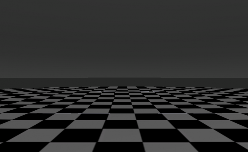
I put together this results screen for my custom pack. It's pretty bare bones, and I think it's a pretty blah picture of it, but I like it.

[collapse= Grey/Black Checkers]
[/collapse]
 

Kati

Smash Lord
Joined
Mar 22, 2010
Messages
1,471
Still has more going on than an all black background. The only problem I see with grey/white against black is the chess resemblance.
 

Pwnz0rz Man

Smash Lord
Joined
Mar 30, 2008
Messages
1,862
Location
Nowhere, Kansas
3DS FC
1950-9089-5761
Still has more going on than an all black background. The only problem I see with grey/white against black is the chess resemblance.
I think that was kind of the point in the original Smash Bros. Personally, I like the checkered pattern of black and white on floors. It turns a floor into a game.
 
Top Bottom