1. Darn, I guess we did. Looks like we can't release Dedede's update with his new eyes and recolours then.
2. Good eye, and I'll explain a bit of why we ended up with that.
To start off, here's the old texture:
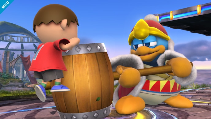
This was way back when we first started out, so we were trying to simplify things a lot back then. This had the side effect of making it look...well, not like wood. This time around, we looked at some other things in Smash U to get a better idea of how we should style it. We looked at these two things:
However, these are both made of planks, and not a chunk of wood turned into a hammer. They've been through a bit more of a refining process, so they'd look smoother. They still have that wood look to them though. That's why we thought it'd be better to use the Brawl texture this time around, as it would still get the rough look of their hammers. Of course, we did modify it a bit:
(New)
(Brawl)
It's small, but we cleaned up the edges to get rid of the small nicks in the hammer, while still keeping it looking rough. This gif should show the small differences:
That said, we may change it. Depends how much motivation is left.
I think I need to up my tease game, no one ever seems to get that I'm teasing something...
I wasn't literally asking where stocks go in the files!
We've done the menu assets for dual Zelda and Sheik, they're in the Brawl pack. The CSS icons are in the individual downloads too.
Seven? There's more than that. This is going to be the biggest update yet.


