I don't want to argue this anymore, but I will say that I know what I'm talking about. I'm in school for game development and I've tried this stuff out. The thing that makes Mario, Snake and Samus look natural standing next to each other has nothing to do with coloring or detail, it's all about the lighting. If you stuck Galaxy Mario into Brawl and then applied that same lighting/shading style to Snake and Samus they'd all look perfectly fin standing next to each other. I promise you that.
You don't have to do either. Mario can remain his less detailed self while Snake can remain more detailed self. As long as the proper lighting/shading is used every character will all fit in perfectly.
I'm not all for arguing about it anymore either, but I won't just let my argument hang in the air, so as a
last comment I'd like to note that you're definitely not the only one who's studying with game development. I'm practically rendering 3D scenes every day, I know what effects lightning and shading has. The problem can't be fixed solely by lightning though, the problem is a big clash of styles that'd make everything look like a big mess that's been put in a blender, which has to do with the models themselves, that can't be fixed with a proper scene setup. There are many factors that makes it look silly, whether it be the textures or the incredible difference in poly count between Galaxy Mario and Prime 3 Samus, they just wouldn't blend well together, lightning sure doesn't fix that.
For example, Mario's Galaxy model was made to be shown in a very bright environment, where everything else is also lacking in detail. Mario doesn't need actual hairs in his moustache, he just needs the black curved banana that's currently under his nose, and it works, because that's the overall style of the game. Bowser is in the same situation, he doesn't need his scales to be visible, he just needs a green and yellow skin color, because of the visual style that game has it isn't necessary for him to have the scales visible. It also isn't necessary for them to be build out of more than simple forms. Then let's delve into Metroid. Samus' model is made to be shown in both dark and bright scenery, where there's details everywhere that really pushes the Wii's limit. The models are a lot more detailed and realistic compared to Galaxy's intentional unrealistic look, both in texture and with the actual model. The style is way more gritty, and is purposely made to be darker.
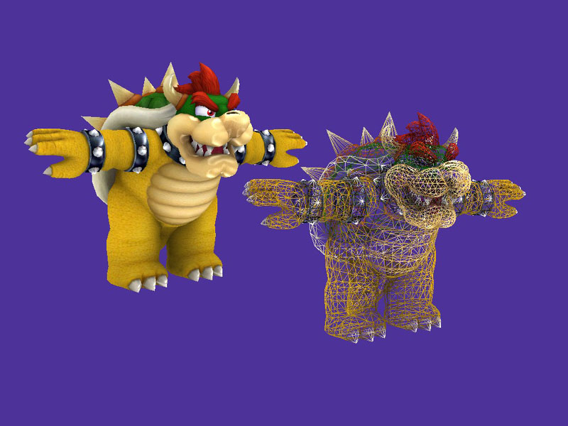
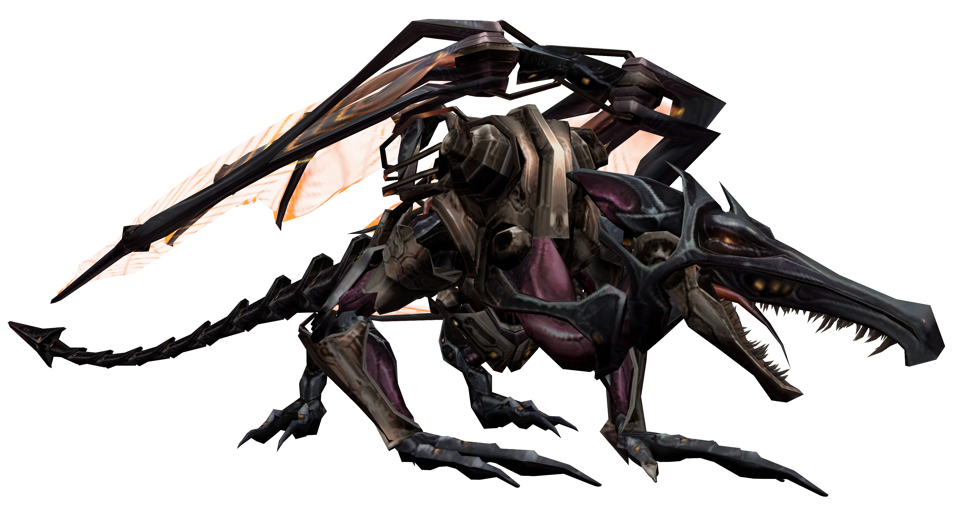
A good comparison to show how it wouldn't blend together is putting Bowser and Omega Ridley side to side. Bowser isn't build out of very many polygons by today's standards, where as Omega Ridley is one of the more complex models on the Wii:
Now that's a fight that'd look incredibly odd. And yes, I'm aware of the lightning in both images, but with these two examples the argument I'm trying to get across should be notable.
That's why Sakurai and his team goes out of their way to give Mario, Olimar, Dedede and Bowser these new details, to make them fit in with the higher detailed models of Samus and Snake. Models don't suddenly blend just because you're good at setting up light or fiddle around with shaders, it's a matter of clashing art styles. When you're putting tons of franchises together, it's important to make them blend well together, that's why Bowser looks much more beastly and grim in Smash Bros than he has ever done in the Mario games. Yes, it still looks odd when Lucas stands besides the Pokémon Trainer, and that's a result of clashing styles, but I'm glad that Sakurai isn't changing proportions in that matter.
I feel like I'm repeating myself now, so there you have it, it's a matter of clashing styles.


 because no other announcer has come even close to sounding as desperate (BOARD THE PLATFORMS), yet still having the best evil laugh.