
Bakemonky
Smash Apprentice
- Joined
- Mar 13, 2006
- Messages
- 179
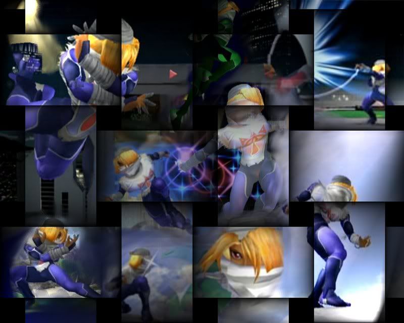
Go here to see the rest of my crap. Tell me what you think. I like nice things.
http://www.smashboards.com/showthread.php?t=86760
SHEIK
http://www.smashboards.com/showthread.php?t=86760
SHEIK