• Welcome to Smashboards, the world's largest Super Smash Brothers community! Over 250,000 Smash Bros. fans from around the world have come to discuss these great games in over 19 million posts!

    You are currently viewing our boards as a visitor. Click here to sign up right now and start on your path in the Smash community!

*Is new*

Onocron

Smash Rookie
Joined
Nov 3, 2008
Messages
5
Location
Utah, USA
New to smashboards, but I think I'm somewhat decent with Photoshop. I dunno, you tell me.

Also, working on some brawl character recolors.

High Resolution Screens are ideal for viewing these pieces, seeing as they appear too dark on other screens.


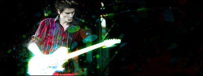


I am hopefully gonna start expanding into different styles. To see more of my previous work and etc, check it out here.
http://neoseeker.com/forums/69/t1148627-onocrons-digital-portfolio-graphics-request-header-banners/

I can be up for some requests, but again, you can't catch me that active on Smashboards. :urg:
 

Angof

Smash Rookie
Joined
Dec 10, 2008
Messages
13
Location
Florida
They are not bad by any accounts. However your style seems limited to (mostly) brushwork. Your two texts are the same style apparently and though they are not bad I would say go grab some free ones for future works if you havn't already.

Also all your boarders looks like one pixel black boarders. Nothing wrong with that, but try experimenting.

If you want to see some of my work and maybe pick up some tips from a few tuts I have, feel free to check out http://angofsgraphics.blogspot.com/

I don't update it much, but I was thinking of throwing up a few more tuts of newer techniques I have learned, so keep an eye on it.
 

Black Waltz

Smash Champion
Joined
Jan 27, 2007
Messages
2,243
Work on defining your focal more and reducing the amount of negative space you have.
 

Inyro Gatling

Smash Journeyman
Joined
Sep 1, 2008
Messages
229
Location
New York
Using default fonts is perfectly fine, don't feel like you need to use exotic font styles.

Your tags are decent, but put some more effort into your focals and colors. Before you call anything done or finished, put it aside for a few minutes and do something else - play a Brawl match, read a book, eat, whatever - and then look at the tag again. Make sure nothing feels wrong.
 

Onocron

Smash Rookie
Joined
Nov 3, 2008
Messages
5
Location
Utah, USA
Hmm, first useful advice I've received as of late. I'll try actually working on my freaking science project for once. :p

I might as well add this seeing as lots of people liked it:


IDK

Smash Lord
Joined
Mar 28, 2008
Messages
1,708
Location
Yo Couch
well, i like the font. i take it you just cut it from another pic? w/e the left of tink looks funky and doesnt fit with the rest of the sig. pretty good tho. you should try your stuff out in the critique topic.
 

Inyro Gatling

Smash Journeyman
Joined
Sep 1, 2008
Messages
229
Location
New York
The focal gets lost somewhat behind the overly-bright lighting. The splatters to the left of the focal could have also been a lot better, and the tag doesn't lend itself much to depth or flow.

Sometimes, the technical aspects of the tag can make or break the composition. Keep in mind the flow of the tag, the blending of the tag, and the depth in it. If the tag looks too flat, you're not going to get too many good reviews. Similarly, a lack of blending can make things seem too chaotic or out-of-place, which is a huge turn-off. Depth is what gives a tag its extra 'oomph,' and can make the viewer really feel the full effect of the tag.

Each aspect also plays off of - and consequently effects - the other aspects. A tag with great depth can make up for some minor problems with blending and composition, but if the tag is too flat, problems with blending may be more easily noticed than not. Keep that in mind.

=)
 
Top Bottom