• Welcome to Smashboards, the world's largest Super Smash Brothers community! Over 250,000 Smash Bros. fans from around the world have come to discuss these great games in over 19 million posts!

    You are currently viewing our boards as a visitor. Click here to sign up right now and start on your path in the Smash community!

Call to the artists of the Melee community - "What defines Melee's art style?"

Eisen

Smash Ace
Joined
Sep 17, 2009
Messages
662
Location
Planet Tallon IV
NNID
AndroidPolaris
Hey there, I'm Android (not Armada's brother), aka Eisen, and I don't hit the Melee forum up too much since I kinda missed my chance for that competitive scene, but I've had this question I've wanted to ask the community for awhile now and it's bothering me that I haven't yet, so... here goes.

"What defines Melee's art style?"

It's a question I've subconsciously tried to ask myself numerous times over the years but have failed to answer 100%. Not only do I have personal interest and time investment into the question, but as an artist I'd like to hear some outside opinions and potentially get a fresh way of thinking to help answer this question more fully. Aside from the personal interest, I'm also attempting to make a story/universe where the art style is influenced by Melee in subtle ways -- but I'm not sure in which ways to do them? This universe will blend not only Melee aesthetics, but elements from some of my biggest visual art inspirations like Metroid, Xenoblade, Mother, DBZ, Cave Story, Cowboy Bebop, Titanfal, F-Zero, Avatar (both the James Cameron movie and the show lmao), Chrono Trigger, Bravely Default/Final Fantasy, Fire Emblem, Homestuck, Star Trek, Halo, and a bunch of less significant sources I should probably stop bothering to list. u_u

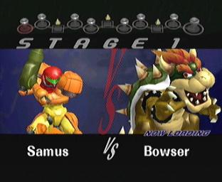
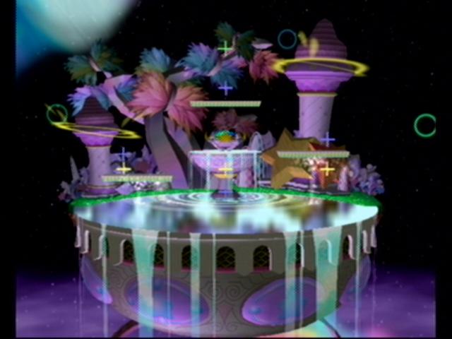
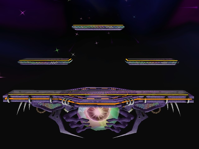
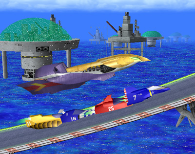
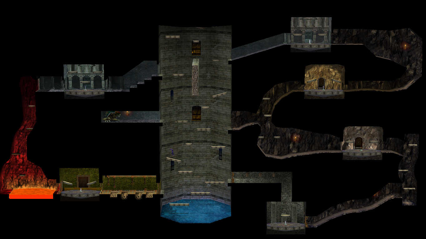
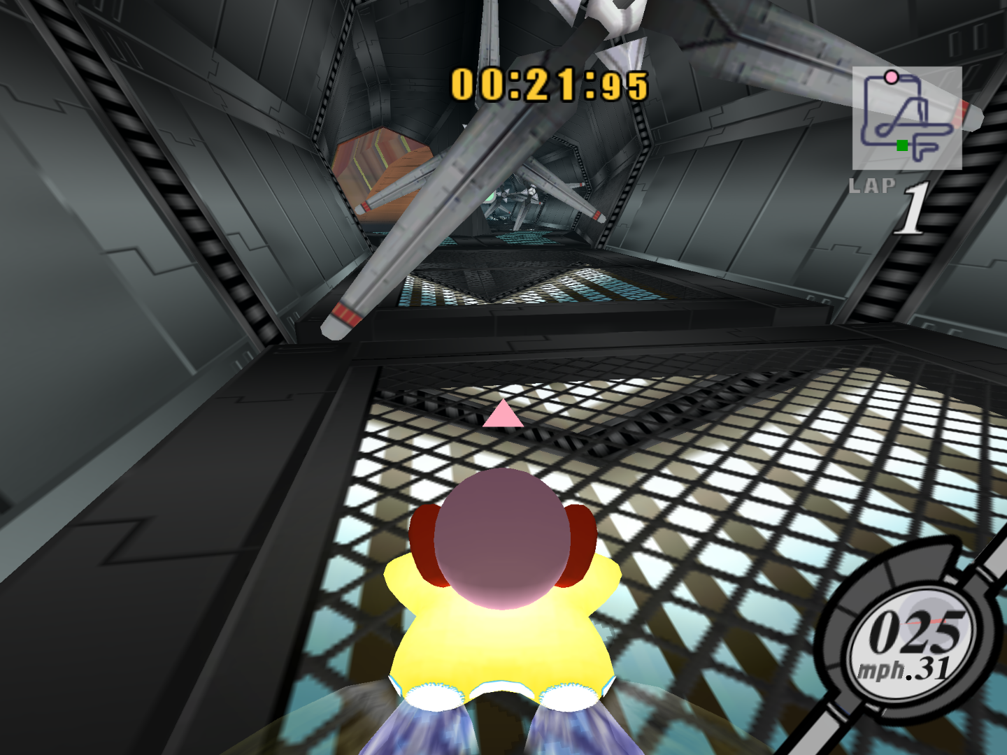
To me, I've always found something profound and unique about, well, just about everything in Melee. In particular, Adventure mode and its sub-levels, the menus, and the designs of some of the stages like battlefield have put me in awe. I've kind of been able to break some of that down and express some of those elements into a character, which I will list in a moment... but, there's a problem. As much as I've deconstructed the menus and the obviously quirky things about Melee -- the abstract geometrical patterns, faded objects and lines blending with cool nebulous backgrounds -- there's still something that sets Melee apart from most other games. At least, to me in my own head. It's some kind of cinematic aesthetic that I've only encounter in Melee itself and one other game: Kirby Air Ride. Let me show you what I mean:

Ah, yes, Temple... A level we're all familiar with from our dawning Melee days... but something is unique about this picture. What is it?

I can't really put my finger on it. Something unique about the lighting, the color choices... It's a very amazing, special blend of color and contrast. But... there's more than that, isn't there?


Here's a quick google image search for a temple. Similar construction, right? But... It doesn't immediately remind you of "Melee", does it? What's different? What has been tweaked to give Melee's interpretation a much more distinctive feel? This is the question I struggle to answer still, and the question that I challenge the Melee community, artist or not, to help me answer.

Melee is very near and dear to my heart, and I want to create something that will breathe its style into a new generation, maybe, because I fear that if I don't, it will go unrecognized for a long time.

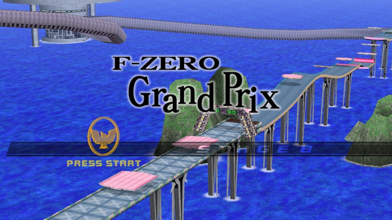
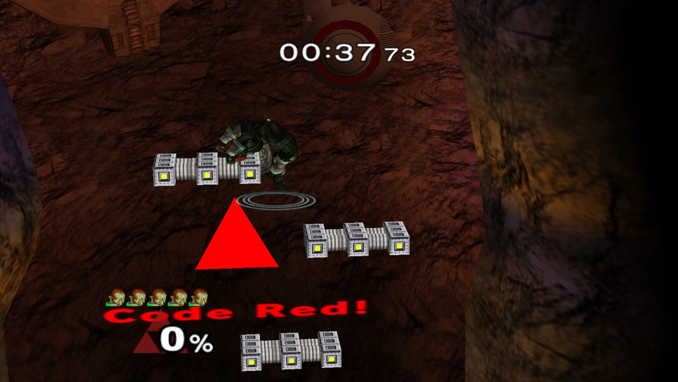
Anyway, here's some screens I feel are relevant to the "style" I want to represent, just to give you guys a reference. Anything you can point out will be helpful. Examine everything -- it's not just the characters and stages I'm worried about, but backgrounds, menus, text, HUDs, everything. Help me define what makes Melee "Melee".


I found an in-development small-dev game with a similar aesthetic here! Source


Also, I have to wonder if anyone else has attempted anything like this? Please, fellow artists, do chime in if this even remotely interests you! Have you seen styles like this elsewhere? Even if you're not an artist and just wanna say, "hey, I know what you mean! I feel that, too!" Please share if any of this applies to you, and thanks for any constructive feedback. If this thread picks up any, I might use this as a compilation/masterpost of inspiration for other artists.
 

JuicePouch

Smash Cadet
Joined
Jan 19, 2014
Messages
33
Location
Your pantry
NNID
JuicePouch
Hi, I'm the artist of the smashbros posters: https://www.facebook.com/media/set/?set=a.1559340700951958.1073741828.1559325167620178&type=3

When drawing, I always try and mold my style to what fits the character's tone and personality. What I've found when drawing the smash bros characters was that I began to subconsciously draw for functionality -- communicating who the character is with little to no "artsy" interpretation -- rather than for visual aesthetic. Of course Melee looks generally visually appealing, but there's a tendency for the in-game graphics to be about functionality versus looking good. Conversely though, functionality DOES look good, as far as gaming graphics go, and that's why I feel Melee is a still a beautiful game graphics wise, because it still stands to this day as the most cohesive and easy to visually learn game opposed to Brawl or Smash4 -- which have a much more substantial emphasis on graphics.

There's a lot more to explain about this, but that's the general trend I see. Besides the average polygon count and other quantitative means of defining Melee, I think the whole idea of the visuals was to support a good game, not to be a stand-alone feature of individual praise.
 

schmooblidon

Smash Journeyman
Joined
Feb 18, 2014
Messages
496
I've always felt that certain aspects and environments of Melee, particularly Battlefield and FD, have such a hard to describe vibe to them. It's sort of like an eery dreamscape, especially when coupled with the music. I would go as far as calling it metaphysical art in some cases too. Perhaps I feel this way because I play this game so much, that it invades my own dreams, but Super Metroid also gives off a similar vibe.

In terms of Melee's textures and models in general, JuicePouch makes the most convincing arguement I've heard. It definitely looks basic but not too plain to be displeasing.
 
Joined
Feb 3, 2008
Messages
858
Location
PWN
the game uses black to shade
lol

Basically this.

I like your post... I think the above comment really covers most of it though. However, the gamecube did have a tendency to render/create games the same way, so I'll go over some examples of those. Melee is really "crisp." The polygons can be seen in full and their relative depth is hyper-clear because of their contrasting dark shading and more reflective surfaces, compared to the general flat-ness of the environment/atmosphere. Additionally, Melee distinctly highlights its borders and outlines with bright colors and transparent/reflective surfaces next to dark matte textures. This is most clearly seen in stages like Battlefield or Fountain of Dreams.


Mario's dimensions are clearly seen. The floor is non-reflective, with a bright yellow on black border. In the upper corner, a more reflective part of the stage is seen.


Stadium's floor is a flat texture. The edges of the platforms and outer areas of the arena at least appear to be reflecting light. The percents and icons are flat, unimportant and unobtrusive to the battle behind them.


The player buttons are clearly reflective here, helpfully indicating their interact-ability, also helping to signal where they are across a surface of mostly similar colors.


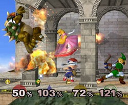
Shaded+lit/reflective Mario against flat background, transparent heart containers with reflective borders. Mario is really distinct from the background, like every stage the melee characters find themselves in.

These are just my thoughts, mainly: Idk if all this is true, I'm certainly no 3d artist or designer in that way, but this is what is conveyed to me through these choices and 'materials'.

I think the game that most similarly-represents Melee's art style (aside from your Kirby game you posted) is F-Zero GX (2003), a very dark game with very bright reflections (and glow).


This next shot reminds me of the Prime games actually.


Creating a brief context here, the GC-generation games were created pre-bloom&desat era (see: gears of war). Take a look at a game like Eternal Darkness (2002).


There's no real glow or anything bright in the game, the atmosphere is created through light reflections off flat or shiny surfaces, giving a detailed atmosphere whose depth can immediately be grasped.


Even Super Monkey Ball (launch title) seemingly uses transparent+reflection effects to create its sense of 'brightness' and lightheartedness throughout the game.


Compare that to the Wii game now and it's like everything is its own source of lighting.


This is too bright.

One problem I thought Metroid Prime (2002) heavily suffered from was this lack of shading in its backgrounds and environment.


Do those rocks in the background really convey a dark subterraneous cavern where the eponymous beast of the game lurks? No, they're way too bright, like everything else in that damn game. (Prime 2 rectifies some of this by adding more reflections to Samus' suit, most notably by reflecting the environment's lighting on her armcannon. Still lame but w/e.)

Anyway. Melee's style is suitable. Far more clear than Brawl or P:M. I get lost in the low contrast of P:M's character/environment borders.


Yuck. That stage is a mess anyway though, but I think Poke Stadium 2 befalls the same problem.
 
Last edited:

Massive

Smash Champion
Joined
Aug 11, 2006
Messages
2,833
Location
Kansas City, MO
I am both a developer and an artist, so I may have a unique perspective on this.

Melee uses high polygon models with antialiasing but generally uses low resolution textures.
There are very few shaders (bumpmaps on a few stages and the reflective floor on FoD) and almost no specular lighting.

All characters appear to be universally lit (very basic gourand/vertex shading instead of dynamic lighting) and appear very colorful and visible because of that.

Also keep in mind that this game was meant to be a graphics demo as much as it was to be a flagship title, so there's a hodgepodge of tech effects in there (almost no other games used the reflection shader on FoD, or the bumpmapping on FD's middle floor).

From an artistic standpoint, notice how every character is portrayed with rounded edges with rare exception. I believe this to be a stylistic choice, aiming to show a stark contrast between the graphics of the gamecube and the angular, restrictive graphics of the nintendo 64.

The character art style itself is indicative of late 90s but still pre-modern anime phase (think cowboy bebop for more "serious" characters and pokemon for less serious/child/pokemon characters).

General stage design and modelling seems to be at least partially lifted from another one of Sakurai's games, Kirby All Stars (more specifically Milky Way Wishes), something you will see heavy influence from again later in brawl (especially boss fights). Many sound effects and general items are also taken from Kirby All Stars. It is easy to see that both games are very clearly Sakurai's creations.
 
Last edited:
Joined
Feb 3, 2008
Messages
858
Location
PWN
All characters appear to be universally lit (very basic gourand/vertex shading instead of dynamic lighting) and appear very colorful and visible because of that.
Nice, you know some cool stuff.

Yeah, I couldn't remember whether the lighting was dynamic or not. I knew when you look at trophies there is, but from the normal gameplay I couldn't tell/remember heh.
 

Eisen

Smash Ace
Joined
Sep 17, 2009
Messages
662
Location
Planet Tallon IV
NNID
AndroidPolaris
I am both a developer and an artist, so I may have a unique perspective on this.

Melee uses high polygon models with antialiasing but generally uses low resolution textures.
There are very few shaders (bumpmaps on a few stages and the reflective floor on FoD) and almost no specular lighting.

All characters appear to be universally lit (very basic gourand/vertex shading instead of dynamic lighting) and appear very colorful and visible because of that.

Also keep in mind that this game was meant to be a graphics demo as much as it was to be a flagship title, so there's a hodgepodge of tech effects in there (almost no other games used the reflection shader on FoD, or the bumpmapping on FD's middle floor).

From an artistic standpoint, notice how every character is portrayed with rounded edges with rare exception. I believe this to be a stylistic choice, aiming to show a stark contrast between the graphics of the gamecube and the angular, restrictive graphics of the nintendo 64.
Thank you all for the replies, especially these long and detailed ones. I'm going to try to look some of these terms up for myself, but in case they're called something else (idk) and just for clarity from a perspective I'm familiar with/Melee examples, do you mind explaining shaders, bumpmaps, specular lighting, gourand/vertex shading and dynamic lighting and how it all works in the game/Melee examples?

Also that post on Metroid Prime made me sad, haha. It's always been a near-and-dear title to me because of the atmosphere it provides, and I feel like for 2002 and for as large and ambitious as a world as it was, it had really amazing graphics. If I remember correctly, Gamecube ISOs must be under 1 GB, and to me it's nuts that that whole game fits in that, personally. I dunno, I never found the game's lack of contrast too jarring and really appreciated it graphically--I felt really immersed. But, perhaps from an objective standpoint it's bad, which is both interesting and saddening. I guess it's further proof of how graphics can turn out to be not so influential in favorite game choices of a person? Aha, small ramble over because I don't think anyone gives a crap anyway. :p
 
Last edited:

SpiderMad

Smash Master
Joined
May 6, 2012
Messages
4,968
I could read hours of this stuff, but I'm clueless on a lot of artistic design word's meanings
 
Last edited:

Eisen

Smash Ace
Joined
Sep 17, 2009
Messages
662
Location
Planet Tallon IV
NNID
AndroidPolaris
Thought I'd at least provide you guys with some progress as to where this is going. This is one of the many "aesthetics tests" I've done. This one of course tries to recreate the Melee look pretty hard, using the black-to-shade rule quite literally? Perhaps it's too much? But I'm realizing that I may actually want to use a legit program to do art this seriously. Most of the time I doodle on this online app whose canvas is no bigger than the image here and only has 3 layers and a few select tools.

This here is our protagonist, a young android on a world quite unlike ours, of royal bloodlines and dealing with his princely responsibilities. I made a crappy mockup sketch, then sorta played with giving the face more crisp black lines on the layers above. He doesn't normally look this serious, but I felt it might add to the "Melee effect" others were describing. Here are two completely different backgrounds, which are two themes I intend to push pretty damn hard; nature/reality/non-sentience and abstraction/dreams/technology/consciousness. In a little while (maybe right after this post), I think I'll add his clothes. Wanted to see how using the black on his "flesh" might work.

Also, since this is Melee inspired, I wouldn't mind sharing more information on my ideas for this story if anyone's legitimately interested? At least, if it's not too off topic in peoples' opinions.

And while I feel like I shouldn't have to say this, all original content belongs to me and whatnot. Donut steel (for real though, been rolling with this idea for months now ;_; )

Edit: Version 2.0
 
Last edited:

Massive

Smash Champion
Joined
Aug 11, 2006
Messages
2,833
Location
Kansas City, MO
Thank you all for the replies, especially these long and detailed ones. I'm going to try to look some of these terms up for myself, but in case they're called something else (idk) and just for clarity from a perspective I'm familiar with/Melee examples, do you mind explaining shaders, bumpmaps, specular lighting, gourand/vertex shading and dynamic lighting and how it all works in the game/Melee examples?
Shaders: For video games a shader is something that transforms the rendered scene/object in some way. The gamecube was mostly able to use vertex shaders, which apply a transformation/effect to every vertex in a rendered scene. The main game I can think of that used shaders for the gamecube was Star Fox adventures, which, despite being a terrible game, did have some impressive graphics. Close up scenes of Fox would render a fur shell shader around the character, making him look furry.
Metroid prime did use some shaders for some glow effects, but they were done very sparingly as they were resource intensive.

Bump maps: Bump maps are a texture that reacts to lighting. They are 2D images that have points that will react to light as if they were 3D objects. The bumpy floor on FD is an example of this, but it is very hard to see if you're not in dolphin. The lighting is very subtle, but interesting.

Specular Lighting: You know that shiny part of an apple that people always draw? Or maybe that little white mark that cartoonists draw in someone's eye? That's specular lighting. Melee basically does not have these effects. The ones you see on character's eyes are actually textures, and very static at that.

Vertex Shading: Vertex shading describes how light hitting a 3D object is rendered. With vertex shading, the only parts of an object that can receive and react to light are the points that make up the triangles in the object. Say you have a long, flat surface made up of 2 triangles. The vertices that can make part of it brighter from being struck by light are all on the corners, so if light hits them in the middle they won't light up. People solve this using higher polygon models so more pixels would get hit by the same light (and it's still used in videogames to this day, just with slightly better algorithms), but it's really noticeable on lower polygon games like melee.

Dynamic Lighting: Dynamic lights are moving lights, and that means that each time they move, the scene's shading and lighting changes. Melee uses no dynamic lighting at all. All lights are static (fixed) in their locations. This makes it much easier for the cpu to render the scene because it doesn't need to recalculate the position of the light every frame. You can actually kind of guess where the light sources are by looking at your character shadow. It is a basic stenciled outline of your character and will give a hint as to the angle the light source is at.

Also that post on Metroid Prime made me sad, haha.
I disagree with that dude and definitely take that critique as opinion, not any sort of assumed fact. Metroid prime is absolutely fantastic, probably the second best game on the gamecube, IMO. The art direction and level design alone are insanely awesome, and it pushed the uppermost limits of what it's (very new) engine could do. It's texture quality and polycounts were higher than almost any other console game released at the same time (for any system), and the framerate almost never drops below 60. That game is a gigantic achievement both technically and artistically, and anybody who says otherwise is blowing smoke.
 
Last edited:

anikom15

Smash Apprentice
Joined
Jun 16, 2014
Messages
180
Location
Southern California
Most of the hit animations have manga-esque 'splashes' which is common in Japanese games, including games with very realistic graphics.

Thin lines and metallic effects are everywhere.

The art style reminds me of realistic-styled animes like MSG, but with a brighter palette.

Brawl is essentially the same, but darker. Almost every stage in Melee looks like it is washed in studio lights. The lighting was probably kept conservative to insure a stable framerate.

As an aside, Melee was considered to have incredible graphics when released. Better than anything on PS2 at the time. Blew me away.
 
Last edited:
Joined
Feb 3, 2008
Messages
858
Location
PWN
Also that post on Metroid Prime made me sad, haha. It's always been a near-and-dear title to me because of the atmosphere it provides, and I feel like for 2002 and for as large and ambitious as a world as it was, it had really amazing graphics. If I remember correctly, Gamecube ISOs must be under 1 GB, and to me it's nuts that that whole game fits in that, personally. I dunno, I never found the game's lack of contrast too jarring and really appreciated it graphically--I felt really immersed. But, perhaps from an objective standpoint it's bad, which is both interesting and saddening. I guess it's further proof of how graphics can turn out to be not so influential in favorite game choices of a person? Aha, small ramble over because I don't think anyone gives a crap anyway. :p
You may be surprised at the high regard I hold for MP's graphics. Almost everything is individually modeled.

As for size, Gamecube discs were essentially mini-DVDs that could hold slightly more, up to 1.5 GB.
Remember that games render as they go, so while a level may be massive, the actual physical design of that level may be very small because you're only storing its geometry and other properties, while the textures (or even sounds) may take up the larger part of the data in a game. Physics and lighting and can be calculated by a pre-set library or engine of rules that each level or scene will call upon. In general, for any rendered scene, you're going to have the lighting (what is the shape/source/type), the textures, which will indicate how the lighting interacts with them, the geometry of the physical terrain or layout, and then the underlying physics which govern how those objects play out. (This is a summary. I'm sure Massive can give you a more accurate or detailed response. Also, I believe you'd create a scene in the reverse order I gave here, more or less.)

I disagree with that dude and definitely take that critique as opinion, not any sort of assumed fact. Metroid prime is absolutely fantastic, probably the second best game on the gamecube, IMO. The art direction and level design alone are insanely awesome, and it pushed the uppermost limits of what it's (very new) engine could do. It's texture quality and polycounts were higher than almost any other console game released at the same time (for any system), and the framerate almost never drops below 60. That game is a gigantic achievement both technically and artistically, and anybody who says otherwise is blowing smoke.
Let me quote what I wrote.

One problem I thought Metroid Prime (2002) heavily suffered from was this lack of shading in its backgrounds and environment.

[pic]

Do those rocks in the background really convey a dark subterraneous cavern where the eponymous beast of the game lurks? No, they're way too bright, like everything else in that damn game. . . .
Do you disagree with this? Do you really think Metroid Prime's backgrounds maintain the depth and accuracy of atmosphere that the game makes you believe is there?

I'm telling you, there are so many rooms in the game where I would think "Wow, this room is awesome, the sights are spectacular, and I get a really giddy feeling thinking about where I am and what lies around the corner."

But the problem I have with Metroid Prime is not about its details but about what it does with those details.

Look at this picture.


I know exactly where in the game this is, but it's not just because no two rooms are alike or any other visual cue, it's because the sense of where you are when you enter this room is given away by how small this room is, how big the room outside it is, the feeling of discovery given by the way the light leaks in from the ceiling and seems to filter through leaves on branches and light up sections of the ruins you're discovering, the pull toward investigating a small side entrance to the right of a dying tree demanding attention as the centerpiece of the room, or the overall tone from the absent, inviting, 'sequented' passages and the lack of any direction at all in this particular point of the game, which encourages you to discover that room.

But there's nothing in the room. When you actually open that door, and find yourself inside a cramped, pocket of a room with a single, uniquely-integrated save station? It's all visual. There's nothing actually inside that room. So what, you gave me a save point? That's what you gave me, was a convenient stopping point? Why stop when I just started? I would have rather had that room be completely empty, I would have left with something, if even disappointment.

And so describes my experience with the fullness of the game. Where I walked into a room expecting something tangibly-moving, as in the fear-inducing blackness of an actually-dark room, I received a tangibly-empty room that only alluded to what should be there. Some secrets satisfied their semblances. But time, and time again, I was disappointed with this monstrosity that is a visually-empty masterpiece.

Play this game if you wish to dream. Play this game if you wish to believe it holds secrets, to imagine the thumping of catharsis banging behind each door. But you will find that catharsis left long ago, making sweet its homes in the crevices of Super Metroid and the Castlevanias.


Empty promises.


At least here they gave you a tree to play with.


One of the more memorable areas in the game.


This is probably the coolest shot in the game, because it's actually creepy.


My two favorite rooms in the game, which are as fun and as vapid as stepping into a children's ball pit.


Not all designs are bad. (MP2)


the adjective sequential reasonably infers that an 'objective' or reason for that sequence to exist is a known objective, such as a game telling you what that objective is or that that certain sequence must take place before or after an objective is attained - this is usually known at a macro level - thus, a path sequentially leads up to or consequently from an objective; sequenced infers that a certain series of events is known to be connected, but without necessarily knowing why that sequence exists, usually assumed on a micro level - thus, a sequence is believed to exist but it can't be proven why, yet, because that sequence could be caused by something or it could lead up to something; sequented deduces that a sequence exists but only because no other sequence can be assumed and no reason for a sequence to exist is known. basically, I could wander around the beginning of MP all day but I'll get nowhere until I get the missile launcher first, which I didn't even know existed yet, so I deduce that that path (which is the only path) is part of a sequence - but during this brief while, I have no additional presuppositions regarding the game's purpose or my own purpose within the game at the moment - this is usually understood from a 3rd-person view, the designer, or 4th-person if the player can understand the game's design well enough to understand the game's presuppositions about itself. the key difference is that the first two presume to have a reason based off evidence, which encourages progression, while the latter forces the player to adopt the presumption that there is a "reason" for this sequence, out of necessity (which, in these cases, comes from a basic pattern-recognition and problem-solving tendency), which encourages exploration.

You're right, though. Its polycounts were higher and were consistently denser than any other console or pc game released during that generation (its levels have unparalleled density, I'm pretty sure). It was commonly tied for best Gamecube game with Resident Evil 4 at around a 9.8/10 or so rating average, and is rated top 3 alongside Super Mario Galaxy 1 & 2 for Nintendo's best games of the last two generations of consoles.

The game is unsatisfying because it fails to exist. Yet there are very good pieces to it.
 

Eisen

Smash Ace
Joined
Sep 17, 2009
Messages
662
Location
Planet Tallon IV
NNID
AndroidPolaris
I don't know what game you're playing, but it certainly isn't the Metroid Prime that I know.

Yes, there are empty rooms in the game, but considering that the game is pretty huge... it's not saying much. The save points were purely there for functional purposes. I don't think it hindered any development of new enemies or interesting new puzzles or room layouts. The save points were meant to be a place of zen and peace; in most of them (or all, I'm not sure) the music cuts out or fades to a much smoother ambiance. The save points served as a place for the player to escape all the enemies that wanted to kill them or silence the bellowed horrific roars of the monsters.

Yes, I do wish there had been more content for Metroid Prime, but then, I could spend years playing a game like that and getting lost in its lush environments, and the Gamecube had its limits. Part of what made the atmosphere of the game wasn't about how difficult the enemies were or how many there were per se, but rather how unique and interesting they were compared to how long they took to take down.

On top of that, the atmosphere is heavily outlined by the player's perception of the enemies and the environment. This is especially evident if, like me, one bothered to make use of the scan visor and read the log descriptions of the flora, fauna, lore and phenomena that were abundant in the game. Part of the joy of playing through Prime was exploring a planet that was being torn between life and death, abandonment and civilization both dead and new. Reading about the interaction of a plant lifeform with an animal lifeform in an environment, reading about the history of the dying Tallon IV, disocvering and piecing together the puzzle of just what the space pirates were up to on the planet... You could see it happening, too. It was like being brought to a new world and having a native tell you all about how it works. Prime does not need tons of stimulation to be thrown in the players' face for that person to feel like they're somewhere real, somewhere alive.

Some of the environments were natural, some of them were artificial. There was a nice mix of the two in this game in particular, and partially why I like Prime 2 and 3 less. It feels like a dominant majority of rooms in the latter two games are on average more barren in terms of plant/animal life or/and are chock full of just seemingly random structures and lore that get almost no elaboration compared to the first game. Point is that there's something unique about Prime 1 that I yearn to see more of in the future.

All in all, I guess what I'm trying to convey is that Prime is unlike other games in its spread of enemies and its story/level design. It's not like Majora's Mask where just about everywhere you go has an enemy trying to kill you. Which, don't get me wrong, I love Majora's Mask, but I'm more partial to games that let you explore the world a little bit too, which Majora's Mask didn't do as well as Prime did. Granted, Prime is one of the best games at doing this and Majora's Mask is still an amazing game, but the two games are just... different from each other.
 
Last edited:

Bismo Funyuns

Smash Apprentice
Joined
Jan 5, 2015
Messages
138
Location
Uranus
I don't know what game you're playing, but it certainly isn't the Metroid Prime that I know.

Yes, there are empty rooms in the game, but considering that the game is pretty huge... it's not saying much. The save points were purely there for functional purposes. I don't think it hindered any development of new enemies or interesting new puzzles or room layouts. The save points were meant to be a place of zen and peace; in most of them (or all, I'm not sure) the music cuts out or fades to a much smoother ambiance. The save points served as a place for the player to escape all the enemies that wanted to kill them or silence the bellowed horrific roars of the monsters.

Yes, I do wish there had been more content for Metroid Prime, but then, I could spend years playing a game like that and getting lost in its lush environments, and the Gamecube had its limits. Part of what made the atmosphere of the game wasn't about how difficult the enemies were or how many there were per se, but rather how unique and interesting they were compared to how long they took to take down.

On top of that, the atmosphere is heavily outlined by the player's perception of the enemies and the environment. This is especially evident if, like me, one bothered to make use of the scan visor and read the log descriptions of the flora, fauna, lore and phenomena that were abundant in the game. Part of the joy of playing through Prime was exploring a planet that was being torn between life and death, abandonment and civilization both dead and new. Reading about the interaction of a plant lifeform with an animal lifeform in an environment, reading about the history of the dying Tallon IV, disocvering and piecing together the puzzle of just what the space pirates were up to on the planet... You could see it happening, too. It was like being brought to a new world and having a native tell you all about how it works. Prime does not need tons of stimulation to be thrown in the players' face for that person to feel like they're somewhere real, somewhere alive.

Some of the environments were natural, some of them were artificial. There was a nice mix of the two in this game in particular, and partially why I like Prime 2 and 3 less. It feels like a dominant majority of rooms in the latter two games are on average more barren in terms of plant/animal life or/and are chock full of just seemingly random structures and lore that get almost no elaboration compared to the first game. Point is that there's something unique about Prime 1 that I yearn to see more of in the future.

All in all, I guess what I'm trying to convey is that Prime is unlike other games in its spread of enemies and its story/level design. It's not like Majora's Mask where just about everywhere you go has an enemy trying to kill you. Which, don't get me wrong, I love Majora's Mask, but I'm more partial to games that let you explore the world a little bit too, which Majora's Mask didn't do as well as Prime did. Granted, Prime is one of the best games at doing this and Majora's Mask is still an amazing game, but the two games are just... different from each other.
Metroid Prime is good end of story.
 

Massive

Smash Champion
Joined
Aug 11, 2006
Messages
2,833
Location
Kansas City, MO
The game is unsatisfying because it fails to exist. Yet there are very good pieces to it.
No sugarcoating, this is pretentious as hell.

Your critiques of Metroid Prime's non-linear and non-sequential design could easily be applied to Super Metroid as well. How many save rooms have no function for anything other than saving? How many graphical effects are there just for the purpose of a graphical effect (scanner eye, lol)? How many wasted possibilities are there strewn through the game?

If you like the metroidvania genre more than prime's FPS/Adventure stylings, that's fine and totally your prerogative, but from the perspective of someone who appreciates both types of games, you will be splitting hairs (as you appear to be) to find anything wrong with Metroid Prime.
 
Last edited:

DerpyDayha

Smash Cadet
Joined
Jan 11, 2015
Messages
59
Location
Edmonton, AB
I'm by no means an artist, but what I see in the art style of melee isn't shading or any other specific things. As someone who doesn't understand that so much, I basically see an overall idea of the art. I think what I see that's different in it, take away the sounds, music, everything, the art itself looks somewhat distant. Like what we see is really an outside view of the picture.

I don't know if that's helpful at all, but I thought I'd share my opinion.
 
Top Bottom