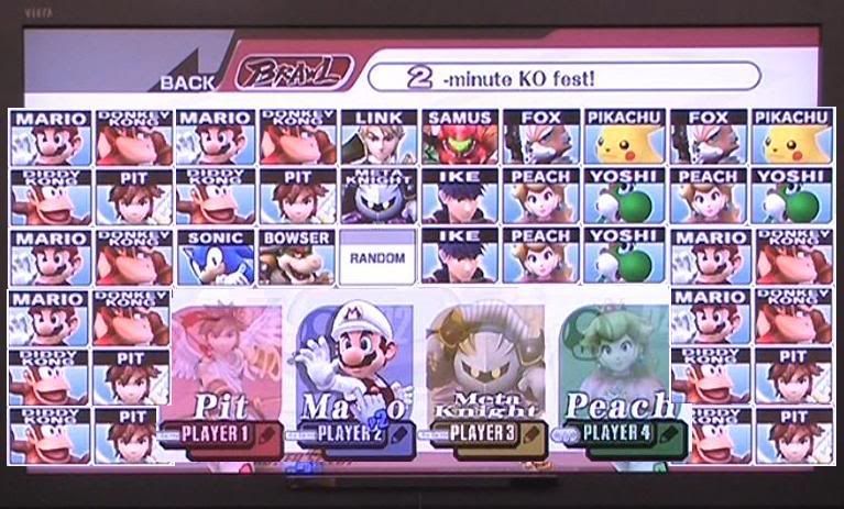
But if they were just making images for a demo, why so much white space? It's not aesthetically pleasing, and it's needlessly harder to position the token on the character you want if the icon is smaller. Far better, if they were just making a screen on which to run a demo, to fill up all the screen space with the characters Sora approved for the demo.
But they didn't, which makes me think they are using the native image sizes for the character icons. And why not? If they were to blow up the images on the existing version of the game, they would be blurry and pixelated. If they wanted to reduce that effect, it would come down to going back to the original images and remaking an icon. Melee's icon sizes didn't change as you unlocked characters; neither did 64's. I understand it's just a demo, but if they didn't already have the character select screen working and finalized, i.e., if this were just a beta character select screen, they would have used bigger placeholder images.
42. I stand with Super Smash Master.