• Welcome to Smashboards, the world's largest Super Smash Brothers community! Over 250,000 Smash Bros. fans from around the world have come to discuss these great games in over 19 million posts!

    You are currently viewing our boards as a visitor. Click here to sign up right now and start on your path in the Smash community!

The Sig Critique Topic

Status
Not open for further replies.

Diddyknight

Smash Lord
Joined
May 9, 2008
Messages
1,134
Location
Socal -> FL
@Twist: Stop posting every Sig/Banner you do. Look up tutorials and take a few days to learn new things and put it into one. Your trying to rush your progress...
anyway.....
[Link Image] What happened to his other eye? Bad blending....
[Afros 1-3] Bad render choice =\
 

Yink

The Robo-PSIentist
Joined
Oct 6, 2009
Messages
7,419
Location
Osaka, Japan
NNID
SSBYink
@Twist: The Link one would be a whole lot better if you got rid of that line from his SHIELD and near the text. Actually this isn't that bad of a sig, especially since you seem to have improved from last time

The last three though are just WAY too dark, and the image just doesn't fit well with the sig. There's a bit too much empty space on them as well (not like you HAVE to completely fill a sig and I hate when people press that).

Look for renders with good flow, angles, etc. There's plenty of tutorials that will help point those out :) Just keep trying.

I encourage you to do what you're doing, by making many MANY copies of your sig. My Taki sig I posted on the last page had 5 versions until I got the one I wanted. Posting your versions is a great way to find the one that looks best. >_>
 

Dr_Twist

Smash Lord
Joined
Oct 6, 2006
Messages
1,110
Location
Iowa-gimme some brawl challengers yo!
meh a bit bland and looks poorly put together

i know..i know "Dont post every sig you do" and im sure im not supposed to redo sigs over and over but i like the afro sig too much (mainly the effects around him) call me stupid and say i shouldnt do it but ill do it anyway

just tryed to revise a little


XIF

Smash Master
Joined
Nov 30, 2003
Messages
4,711
Location
ZOMG Duluth, GA mostly... sometimes Weston, FL
love the insightful critiques

-XIF: its funny lol but bad interms of a sig, like the guy being transparent doesnt work but im not sure how to critique it accuratly so ill leave it at that.
Actually the picture came like that with the double image I added inAkuma in MS paint and edited out all the extraneous parts of Akuma pixel by pixel.

Get at me.
 

Dr_Twist

Smash Lord
Joined
Oct 6, 2006
Messages
1,110
Location
Iowa-gimme some brawl challengers yo!
just the it seems like two colors slapped on there then smudged and blurred, lacks detail and any direction of flow.

srry Xif- its nice tho if you couldve made it so i looked like he was inside the studio itd be awesome
 

Inyro Gatling

Smash Journeyman
Joined
Sep 1, 2008
Messages
229
Location
New York
The direction of flow is outward from the center (an explosion flow like I use in most of my tags, including the one in my sig space above). And yes, it's smudged. That's the composition, an abstract smudge. I don't see how that makes it poorly put together.
 

NekoNekoXD

Smash Cadet
Joined
Jan 18, 2009
Messages
29
lol gatling i think with your sig its way to bright away from the focal point. Also the gray lighten effect looks a bit awkward and over saturates the render. The effects are nice but they look way to solid and take away from the flow. Also the color scheme you went for is good but over all gets messed up by the gray lighten and lack of focal.

Anyways its a good tag its just missing some key elements.

Keep it up
 

superscience890

Smash Cadet
Joined
Sep 9, 2005
Messages
32
:D
I haven't made a sig in a year >_> but randomly decided to make one :D
Feedback would be appreciated


As for critiquing
@Diddyknight
Well first things first lets get the text out of the way. The font of the text doesn't match the sig well. I would think that font would work better in certain vector sigs. Anyways, I must say I like some of the effects that you do, but it seems a little random. One other gripe is how on the very right, it turns black which to me seems a little awkward. Also, on the bottom left of the sig, its a little to bright and it begins to be hard to notice the render's hand
It's a nice sig, but has a little bit of weirdness in it.
btw, random question, but where is the render from?
 

Inyro Gatling

Smash Journeyman
Joined
Sep 1, 2008
Messages
229
Location
New York
ss890: Your flow is nice, but work on your effects and colors. The stars/sparkles/dots are too sharp, and the c4ds are too obviously c4ds. Current stylistic opinion dictates that c4ds should not look like c4ds unless the focal of the tag is a c4d. Kinda messed up, but meh.

Anyway, on top of that, work on your colors some. I think this tag would look awesome with a bit of a washout in the blacks, and some more pastel colors.


Shameless LP Crops:
Smudge the Apocalypse:

LP: http://fc03.deviantart.net/fs71/f/2010/030/a/5/No_More_Tomorrow_by_Inyro_Gatling.png

Smudge Canyon:

LP: http://fc09.deviantart.net/fs70/f/2010/029/9/3/Smudge_Canyon_by_Inyro_Gatling.png
 

superscience890

Smash Cadet
Joined
Sep 9, 2005
Messages
32
@Inryo
Ahaa thanks for the cnc ^^ i'll take that into account but ya I was worried that the background was too plain =__=
But I was wondering, what do you recommend if I try to disguise (i guess you could say) the C4Ds?

As for the smudging works that you have done, their quite interesting :D For the first LP, I like how you did the depth with blurrinesses and such, but the one thing that bothers me is that there's only fire. The landscape itself doesn't really have any depth or texture so it seems a little empty. and IMO the clouds are a little too blurry, but honestly, they're fine the way they are.

As for the second LP it seems really peaceful to me ^^ To be perfectly honest I wouldn't be able to tell its a canyon >_> but still, it's interesting :D The textures that you used for this make it quite interesting btw just to make sure, the smudged white circles are a flare yes? but anyways, overall its quite nice ^^ like it alot :D
 

Inyro Gatling

Smash Journeyman
Joined
Sep 1, 2008
Messages
229
Location
New York
Well, the first thing that comes to mind for disguising c4ds is: http://forums2.battleon.com/f/tm.asp?m=17250974

And thanks for the comments. Yeah, the terrain in the first one got lost in all the burns, blurs, and contrast... At some point there had been some slight texture on it lol. As for the second one, yes, the circles are supposed to be flares, I don't really like how they came out though...
 

superscience890

Smash Cadet
Joined
Sep 9, 2005
Messages
32
Ahaa interesting :D

The flare in the end was as little to blurry imo plus its a little weird that their all the same color and theres no variation between the circles

Well after taking your advice I decided to make an edit... though I'm not too sure if it's too crowded now >_>


Btw, never knew smudging and liquify was so fun... will use more often in the future :D
 

XIF

Smash Master
Joined
Nov 30, 2003
Messages
4,711
Location
ZOMG Duluth, GA mostly... sometimes Weston, FL
Ahaa interesting :D

The flare in the end was as little to blurry imo plus its a little weird that their all the same color and theres no variation between the circles

Well after taking your advice I decided to make an edit... though I'm not too sure if it's too crowded now >_>


Btw, never knew smudging and liquify was so fun... will use more often in the future :D
As Bang is probably my favorite fighting game character of all time, I think I speak from the heart when I ask you to have my children.
 

Inyro Gatling

Smash Journeyman
Joined
Sep 1, 2008
Messages
229
Location
New York
ss: The new version is pretty great, but I feel like it's in limbo between being just right and being chaotic. I'd say burn the background (and maybe add in some orange, right now it's very blue...) and get rid of the text. Both of those are distracting from the focal.

Other than that, the tag is pretty awesome.

This is a tag I scrapped a long time ago (okay, like two weeks ago), but I might as well post it to see exactly where I went wrong.
 

Neon Ness

Designated Procrastinator
Joined
Jul 10, 2008
Messages
3,631
@ Inyro: I think you had a good idea, but yeah something went... awry. The lighting is weird--the buildings are lit from the left but the guy has light coming from his right...? Also, they're photorealistic while he's hand drawn, so it doesn't look cohesive. It can work sometimes, but I dunno, it doesn't fit here for some reason. The ink splotches are sparsely placed and look random. But they could work if they had some sort of logic to their arrangement... I do like the strict black and white look as a whole.

Seeing that BlazBlue tag makes me wish DFEAR still posted here. :/
 

Black Waltz

Smash Champion
Joined
Jan 27, 2007
Messages
2,243
Hey new guy, welcome to the AE.
Check this out on the first page:
And try to give other people some helpful comments before demanding feedback. If you genuinely can't think of something to say, fine. Don't stretch yourself. But at least try.
 

Anxiety

Smash Apprentice
Joined
Jan 21, 2010
Messages
162
Location
KC 'dotte' K
Ahaa interesting :D

The flare in the end was as little to blurry imo plus its a little weird that their all the same color and theres no variation between the circles

Well after taking your advice I decided to make an edit... though I'm not too sure if it's too crowded now >_>


Btw, never knew smudging and liquify was so fun... will use more often in the future :D
I like this, but its a little too big for a sig imo.. I dont have any experience in C4Ds which it seems like u used (unless im just seeing things)..But the blending of the stock and bg is nice..
 

PurDi

Smash Journeyman
Joined
Jul 22, 2009
Messages
342
Location
I don't really know anymore...
Not to be a stickler or anything but you may want to read the first page Anxiety...

You're supposed to disable your sig before you post in here (unless you want it critiqued).

Anyways, I like you sig, there's just a couple things throwing me off with it. Does he have arms? like srsly, I can't see any. Also the text, while a nice font for what you're doing kinda pulls your attention away.

How's my sig. I was going for REALLY simplistic grayscale clocks.

EDIT: err looking at it. I need to work on the border and probably up the contrast.
 

Neon Ness

Designated Procrastinator
Joined
Jul 10, 2008
Messages
3,631
@ Anxiety: Why are there 2 Lucarios? It's a little strange looking having two focals on opposite sides. Get rid of the left one. The effects are decent, great colors as well. I don't think any parts of Lucario should be transparent--he needs to stand out if he's the main focus, so it might be a good idea to fix that if possible. I actually don't think the text really adds anything, but it's not really too bad either... The font makes it tough to read for me, but it does its job, I guess. It may be good to try different angles of text in the future.

@ PurDi: Nice, clockwork. I can tell what it is, but yeah, upping the contrast would look nicer since it's a grayscale tag. What are those elliptical watermarks all over the place? They're sorta distracting... I dunno why they're there.

Instead of having 3 clocks, though, maybe try having like one big one using the Rule of Thirds. Those abrupt breaks between them look not so great, as if they're different images and not one signature. Clocks can be correlated to steampunk aesthetics, time, machinery, a lot of things--you shouldn't have too much trouble creating some more effects. It's plain but you can go in a lot of directions. Those gears might be good if they were metallic and finished looking instead of transparent. Looking at your current avatar, that look stands out nicely with the gold/machine theme. Try to experiment and emulate that.

The text is transparent and fuzzy looking. I'm wondering why it's placed where it is. The font's not bad but it's pretty big in relation the overall size of the tag.
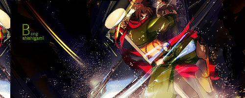
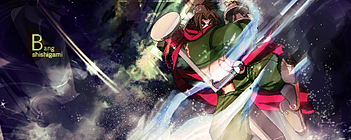
 

Doromac

Smash Journeyman
Joined
Aug 31, 2009
Messages
260
Location
Nashville


Purdi, the three clocks are not very appealing, and it's really low quality. Get some better quality pictures.
 

Inyro Gatling

Smash Journeyman
Joined
Sep 1, 2008
Messages
229
Location
New York
Nice concept, bad execution Doro. The lighting is too intense and the flow needs some major overhauling, but otherwise it's not bad.


New:
 

Player-4

See you in 25 years
Joined
May 16, 2009
Messages
5,582
Location
Campgrounds, TX
@ Inyro
I love the smudging and the depth of it. Though the main focal seems too harsh on the black. Idk something about it seems off, too bright I guess (center part of the focal). :ohwell:


Made for a friend. I'm hate using two different character renders in one sig, but it's what he wanted. CnC please ^_^
 

superscience890

Smash Cadet
Joined
Sep 9, 2005
Messages
32
@Doromac
:O it's Q :D Awesome character btw :D Interesting effects you have going on there, but they sorta mix each other up and becomes too crowded D: Also, his legs sorta dissappear into the effects... and well never reappear so slihgtly odd imo Also random white brush line on the left side isn't smooth enough IMO. I think you should just do that with the pen tool and try and make it more smooth.

@Inryo
Quite liking the whole smudging thing huh? Very clear focal for one thing :D and its niec that its quite simple as well. Though the transition in the background between white and black, I think you could have worked a little more on trying to blend that a little more. But it's quite simple as is right now... Perhaps you could add more to it, but I'm not exactly sure what you could add more.

@Player-4
For Tatsunoko I assume? But anyways, nothing against you or anything but generally 2 render sigs are really hard to pull off. I have yet to see a very successful one. Because of that it's hard to find a single focal point because of the two renders. Also, all it seems you did was paste the renders in, erase part of it, and overlay a copy of it on top... And especially with the wireframe background, it doesn't blend in quite nicely. The overlayed Zero seems too bright well especially the white parts of his costume against a white background so that doesn't help D: But ya two render sigs are really hard >_> especially when they're completely different art styles =__=
 

Doromac

Smash Journeyman
Joined
Aug 31, 2009
Messages
260
Location
Nashville
Inryo. It's too empty. It has decent smudging but other than that and decent color choice, I don't see anything great about it. The sudden shift to light to dark look weird and the dark part is really empty. It needs to be either smaller or have more to it.


Completely redid my sig. It's a W.I.P atm.

 
Status
Not open for further replies.
Top Bottom