Omis
my friends were skinny
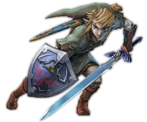
Suiwei when I said make Marth more prominent I meant make his tecture less faded and blury. His size is fine but it makes it look weird when you can barely distinguish him from the backround.
Constrive critism beside I love the first sig you made for me. I think I might actually use it if you can make one or two agustments for me. First one is that I can barely recongnize the oboe. Try either A) making the oboe larger or B) make the sigs borders smaller ie. trim some of the edges. Next is the background. If you could change it to something like red and another vibrant color I think it would accent the silver keys and black body of the oboe. Maybe even the background of your first sig with red and another color besides black would work. Overall Im liking it.
Constrive critism beside I love the first sig you made for me. I think I might actually use it if you can make one or two agustments for me. First one is that I can barely recongnize the oboe. Try either A) making the oboe larger or B) make the sigs borders smaller ie. trim some of the edges. Next is the background. If you could change it to something like red and another vibrant color I think it would accent the silver keys and black body of the oboe. Maybe even the background of your first sig with red and another color besides black would work. Overall Im liking it.