jalued
Smash Lord
Hey guys,
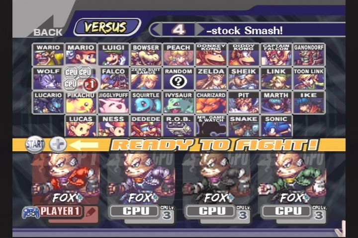
I don't know if this bugs anyone else, but I really despise the "ready to fight" icon that covers the top section of each character portrait. Apologise for the image not being the official PM icons, but you get the general idea:
The bar also currently covers the "warning: this costume might cause lag" symbol, which makes it difficult to determine which costume should not be used once all are selected

I think it would look better if the "ready to fight" icon was given a bit more room so it could fit between the icons and the portraits. There is a reasonable amount of space at the top that does not really add anything to the CSS.
So my solution is this (paint ftw)

Red box is new CSS concept
So by cutting off a bit of the top, you can create slightly more room for the "ready to fight" icon so that it doesn't interfere with the portraits.
Thoughts?
Jalued
I don't know if this bugs anyone else, but I really despise the "ready to fight" icon that covers the top section of each character portrait. Apologise for the image not being the official PM icons, but you get the general idea:
The bar also currently covers the "warning: this costume might cause lag" symbol, which makes it difficult to determine which costume should not be used once all are selected

I think it would look better if the "ready to fight" icon was given a bit more room so it could fit between the icons and the portraits. There is a reasonable amount of space at the top that does not really add anything to the CSS.
So my solution is this (paint ftw)
Red box is new CSS concept
So by cutting off a bit of the top, you can create slightly more room for the "ready to fight" icon so that it doesn't interfere with the portraits.
Thoughts?
Jalued
