
Soy_Man
Smash Apprentice
- Joined
- Jul 13, 2018
- Messages
- 162
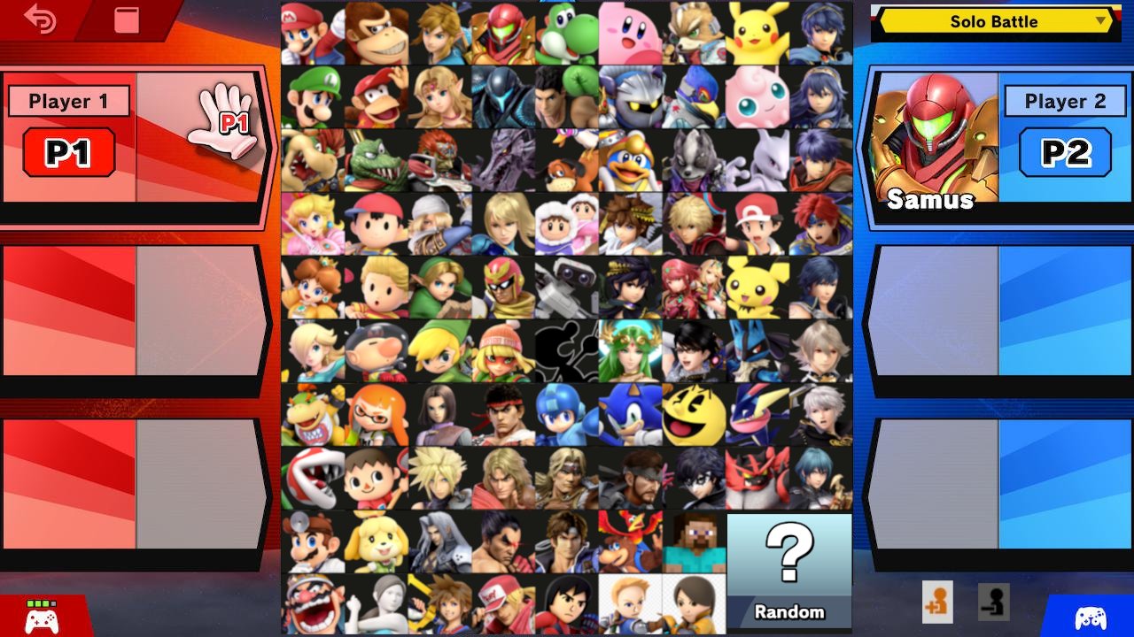
So the goal with this was to make something similar to Brawl's character select screen, where all the characters are organized into rows and columns.

What's so special about Brawl's character select? Well, it's organized so that each column revolves around a Nintendo IP, or has a theme.

And in each column the characters are generally ordered by how important they are to the series, having the main character first, followed by secondary characters or sidekicks, and then the villain. When a series doesn't have enough characters to fill the column, then they are followed by characters from the more niche Nintendo IPs, that have a similar vibe (e.g. Pikmin with Kirby, and F-Zero with Star Fox).
Organizing the character select like this is pretty simple when there's just 35 characters, but now the roster looks like this:

So, after some time and making several revisions, this is what I ended up with:

Column 1 is the Mario series
Column 2 is general Nintendo franchises
Column 3 is fantasy stuff
Column 4 is "We are going to beat you to death"
Column 5 is old ass ****
Columns 6 and 7 aren't very cohesive, it's just the stuff that was left over
Columns 8 and 9 don't need explaining
Row "a" is for the original eight characters (and Marth is there too).
The original eight being the first to come to smash. This is why Yoshi isn't in the Mario Column.
Row "b" is primarily secondary characters.
Row "c" is primarily villains.
Hopefully you get the idea.
I made Random take up four character slots so that there's no blank space.
It's not as organized as Brawl's I think it's pretty clean. I especially like how all the third party characters and the Miis come together to make a perfect square at the bottom.
And yes, the character select is a square rather than a rectangle, like in every other smash game. If it was a rectangle, I'd have to split Pokemon, and Fire Emblem into separate columns, which I didn't want to do. This meant putting the characters in the middle, and the player slots on the sides. This is similar to how many conventional fighting games arrange their select screen, and I personally think it looks cooler.

I spent several hours on this.


