
finalark
SNORLAX
Link to original post: [drupal=2962]Box Art Comparisons II [/drupal]
So I'm bored and I thought that I might just write a sequel to one of my blogs. Here I will compare box arts of the same game but from different regions to look at culture differences. Eh, who am I kidding? I hope this keeps you entertained.
Castlevania: Symphony of the Night
US
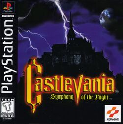
This book art is boring. All we have is Dracula's Castle with some lightning in the background. Oh, and there's a moon that looks like planet. This doesn't scream "Gothic fantasy adventure" it screams "1950s horror movie cliches."
EU

Now this is what I call box art! While is the US one is bland and generic, this is interesting. Alucard posing solemnly with Drac's castle looming in the background. And the unlit candles are a nice plus that add to the mysteriousness. Now this is the box art that says "Gothic fantasy adventure."
Okami
US

I really like this Box Art. It's exciting, interesting, and really does catch the eye. The fact that they show you that a wolf is the protagonist is one way to draw you in and get you interested. And showing that said wolf has power with the fire and the sun is a nice touch too, along with the "Asian" font used in the title.
JP

Here's one of those cases in which I just can't decide on which box art I like more. While the US box looks adventurous and mysterious, this one looks dark and mysterious. While the US background is bright and inviting, this one is menacing. Although I do think that Amaterasu looks much cooler in this box art than she does in the US box art. Also, it might just be because of how western I am, but the fact that they call it a "Nature Adventure" in the lower right hand corner kind of makes it feel a little less dark.
Star Fox 64
US
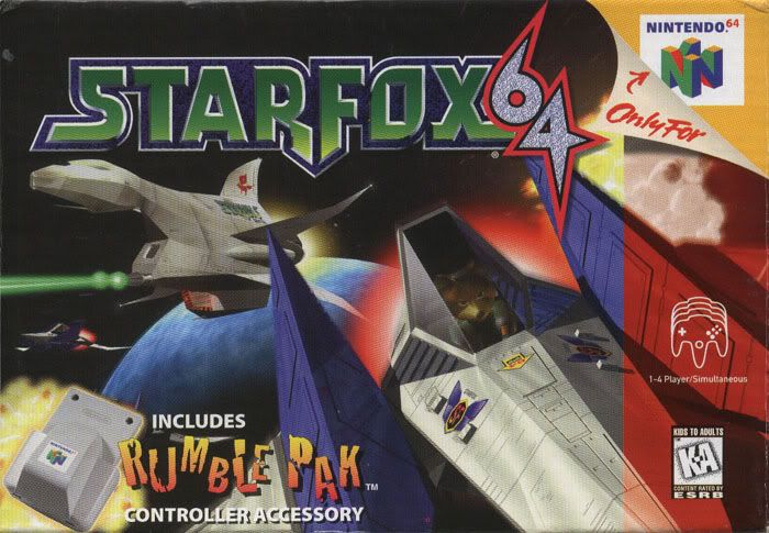
I like the US box art for Star Fox 64. It catches your eye, gets you interested, but doesn't shove it into your face. Well, unless you count fox flying right at you as being in your face. Either way, it's nice on the eyes and gets your attention, so overall it works.
JP
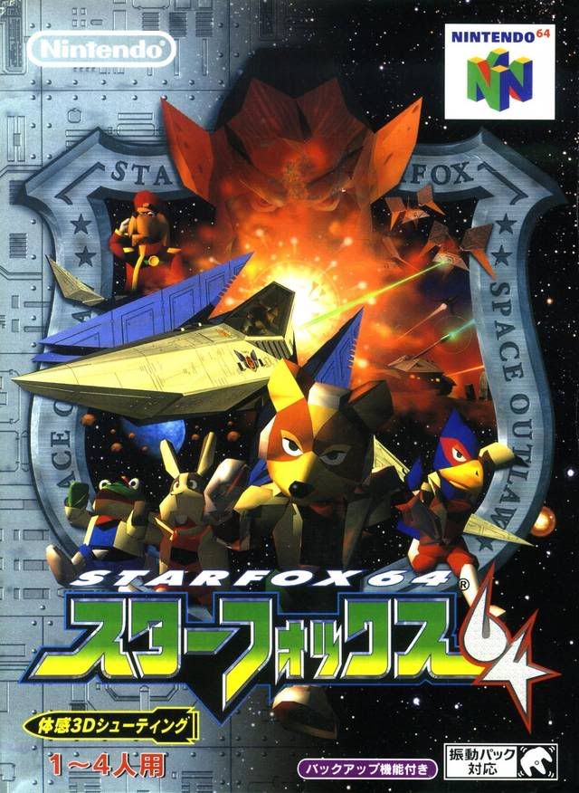
Why do the Japanese almost always get the cooler box art? This doesn't even look like box art, it looks more like a movie poster. The main characters are running at you, an epic battle is going on the background, General Pepper is posing heroically, and Andross is looming over you. This is the box art I'd rather see on my shelf.
So I'm bored and I thought that I might just write a sequel to one of my blogs. Here I will compare box arts of the same game but from different regions to look at culture differences. Eh, who am I kidding? I hope this keeps you entertained.
Castlevania: Symphony of the Night
US
This book art is boring. All we have is Dracula's Castle with some lightning in the background. Oh, and there's a moon that looks like planet. This doesn't scream "Gothic fantasy adventure" it screams "1950s horror movie cliches."
EU
Now this is what I call box art! While is the US one is bland and generic, this is interesting. Alucard posing solemnly with Drac's castle looming in the background. And the unlit candles are a nice plus that add to the mysteriousness. Now this is the box art that says "Gothic fantasy adventure."
Okami
US
I really like this Box Art. It's exciting, interesting, and really does catch the eye. The fact that they show you that a wolf is the protagonist is one way to draw you in and get you interested. And showing that said wolf has power with the fire and the sun is a nice touch too, along with the "Asian" font used in the title.
JP
Here's one of those cases in which I just can't decide on which box art I like more. While the US box looks adventurous and mysterious, this one looks dark and mysterious. While the US background is bright and inviting, this one is menacing. Although I do think that Amaterasu looks much cooler in this box art than she does in the US box art. Also, it might just be because of how western I am, but the fact that they call it a "Nature Adventure" in the lower right hand corner kind of makes it feel a little less dark.
Star Fox 64
US
I like the US box art for Star Fox 64. It catches your eye, gets you interested, but doesn't shove it into your face. Well, unless you count fox flying right at you as being in your face. Either way, it's nice on the eyes and gets your attention, so overall it works.
JP
Why do the Japanese almost always get the cooler box art? This doesn't even look like box art, it looks more like a movie poster. The main characters are running at you, an epic battle is going on the background, General Pepper is posing heroically, and Andross is looming over you. This is the box art I'd rather see on my shelf.