• Welcome to Smashboards, the world's largest Super Smash Brothers community! Over 250,000 Smash Bros. fans from around the world have come to discuss these great games in over 19 million posts!

    You are currently viewing our boards as a visitor. Click here to sign up right now and start on your path in the Smash community!

Am I the only one who thinks the menus are bad?

Kirbilord

Smash Rookie
Joined
Sep 27, 2007
Messages
19
I've actually always really loved the menu style of games associated with Masahiro Sakurai. I think its simplicity is a plus, since it clearly communicates the function of every selection through use of a single symbol. As for color, Sakurai has a tendency of categorizing different menus and submenus through specific colors to aid navigation. And this is the top screen, I believe, so the 3D effect needs to be taken into consideration.
 

AncientArk

Smash Apprentice
Joined
Jul 11, 2012
Messages
184
Location
London
I have no problem with them, they look simple to navigate, easy to read.
The fact they are part icon helps readability.

Makes sense for it to look clinical, it's a fighting game, someone is going to hospital.
 

wizardto1

Smash Lord
Joined
Aug 1, 2014
Messages
1,026
Location
Lurking
NNID
waddledee3
3DS FC
1676-4166-2291
I think it looks fine and good. If anything, assuming if the leaks are true, CSS and Stage selection looks unSakurai.
 

Fishbowl

Smash Apprentice
Joined
Jun 12, 2014
Messages
129
Location
San Diego
NNID
Fishbowl22
I just miss the checklist style menu's from 64 and Melee. I didn't like Brawl's (or the 3ds' for that matter) as much, but clearly it's because I'm biased towards the games I grew up with.
 

Beatness

Smash Apprentice
Joined
Apr 5, 2014
Messages
171
Location
Anteiku
NNID
Beatness
3DS FC
5412-9896-3151
I think the menu is nice, I just hate how bland the character select screen is for the 3ds version. I mean, it get it that they're packing in a lot of characters on a handheld screen, but it is just so uninteresting to look at. The boxes hardly even have borders anymore.
 

KaZe_DaRKWIND

Smash Ace
Joined
Aug 13, 2014
Messages
904
Location
Oregon
3DS FC
5043-2124-2144
I think the menu is nice, I just hate how bland the character select screen is for the 3ds version. I mean, it get it that they're packing in a lot of characters on a handheld screen, but it is just so uninteresting to look at. The boxes hardly even have borders anymore.
Agreed. It's not the menus that look bad. It's the selection screens.
 
D

Deleted member 245254

Guest
Personally, I would think it foolish to believe you are the only, single individual in the world to like or dislike any one thing.
 
Last edited by a moderator:

Gunla

wow, gaming!
BRoomer
Joined
Aug 18, 2013
Messages
9,069
Location
Iowa
@ Calibrate Calibrate
This thread has been moved to the 3DS boards given it is the main focus of the thread.

Carry on.
 

Texas Toast

Smash Cadet
Joined
Aug 1, 2014
Messages
46
Location
DFW
NNID
TexasToast-3
3DS FC
1461-6200-1949
I don't like the menus in particular, but to be brutally honest I've never found them that important as long as they serve their function.
 

Neanderthal

★ ★ ★ ★ ★
Joined
Oct 29, 2006
Messages
1,227
Location
Sydney, Australia
I don't like the menus either. The white background feels too plastic to me.
Didn't like brawls either.
Preferred the feel of Melee and 64's.
 

DakotaBonez

The Depraved Optimist
Joined
Jun 23, 2012
Messages
2,549
Location
San Marcos, Texas
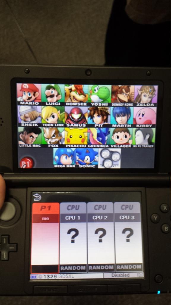
For such a colorful game, the menus are really bland!
So, like. Post an image of a menu that ya do like?
I mean, the icons probably have little animations as you go over them, and who knows whats going on in the background. We'll have to see footage of the menu's in action.

In my opinion though, the smash button should be in the middle.unless of course pressing left takes ya to the challenge button. I wonder if you press down from the smash button, whether it places the selection over the steetpass button or the wii u button...
Also, will I have to press down, then right to go to smash run?
 

CatRaccoonBL

You can do it!
Joined
Jul 22, 2013
Messages
4,898
Location
Wuhu Island
NNID
RaccoonBL
3DS FC
2294-4606-0767
First, I'm going to wait to see how they look on the 3ds screen to have my final thoughts on it.

With that said, I'm personally fine with them so far. They are simple enough. They don't really bother me at all. Maybe they could be prettier, but overall, I like it.
 

Fire Tactician

Smash Lord
Joined
Aug 17, 2014
Messages
1,395
3DS FC
4596-9948-4995
First, I'm going to wait to see how they look on the 3ds screen to have my final thoughts on it.

With that said, I'm personally fine with them so far. They are simple enough. They don't really bother me at all. Maybe they could be prettier, but overall, I like it.
I'm sure it'll look at least a little better on the 3DS. Anyway, since the characters now have uniquely colored backgrounds, if the background of the character select screen was any more colorful, the screen would be too crowded and it'd clash with the characters. It's either leave the background black or make a second page of characters with a more colorful background.
 

Superyoshiom

Smash Master
Joined
Jul 15, 2013
Messages
4,337
Location
The Basement
NNID
Superyoshiom
I think the menu is nice, I just hate how bland the character select screen is for the 3ds version. I mean, it get it that they're packing in a lot of characters on a handheld screen, but it is just so uninteresting to look at. The boxes hardly even have borders anymore.
If you count up the number of potential characters and empty spaces, the entire screen is going to be filled with character slots anyways, so there's no point fussing over what's behind that.
 

SmasherP83

Smash Ace
Joined
Jan 7, 2014
Messages
626
Location
Virginia
NNID
SmasherP83
3DS FC
4699-8697-4633
I like the menu screen it'll always remind me of Kirby Air Ride.
 

Dr.Rock

Smash Rookie
Joined
Apr 22, 2012
Messages
18
Location
ATL
I loved 64s and Melees, but brawl's menu just didn't resonate with the gameplay to be honest.
 

SS-bros14

Smash Champion
Joined
Jul 26, 2014
Messages
2,775
Location
VA, United States
3DS FC
4038-6159-5535
Personally, I would think it foolish to believe you are the only, single individual in the world to like or dislike any one thing.
I'm pretty sure he knows he's the not the only one, since saying 'Am I the only one who thinks...' is just as expression. :p
Anyway, I actually like the menus, and think it's quite the opposite of 'bland' and 'colorful'.
 
Last edited:

Calibrate

Smash Apprentice
Joined
May 6, 2014
Messages
131
Personally, I would think it foolish to believe you are the only, single individual in the world to like or dislike any one thing.
Personally, I think you must be pretty god damn stupid if you believe I think I'm the only one in the world to dislike this.
 

Smash G

Smash Journeyman
Joined
Apr 9, 2014
Messages
268
As someone who makes UIs for a living (as well as other things) I can see why this was their only real option.

The main thing here is you're fitting roughly 50 characters in a freakin' TINY screen. It is TINY. So TINY! I played it on the 3DS and it's freakin' basically TOO TINY lol. So they work with what they've got.
Besides obviously fitting in all the relevant information the second most important thing is keeping it simple and easily understandable. Bad UIs are bad. This UI isn't bad. It's a bit plain but it's because there's so little room and they wanted to keep it simple (KIS or KISS for Keep It Simple Stupid). Usability and showing all the relevant and required information is more important than making it look pretty. Plus IMO it doesn't actually look bad, just plain. And again, it's because the resolution is so TINY. I mean it looks like they had to make some pretty big concessions already like the names disappearing. There was simply not enough room to make it look really fancy and I truly believe they did the best they could with what they had. Expect a prettier character select with the Wii U since it doesn't have such strict limitations.

When talking about stuff besides the roster... that's just a matter of taste. I think Smash Bros's menus is one of the best UIs out there. It's simple (which is freakin' important so people can navigate easily). It's stylish in my opinion too. Nobody ever has trouble navigating the UI. I like it.
 

Tino

Smash Hero
Joined
Jul 31, 2014
Messages
7,211
Location
Spartanburg, South Carolina
NNID
FaustinoRojo10
3DS FC
5284-1678-8857
Switch FC
SW-6232-2426-8037
The menu designs that's done by Masahiro Sakurai himself has always turned out to be the best of the best. Just saying.
 

King Zekrom

Smash Apprentice
Joined
Aug 1, 2014
Messages
133
I also think the menus aren't the best. I would like it more if it was either
  • On the touch screen
  • The buttons interlocked with each other, giving a cleaner feel IMO
 

infomon

Smash Scientist
Joined
Mar 11, 2008
Messages
5,559
Location
Toronto, Canada
Could we be any more picky :)

It actually says a lot about how amazing Smash is, that we go onto forums to complain about the menu screens being slightly below our aesthetic ideals.
 
Last edited:

LiamMail

Smash Journeyman
Joined
Jul 14, 2014
Messages
283
NNID
Liam5d26
sakurai's wife does a awesome job on ui design
yes
yes
i did say
SAKURAI'S WIFE does the UI design
i betcha didnt know dat
 

oscuras

Smash Cadet
Joined
Aug 23, 2014
Messages
46
3DS FC
2105-8721-7551
IMO, the menus look messy, and it looks like a total rip-off from KI:U, but worse. The colours look lifeless even though they are bright colours, IDK, maybe it'll look better during actual play.
The character and map selection screens are just awful, hoping the black spaces means more character slots.
 
Top Bottom