Hall of Fame
[collapse=Rounds 1-10][collapse=Round 1]
Fuelbi:
Firus: 7/10
Spire: 8/10
Final: 7.5/10
Meta-Kirby:
Firus: 8/10
Spire: 7/10
Final: 7.5/10[/collapse]
[collapse=Round 2]
Sir Bedevere:
Firus: 10/10
"Follows the prompt. While the neon green you used is a little bright, this sprite is very,
very good. Not only does the basic shape effectively imitate Hitmoshi being a candle, but you altered Exploud’s windpipes to be candles as well – not only being on fire, but dripping like candles as well. For that matter, Exploshi is dripping like he’s made of wax all over the place, and it looks completely natural. Honestly the best combination I could imagine coming out of these two Pokémon – you did an excellent job."
Spire: 10/10
"Just going to say that the dripping candle wax completes this. It adds your own personal touch. With the cold mouth, a potentially radioactive ooze body, and blue flames emiting from its exhaust tubes, this creature nearly makes no sense, and yet it all works together. It's like a chemical waste nightmare. Biologically unstable enough to not be able to uphold a definite form, yet all the while trying to with its erect candles. You've disguised Exploud incredibly and Hitomoshi even better. These two Pokémon have yielded a truly unique creation."
Final: 10/10[/collapse]
[collapse=Round 3]
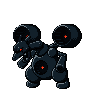
Neon Ness
Steel/Dark
Firus: "This sprite is amazingly well-done. You immediately see that it’s mechanical – and therefore probably Steel-type – but the dark coloring and red lights on it also give off an evil vibe, accomplishing the retype well. Charizard looks as if it were turned into a robot, not only with mechanical joints and parts, but its wings have even been replaced by engines. Excellently done."
Firus: 10/10
Spire: 9/10
FINAL: 9.5/10[/collapse]
[collapse=Round 4]
ChiboSempai
Ghost
Spire: "This completely took me by surprise. Every time I've ever imagined a Ghost evolution of Eevee, I've just seen a typical ethereal version of an Espeon-like creature. My imagination doesn't always serve me best. You've managed to re-invigorate my idea of strong conceptual evolution like never before. This design is nigh flawless. Truly my only complaint is how you handled the bottom edge of the tombstone. It would have preferred a straight edge because the rest of the sprite suggests such, but I totally see what you were going for in its angling. The whole feel of the sprite harkens back to the Pokémon Tower in Lavender Town. This Eeveelution is not transparent, and yet we can read that it is a ghost because of its tapered form wrapping around a tombstone. I'll often complain about Pokémon with objects in their design, but this just entices me. As a last note, the name is truly perfect. I wish this Pokémon were real, truly."
Firus: "You did a really great job with this sprite. You took a great concept and made it into a great sprite, which follows the prompt extremely well. It definitely resembles an Eeveelution, but you took it even further. I love how the gravestone accompanies the sprite, not to mention the level of detail you put into it. Furthermore, the fact that it’s wrapped around the tombstone as it is makes it so much more effective. The base of the tombstone does look a little awkward, but other than that the sprite is so well-executed. I can truly imagine this Pokémon being real, and indeed wish it were."
Firus: 10/10
Spire: 10/10
FINAL: 10/10[/collapse]
[collapse=Round 5]
Roxy

/

Grass/Ground
Firus: "I absolutely love Chlorophix. Its coloring immediately gives off a mud vibe, which works for the ground typing, but also lends itself well to adapt a grass typing. The leaves you added as its mane further help to create the grass idea, and the bits of moss on the various pieces complete the picture. The male/female difference is also not only a nice touch, but it works extremely well. The way you formed Chlorophix, it really gets the retype across and it truly feels like it could be its own Pokémon."
Spire: "I don't think a Pokémon sprite has ever so realistically portrayed a material as well as Clorophix's mud. I look at the sprite and I see a bunch of clumps of smooth, wet clay. It's fantastic. The shading is absolutely flawless. Also digging the pink iris you gave the female version to match its flower. It's little tidbits like this that make all the difference in the world. In my honest opinion, this is a perfect display of retyping a Pokémon. Congratulations."
Firus: 10/10
Spire: 10/10
FINAL: 10/10[/collapse]
[collapse=Round 6]
Sir Bedevere
Firus: This sprite totally blew me away. I’m not a fan of Vanilluxe at all, but Vanillorn is awesome to the extent that I wish it and a line of similar Pokémon could replace that line altogether. You effectively represented both Ferrothorn and Vanilluxe in the sprite, making Ferrothorn’s main body resemble an ice cream cone but in a much less obvious way than Vanilluxe, which makes it more appealing in concept to me. You also changed Ferrothorn’s appendages, I suppose you could call them, to be heads, going along with the theme of multiple heads within Vanilluxe. Even aside from how you fused the two conceptually, you did a good job fusing the two artistically as well. The sprite truly looks icy; the “cone” in particular looks great, but the whole sprite truly gives off a chill. Great job on this sprite.
10/10[/collapse]
[collapse=Round 7]
Charmander - Spacebuck
Firus: On first look, I felt this sprite was awkward, but the more I look at it the more I like it. The overall green tone of the sprite gives it sort of a radioactive, test-subject-like vibe, and the chest plate and tail further contribute to that idea. The most glaring thing to me is the Arceus antlers, but after some consideration I think that was ultimately a good decision, because it further creates a futuristic look which once again adds to the laboratory idea. The one thing I might've changed is the fact that the antlers are connected -- I think they'd look less awkward if they didn't have the connector in the middle -- but overall, you executed the concept well here.
9.5/10[/collapse]
[collapse=Round 8]
Sir Bedevere - Ardridoom
Firus: I love how you took this concept and made a really solid sprite using that concept. The Cerberus/griffon fusion through the use of three different Pokémon is a really cool idea, and you blended the pieces pretty well in addition to using blue and black, which work well together. I do think using some darker blues to transition from neck to body might’ve looked better, and I also think it might look better if you separated the lines of the tails in some way – they look a little like a jumble of black lines as they are – but overall you executed it very well.
Neon Ness: Who doesn’t love a 3 headed Houndoom monstrosity? Reminds me of a chimera. I love how the front half has bird talons and the hind legs are canine. The middle head appears to have an elongated chin as opposed to having a spherical head like the others. Still, I can appreciate the amount of effort it took to make Houndoom heads from 3 different angles. The pitch black details of the tail/necks is a bit too dark compared to the overall tone of the sprite--you might want to try using a really dark gray or something similar there instead. I wish the transition from the blue feathers to the dog fur on the torso had been slightly more graceful, but it’s good all in all. I can tell a lot of thought was put into the concept behind the fused Pokemon, and the end result is excellent.
F8AL: 8.5/10
Firus: 9.5/10
Neon Ness: 9.5/10
FINAL: 9.2/10[/collapse]
[collapse=Round 9]
Meta-Kirby - Phountain
F8AL: I can see what you were trying to accomplish here with this sprite. You were successful in turning Lampent into a water type because the colours really go together with each other, everything looks like they belong with each other and work together.
Firus: I love what you did with Phountain, taking the torch concept of Lampent and slightly altering it to be a fountain – rather than just doing a generic sort of water retype, you took it to the next level conceptually (and took advantage of the subtle similarity there). You did a great job of conveying it sprite-wise, as well; the spout of water at the top, the water trickling down the sides, and the water finally dripping off all look completely natural. The one thing I’m a little iffy on is the gold coloring of the “fountain” part – I think a silver or other cool color might’ve worked better, as the gold clashes somewhat with the color of the water, but it doesn’t detract too much from the overall sprite. Well done!
Neon Ness: I’m a huge fan of the concept. I never realized how closely Lampent actually does look like a fountain before this. The subtle blue gradient of the water inside of its glass bulb is very well done, and the way the water spills down over its body is really impressive. Something that seems a little bit off is the ‘flame’ shape in the middle. If it’s supposed to represent the pressure of the fountain spray from within, then maybe a lighter color or something that resembled bubbles might have looked more cohesive. An unusual color choice with the brass look for Lampent, but it makes a pleasing contrast with the blue in the water. Some parts of Lampent’s cap are a little rough; I can’t quite get a sense of the direction of the lighting and it looks like there might be some sort of texture, but it’s hard to tell. All in all this is a well designed sprite, you worked from a really strong idea here.
F8AL: 8/10
Firus: 9.5/10
Neon Ness: 8/10
FINAL: 8.5/10[/collapse]
[collapse=Round 10]
Meta-Kirby - Zohralia
F8AL: The colors are amazing on this sprite. They go well with each other and I can definitely tell the resemblance between the trainer and pokemon. Awesome work, as usual!
Firus: You really infused Zoroark into Dahlia’s sprite here. You recolored her well to resemble Zoroark and chose the colors for each piece such that they work together instead of one overwhelming the other. I really like that her jacket even resembles fur and almost fuses with her body – that, plus the natural blending of Zoroark’s “hair” as her own practically makes her look like a werewolf, Zoroark-style. Great job with this.
Neon Ness: Amazing sprite—a lot of fine details complete this fusion. The way her hair and clothes have been restyled to resemble Zoroark’s fur is incredible. You even changed her eye makeup which I didn’t notice at first glance. I like that you included more magenta in her outfit than gray since it causes the sprite to stand out more as a whole. I can’t think of many ways this costume could have been done better, myself.
F8AL: 8/10
Firus: 9/10
Neon Ness: 9/10
FINAL: 8.67/10[/collapse][/collapse]
[collapse=Rounds 11-20][collapse=Round 11]
Daddy Ash - FuRageFet
F8AL: When I first looked at the sprite I didn't like it very much but upon closer inspection I noticed that it didn't have to look uniform or anything and that the sprite wasn't meant to be taken seriously. While I think pulling off that face on a sprite would be almost impossisble for me, I think you did it quite nicely and found myself laughing at the sprite when I finished thinking about it. You made the eyes perfect but I think you could've done a bit more work on the mouth. Overall, I think you did a good job on the sprite and with a couple of tweaks it could be perfect.
Firus: You did a good job with this sprite. The “Fuuu” face was well-constructed and it blends in with Wobbuffet well; although the face is odd (just due to the fact that it’s a strange face), it looks natural on Wobbuffet. My one complaint about this sprite is that the face clashes with Wobbuffet’s body position a little bit; if you had moved his other arm up in the air instead of having it bent at his side, I think it would’ve lent itself better to the face and completed the sprite.
Neon Ness: I love the eyes/eyebrows lol. The face just fits really well on Wobbuffet, oddly enough. The shape of the mouth is slightly off (I think it’s a little more angled down near the sides as opposed to being rounded off) but it’s still easily recognizable. Nicely done.
F8AL: 9/10
Firus: 8/10
Neon Ness: 9/10
FINAL: 8.67/10[/collapse]
[collapse=Round 12]
M.K
F8AL: I feel like your sprite literally came to the closest depiction of Pikablu back in the day. The sprite almost looks as if someone working on a pokemon game had a hand on this and the design was just so cute. I honestly felt as if your Pikablu was part of the rodent family that seems to be plaguing us now. (i.e. Plusle, Minun, etc.) The colors felt right on it and his facial expression is pretty well done.
Firus:I love this sprite both in its artistic qualities and its concept. It’s a very well-created sprite that stands out in its own right, keeping from resembling any single pre-existing Pokémon such that it could be its own yet having that same rodent feel that each generation’s respective rodents have. I do like that, of any rodent, it most resembles Marril in such a way that it’s almost like a prototype of Marril, which is fitting given Pikablu’s origins and how that was the name given to Marril before any official name was given. If this sprite were made to be 8-bit, it would fit in perfectly with the old games and I could truly imagine it being Pikablu.
Neon Ness: I really like the design here. It’s not overly complicated, just the essential elements of a small, cute blue rodent but it really works. There’s something strangely familiar about it as I feel like this could have easily been the actual Pikablu. There’s not much for me to comment on, the only thing is the segments on the legs make it look somewhat robotic or doll-like and I’m not sure if that’s what you had in mind. Great colors and overall concept.
F8AL: 9.5/10
Firus: 9.5/10
Neon Ness: 9/10
FINAL: 9.33/10[/collapse]
[collapse=Round 13]
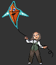
Wretched – Ben Franklin & Rotom (Kite Forme)
F8AL: I feel like if any pokemon were to go with Ben Franklin, it would be a kite rotom. Your sprite looks well done except I feel that the face is slightly blurry and should be cleaned up a bit more and the hair needs to distinguish itself better from the background. (Depending on the forum skin that you're using) Otherwise, good job turning Rotom into a kite and nice idea!
Firus: I really like what you did with this sprite. Not only did you create a Ben Franklin trainer which very closely resembles him, but you went to the next level with his accompanying Pokémon such that even if the trainer sprite didn’t get it across, the Pokémon surely gives it away. I love that you infused Rotom with Ben Franklin, not only combining the two, but creating a new forme for Rotom to fit the concept better, and the kite forme is well-made for the most part. The electricity coming off on the right side looks a bit strange, and I might’ve left off the mouth, but other than that it’s very good. As for Ben Franklin himself, his clothing matches him well and his hair and face effectively portray him as well, though the shading on his forehead looks a little strange. This sprite combination really pulls it together, though; it’s a very creative concept and a well-executed sprite.
Neon Ness: Incredible. I have to give you credit for going the extra mile and doing something really unique here. Not only did you give Rotom a new form that looks convincing, but you’ve made the Trainer and Pokemon really interact with one another in your submission. The shading is sound for the most part, and his costume design and stance are excellent. Really I’m just impressed by how clever this is.
F8AL: 7.5/10
Firus: 9/10
Neon Ness: 9.5/10
FINAL: 8.67/10[/collapse]
[collapse=Round 14]
Tacel – Guls
F8AL: I think this is among the better sprites to be made this contest. You managed to combine Macargo and Arbok really well and I think the gas bubble bumps to be a really good finishing touch to the sprite. You made the colors blend in will with the sprite and I also really liked how the bottom of the sprite looks like it's gooing to the floor a bit. Overall, a well made sprite. Great job!
Firus: I really like what you did with this sprite. For starters, although this isn’t part of the sprite, I like the clever name for it. In general, though, you really fused Slugma into Arbok. Slugma’s head with Arbok’s fangs actually blends quite well, and I love the subtle bit of dripping slime from Guls’s mouth. The magma bubbles throughout the sprite really carry through the idea, too; there’s a small bit at the bottom-right of the sprite which looks a little too jagged, but other than that you did a good job, and it truly carries across the concept of Slugma into the body of Arbok. Great job.
Neon Ness: I'm really impressed with how this one turned out. The bumps on the main body show careful attention to detail, and the cobra markings really fit this fusion since they already looked like fire. I commend you on attaching Slugma's oddly shaped head seamlessly onto the snake body. Not really sure what to comment on, pretty much everything is finely crafted.
F8AL: 9/10
Firus: 9.5/10
Neon Ness: 9/10
FINAL: 9.17/10[/collapse]
[collapse=Round 15]
vVv ChiboSempai - Pigglyruff
F8AL: I find this pokemon to be quite comical to look at. It's not exactly what I'd expect the cute and cuddly Wigglytuff to evolve into, but it certainly does have a creative approach to it. I like how this is a sprite that doesn't take itself too seriously and just tries to be funny (or at least it made me laugh) and brings in a refreshing direction from most evolutions concieved. My only complaint is is that your pokemon could look more roughed up. (If that's what you're aiming for in the first place with your description.) I would suggest maybe a couple of scratches or a black eye to make it look like it really does get into fights, instead of just looking like a pokemon who just got up from his slumber and then tripped and hurt himself. Just anything to make it look like it should be beat up from all it's fights. Overall, a good pokemon. Keep up the good work!
Firus: On first look, it’s not much different from Wigglytuff; on closer inspection, however, I’ve realized that it’s actually a very effective evolution. Its entire feel is entirely opposite of Wigglytuff’s bright, peppy look, evident from its eyes, its frown, its ears, its reclined pose, and its bandages. The one thing I would’ve suggested changing – which I think is what gives it the appearance initially of not being much developed from Wigglytuff – is the color. There’s a slight tint change from Igglybuff to Jigglypuff, and Jigglypuff to Wigglytuff, and I think it would help to separate Pigglyruff from Wigglytuff a bit better. My only problem aside from that is that the majority of the body is lacking in shading and looks a bit flat. Aside from those two issues, I love the concept and execution of this sprite.
Neon Ness: At first glance it doesn't appear to be a big enough change to be an evolution, but the more I look at this the more I appreciate that you didn't go overboard with altering the appearance. I really like the attention to detail here--moving the white area to become a 5 o'clock shadow, adding bandages, and giving him more bulk. That expression is priceless. The shading's flat near the bottom of the torso and the right ear looks misplaced (too low?). Other than those, this turned out nicely--strong idea.
F8AL: 9/10
Firus: 8.5/10
Neon Ness: 8.5/10
FINAL: 8.67/10[/collapse]
[collapse=Round 16]
Charmander – Pyro (Grumpig)
Great job on this sprite. I would have kept the ears the way you had them initially, honestly, because I think it helps to maintain the Grumpig feel better – as it is in the final state, it’s a little more difficult to discern the base – but this is sprite is really well done. I love that you didn’t go the obvious Magmortar route but still did a great job creating a Pokémon version of the Pyro. As I said, if you had kept the ears I think it would’ve done a better job of maintaining the look of being a Pokémon, but other than that, wonderful job.
9.5/10[/collapse]
[collapse=Round 17]
Kantrip – Porygon-AB
F8AL: The only complaint I have for your sprite is that in my opinion, the colors don't go well with each other and you could have made it look more like a bug pokemon by adding more details and choosing a different pokemon to use. Overall, a decent sprite.
Neon Ness: Great concept, I like to see how you've used parts of Porygon in an unusual but effective manner. The compound eyes and wings are a great touch, and of course the beak area was nicely redone for a bug look. I only wish you had changed the colors a bit, something in the tan/brown range would push the mosquito look further. The tail seems unresolved somehow, a bright blue bulb doesn't seem to fit with the bug motif here. The wings are slightly tacked on, I think it's because of the outline overlap but mostly this is a well made entry, very nice.
F8AL: 8/10
Neon Ness: 8/10
FINAL: 8/10[/collapse]
[collapse=Round 18]
vVv ChiboSempai – Gummylluxe
F8AL: I like it how you kept the colours of this sprite consistent and how you added the bubble for the scoop on the right. Nice touch. Everything looks like it belongs there and mends well together.
Firus: This sprite is pretty simple, but I really like how it came out. The chunks of bubble gum are a neat touch, although they’d have been more effective if they were less subtle. Merely in the recoloring, you get across the bubble gum flavoring, but the bubble really adds a lot to the sprite. Not only is the bubble well-done, but it fits naturally into the sprite and immediately indicates the bubble gum flavoring, as opposed to another pink flavor.
Neon Ness: I really like how this came together. At first glance this could have easily just been a simple change to a strawberry flavor but the bubble gum coming from the second head gets your idea across very clearly. Not the first flavor I would think of for ice cream, but the design is convincing. I actually can't see any of the bubblegum chunks you mentioned, if those finer details stood out a bit more clearly, this would be even better. I'm glad to see that the cones were redone for the sake of tying the whole look together.
F8AL: 9/10
Firus: 8/10
Neon Ness: 8/10
FINAL: 8.33/10[/collapse]
[collapse=Round 19]
Neon Ness – Metablim
This sprite is truly impressive. The shading on it looks great, and the scratching involved in the sprite looks completely natural. The headpiece looks great as well, and the eyes look really good. Honestly, my only complaint about the sprite is that the hind legs don’t quite look like they match up with the body, but the rest of the sprite is extremely impressive.
9.5/10[/collapse]
[collapse=Round 20]
vVv ChiboSempai – Gentleman Caterpie
Firus: Love the concept here; a gentleman is certainly awesome, and top hats and monocles go well on pretty much anything. In actual execution, however, there are some flaws; the most glaring flaw is the shading of the hat. Due to the fact that it almost entirely lacks shading, it doesn’t fit the rest of the sprite and looks out-of-place rather than attached to Caterpie’s head. The coat’s a nice touch, and the monocle is well-made, although if you’d perhaps made it a bit darker to distinguish it from the rest of Caterpie, I think it would be more effective. On first glance, it looked to me like Caterpie was missing his eye. Overall, although the sprite is simple, and despite some flaws, it’s a solid sprite which takes a good approach to the prompt.
Neon Ness: A really solid sprite with a unique direction, it has everything I'd expect from the traditional gentleman. The shading on the hat seems somewhat flat however, and oddly lighter than the rest of the sprite. Somehow the angle doesn't appear correct on how it sits on Caterpie's head either. The monocle is also hard to make out because most of it is as light as Caterpie's face, so maybe a slightly more defined outline would help separate the details in that area. No complaints about the bowtie and tux, I really like how those were implemented on such a small scale. Very classy.
Firus: 7/10
Neon Ness: 7/10
FINAL: 7/10[/collapse][/collapse]
[collapse=Rounds 21-30][collapse=Round 21]
Fuelbi - Lunialga
Firus: I definitely like the idea of a moon dragon, so the fusion of Lunatone with Dialga is an interesting one. I like that you stuck with Dialga’s colors rather than swapping to Lunatone’s, as the dark blue gives a much more epic feel than the light tan of Lunatone, and I like how striking the red eye is compared to the dark overall color. However, Lunatone is somewhat awkwardly placed into Dialga. There aren’t a whole lot of ways to fuse those two, but I think going for a crescent theme on Dialga’s body or maybe changing Dialga’s head to be more like Lunatone would have been less awkward. The legs, tail, and crest simply attached to Dialga all seem off. Even sticking with the same idea, I’d have moved the tail down a bit and made the distinction between the body and tail more obvious, and I’d probably have moved the crest to be a bit farther back on Lunatone’s head. There are also some odd white pixels in a few places. Furthermore, in regards to the prompt, I feel like this particular fusion focuses more on Lunatone and the fusion itself than making a “cooler” dragon. I like the idea that could have been achieved here, but I don’t think the sprite was executed as well as it could’ve been.
Neon Ness: The colors on this really work, that cerulean blue gives off a mystical feel fitting of a dragon or night sky so I'm glad you stuck with Dialga's colors. Unfortunately the fusion seems a little unbalanced since the Lunatone elements are pretty much unchanged except for color. In a fusion I think it's helpful to try and alter elements from both sides so one doesn't dominate the other. In this case it sort of feels like Lunatone is the focus since it has Lunatone's face making up most of the body, which detracts from the overall Dragon feel. There are some minor errors here and there--the outline is inconsistent, the legs don't quite mesh into Lunatone's body, and there's a stray white pixel on the right edge. I think a moon dragon idea would have been cool pushed further but this falls a little short.[/collapse]
[collapse=Round 22]
Jdietz43 – Not-so-Slowbro
Firus: I really like your concept here. You may not have drastically changed Slowbro’s appearance for the sprite, but the concept behind it fits perfectly with the prompt. Furthermore, the simple alterations you made were effective and well-executed. Slowbro’s eyes are looking down to read the book, and the book itself is well-made. My one complaint is the positioning of Slowbro’s left hand, as it seems to be awkwardly grabbing the book, but other than that the sprite is well-done.
Neon Ness: Really, really strong idea. A very believable New Year's Resolution for Slowbro if I've ever seen one. There isn't much to comment on technically-- you didn't change much of the sprite itself, but you didn't really need to either. The way it's holding the book is a little bit awkward; maybe if both claws were level and it were a little closer to his face it would look more proper. But it kind of works since he's new to this whole reading business. All in all, this is a very clever solution to the prompt.
Firus: 8/10
Neon Ness: 8/10
FINAL: 8/10[/collapse]
[collapse=Round 23]
asage94
Firus: The execution of this sprite falls a bit short. While it has the beginnings of an ice retype, it’s lacking the touch it needs to look like an ice-type Pokémon. In the colors themselves, I’d go for more chilling colors; white and lighter blues combined tend to work for it pretty well. The colors you have now, like the purple for the eyes and the blue-purple used on the body, can work for ice type, but they also make it look like Volcarona could be dark type instead. Also, while you altered the antennae, you could have done many more physical alterations to Volcarona to make it seem more ice-type. Something with the wings would have been especially effective, but even something more subtle would definitely contribute to the feel. Even just adding ice crystals onto it in a few places or something would have helped.
Neon Ness: I can see that you clipped part of the antennae and did some recoloring, but otherwise the idea could have been pushed a little further. The wings, being one of the standout features, could probably have been altered most to give off an icy feel, but they're mostly unchanged. Besides the colors, nothing about the sprite particularly says 'Ice type'.
Firus: 3/10
Neon Ness: 3/10
FINAL: 3/10[/collapse]
[collapse=Round 24]
Jdietz43 - Milggron
Firus: Despite the mildly creepy result of Aggron with udders, I rather like this sprite. I like that you focused on the minor details more rather than swapping the significant pieces, as is often done in Pokémon spriting. The udders are a nice touch, and I like everything you did to the head. The horn change is subtle, but I really like how that changes Aggron to be more Miltank-like, and the eye and ear changes really help bring it across even better. The one thing that does confuse me is the tail/stomach area; I understand the tail being recolored tan, but that one stripe on the chest looks a bit weird. I’d either go for recoloring more or for leaving it just to the tail. Aside from that, though, I’m really happy with this entry. Good job.
Neon Ness: This fusion's really good for a number of reasons. Elements from both Pokemon seem pretty even, I can appreciate how even small details like the eyes were changed. The udders stand out as probably the best part of this, as creepy as they are. I really like the head area because the shortened horns, "ear", and eyes all really convey the idea of these two very different Pokemon being fused together. I'm not really sure what's going on with the tan abdomen segment/tail, it just seems so different than the rest of the sprite. It might've worked better if the tan area covered the middle section more, perhaps where the udders are. Overall, a great entry.
Firus: 8/10
Neon Ness: 8/10
FINAL: 8/10[/collapse]
[collapse=Round 25]
Ingulit - Zudisc
Firus: An interesting and creepy fusion, albeit an effective one, despite its simplicity – not that there’s really much to work with on Luvdisc – and one I like. There are, however, some flaws with it. For one, the ears are a bit awkward, mostly because the ear on the close side is at a different angle from the other one. The feet are also in a strange position; it would make more sense for them to be towards the bottom. Furthermore, the wings would probably have fit better on the middle instead of the bottom, as they would logically make more sense there. Despite those flaws, though, I do think this is a decent start and an interesting concept. I also must say, I laughed at the description of the Pokémon.
Neon Ness: I can't actually think of many other ways this combination could've worked so I have to commend you on the overall design and placement of the parts. There are some issues with certain areas though. The ears look crooked since one is drooping lower than the other, and the outline doesn't seem strong enough on the rightmost ear. The attachment of the closest wing could also have been more seamless. The legs are the only parts that really don't seem to fit, maybe they could have been removed altogether. In this case the outline separating the body and legs is too strong and makes them look tacked on. But the shading is great overall, I really like how the recolor of Luvdisc was accomplished.
Firus: 6/10
Neon Ness: 7/10
FINAL: 6.5/10[/collapse]
[collapse=Round 26]
Varist - Zapgoose
Firus: This was a good type correlation you spotted. The zigzag-type design of Zangoose definitely lends itself towards the electric type, and you expanded on that with some great, subtle changes. You added a more spiky element to the ears, the arms, the zigzag on his chest, his shoulders, and particularly with his tail. I like the blue, spark-y claws and the sparks on the edge of his shoulders, too. The only issue I have with this, in fact, is the yellow colors that you used. The bright yellow on top of the white is hard to look at. It’s hard to get a yellow color that isn’t too bright, of course, but I’d recommend either trying to darken the yellow a bit, darkening the overall body a bit, or perhaps a bit of both. But aside from that, excellent job.
Neon Ness: This is really clever. I like how you've taken the jagged parts of Zangoose's design and turned them up to eleven. I especially like the glowing blue wire protrusions on the shoulders, it has a very nice color scheme overall. No complaints about the technique, this is a very polished sprite with a solid concept.
Firus: 9/10
Neon Ness: 9/10
FINAL: 9/10[/collapse]
[collapse=Round 27]
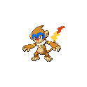
Kantrip - Blaziduck
Firus: A solid fusion. Blaziken and Golduck, both being bird-like, were good choices for the fusion, and the parts are blended together well. Blaziken’s arms and legs both look natural on Golduck’s body and don’t look like they’ve been attached. The only issue with the sprite is that the shading is a bit off in a few places. While the shading on Golduck’s chest and arms work for Golduck, and the shading on the right leg work initially on Blaziken, it looks awkward in the fusion, particularly with the contrast between the darkest body color and the next lightest color. There’s no particular reason that that much of Blaziduck’s body should be shaded, since there’s more body and still the same size head. Also, something important to note: If you flip parts from a Pokémon (as you did with Blaziken’s legs), remember to change the shading so that the light source is still from the upper left. You could also have gotten a bit more creative with adding smaller parts (e.g., adding webbing to Blaziken’s claws), but overall your fusion gets the job done, minus the few shading issues.
Neon Ness: A fairly clean fusion. Technically, it's very seamless and the parts you did splice were done very well. My only real complaint about this is that it feels a bit too clean in the head area. I think Blaziken's spiky crest would have worked well with Golduck's head shape, or some other detail to really make the sprite stand out. There are a few stray pixels on the left arm but it's a very solid entry.[/collapse]
[collapse=Round 28]
Kantrip - Hierune
Firus: A fairly solid sprite. I can instantly tell that it’s supposed to evolve into Sigilyph, which is a good thing. I also like how you added some green to the small piece you decided to keep from the top of Sigilyph to make it better resemble Sigilyph’s main body instead of just slapping in that piece on its own. However, I feel like the baby quality of the sprite is a bit lacking. The parts aren’t much changed or sized-down at all to better fit the new main body; it feels more like a cut-down version of Sigilyph than an undeveloped one, which is more what a baby form should feel like. I don’t think the main body change was a bad one, but I would have altered the wings and tail to make them a bit shorter, instead of just decreasing the number of prongs attached on each.
Neon Ness: Kind of on the fence about how well this works as a "baby". I can see you clipped the lower half of the wings and part of the feet, and shrunk the mid section. But it doesn't seem that much of the fundamental anatomy or shape was changed significantly. If it were to evolve into Sigilyph it just gets more of what's already there--I would have liked to see a bigger difference in how the features were arranged, or even how the coloring/patterns look on the body in a pre-evolved form. From a technical standpoint it's good, it just needs to be pushed a bit further in terms of creativity.[/collapse][/collapse]


 I'm liking all of the entries so far though.