
Japanese Monk
Smash Journeyman
- Joined
- Oct 17, 2007
- Messages
- 370
I made a mock-up of SWF since people often mention how drab this place looks.
Things to note:
I had to basically recreate all the things you see there from the DOJO. I couldnt just copy and edit. I had to recreate all of it. (Either im a n00b at the program I have or it has huge limits) The only thing I didnt do in these two pages are Reggie, the Green Ad, Bowser, and Language flags. I even had to DRAW the SBBB font. I couldnt find any font like the one from the Dojo. (not the blue font though)
The dividers you see are supposed to be from the Brawl Character select screen. Of course its tweaked.
The Japanese words (I think) are supposed to say things related to smash bros.
Some things I took time on, some I didnt. So please don't bother me with posts about things the mock up is missing, or things I goofed on.
Its just supposed to be an example.
I was going to go further with the mockup, tighten it up, create more pages (threads, posts, profile pages ect) but it would be a waste of my time since whoevers running this site probably wont want to change it. And even if you he/she did, I dont know how to "build a site from scratch" all I do is draw......:embarrass (I imagine it cant be THAT hard)
But if asked I would try.")
Anyway enough writing. On to the MOCKUPS!

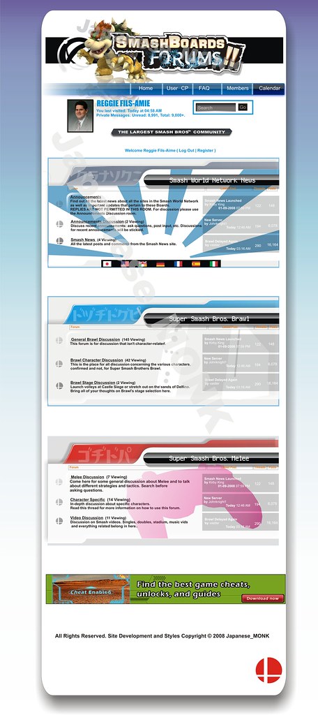
btw, sorry about the watermarks. I didnt know It was going to be so small. I couldnt find a good uploader.
And also, would you prefer either over the one we have now. And if so, which one. Black or White?
--
--
Things to note:
I had to basically recreate all the things you see there from the DOJO. I couldnt just copy and edit. I had to recreate all of it. (Either im a n00b at the program I have or it has huge limits) The only thing I didnt do in these two pages are Reggie, the Green Ad, Bowser, and Language flags. I even had to DRAW the SBBB font. I couldnt find any font like the one from the Dojo. (not the blue font though)
The dividers you see are supposed to be from the Brawl Character select screen. Of course its tweaked.
The Japanese words (I think) are supposed to say things related to smash bros.
Some things I took time on, some I didnt. So please don't bother me with posts about things the mock up is missing, or things I goofed on.
Its just supposed to be an example.
I was going to go further with the mockup, tighten it up, create more pages (threads, posts, profile pages ect) but it would be a waste of my time since whoevers running this site probably wont want to change it. And even if you he/she did, I dont know how to "build a site from scratch" all I do is draw......:embarrass (I imagine it cant be THAT hard)
But if asked I would try.
Anyway enough writing. On to the MOCKUPS!
btw, sorry about the watermarks. I didnt know It was going to be so small. I couldnt find a good uploader.
And also, would you prefer either over the one we have now. And if so, which one. Black or White?
--
--
