• Welcome to Smashboards, the world's largest Super Smash Brothers community! Over 250,000 Smash Bros. fans from around the world have come to discuss these great games in over 19 million posts!

    You are currently viewing our boards as a visitor. Click here to sign up right now and start on your path in the Smash community!

A fresh and sleek new HUD

hamyojo

Smash Ace
Joined
Mar 13, 2012
Messages
551
Location
DFW
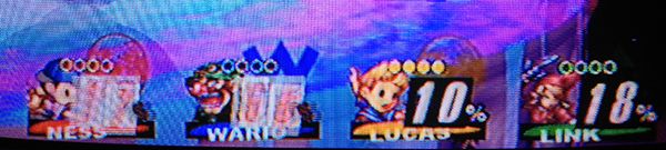
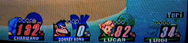
THE NEW GLORIOUS HUD
im so sorry it took so long
2.6B UPDATE:
Also good job PMBR on the new HUD, but you're going to put this mod out of business!

Most recent version: Circle Stock Square Stock
Triangles, too!
Extras and alternate versions here:

Also: vBrawl Squares and vBrawl Circles are up for those of you who want them.
The HUD with names: Download.

And a training mode .pac for it. No names though. Download

Also, JD's HUD without the swipe + player colored hearts. Download (rename it to info.pac).

These all go in the info2 folder. Info_training needs no renaming.

This should hold folks over for a bit while school eats my free time.
Quick tutorial:
OK, since I did a ton of moving elements of the HUD around in my "Classic HUD", here's more or less what you need to do to rearrange stuff for your HUD.

Basically, almost every element of the HUD has its texture stretched to fill a single rectangle, the position of which is controlled by a mere four vertices in one of the model files in info.pac's MiscData[30] folder.

Basically, here's the process you go through for moving a bit of the HUD; say you wanted to move the franchise icon about a third of its width upward. Its vertices are stored in the file contained in the Vertices folder of the InfMark model, and here you can find a number of important information. Look under the "Vertices - Vector3[] Array" tab to find out the vertices' values; in this case, they go from 0.4 to 6.8 X and -1.7 to 4.7 Y, pretty much no HUD stuff uses Z-coordinates. This forms a rectangle of length 6.4 in both directions, so you want to add about 2.2 to all the Y coordinates.

To figure out where to find the data, add the MDL0 Offset and DataOffset together (ignore the negative sign on the former), and convert them to HEX. Then open a HEX editor and look at this offset (in this case, 0xCE0). The vertices will be listed here; since most of the files use "Int16" format with no Z-coordinates, each vertex takes up four bytes, two for X and two for Y (Int8 uses one apiece). The "Divisor" field in BrawlBox tells you how to convert these values to understandable values; first of all, convert the 16-bits to signed decimal integers, then divide by 2 to the power of the "divisor" specified. For example, the first Y value in the file is "4B33" = 19251; divide this by 2^12 = 4096 to get 4.7. We want to add 2.2 to this, so multiply (4.7+2.2)*4096 = 28262 = 6E66 in hex. Similarly, E4CD = -6963 / 4096 = -1.7, add 2.2 to get 0.5 * 4096 = 2048 = 0800 in hex.

That's pretty much all there is to it; I'd suggest using my "fully rectangular HUD" as a base as it's got everything aligned to right angles, including the character names. I haven't experimented with changing the divisors to allow for bigger coordinate values, or even changing the size of rectangles that much, but I presume it's possible. Z-coordinates or changing Int8s to Int16s is probably not going to work, though.

Here's a list of all the files I know how to edit and some useful stats pertaining to them:

Element Model File Vertex File Offset Divisor Format
HP symbol InfDamage0 hp__lambert93 1600 2^6 Int8
% symbol InfDamage0 pers__lambert84 1660 2^6 Int8
Ones digit InfDamage1 (only one) C60 2^13 Int16
Tens digit InfDamage2 (only one) C60 2^13 Int16
100's digit InfDamage3 (only one) C60 2^13 Int16
Baseline InfFace base_lambert108 2C20 2^12 Int16
Name InfFace name__Character_Name_Mat 2D60 2^12 Int16
Series Icon InfMark (only one) CE0 2^12 Int16

The only things I don't know how to edit properly are the BP and BP backdrops; stocks can be moved by changing the bone locations in the InfStock model (pos0 = 6+ stock heart, pos1 = 6+ stock number, pos2-6 = stocks 1-5).

To install open your SD card, go to private>wii>app>RSBE>pf> then bring the info2 and info you get in your downloads and replace the info and info2 that's currently in your SD card. It will replace many files during this, and let it merge/replace/etc, then you're all set up! Restart your Wii and run P:M again and it should all be there!

Additional HUD "Classic HUD" by jdaster64:


Brawl Vault - Direct Link (Dropbox) - Brawl preview - Project: M 2.5 preview

Update 1/7 Melee HUD update:​
Combo video featuring it: http://www.youtube.com/watch?v=DSa2_KAqkRU
-New Melee font​
Update 12/29 (the day after 2.5's release):

Vid preview: http://www.youtube.com/watch?v=b3A1OCTYEJM&feature=youtu.be
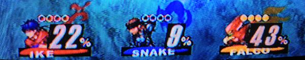

Circle Stocks
Square Stock
-Removed names
-updated for 2.5

(12/13 update) Melee HUD beta!​

shun_one' pid='118126' dateline='1355418858 said:
- No BP's​
- No Face Line​
- No Battle Names​
- Darkened Franchise Logo's​
- vBrawl Stocks (which actually look pretty great now that I can see 'em)​
- vBrawl Damage font​
shun_one' pid='118214' dateline='1355434874 said:
vBrawl screenshot​

Update 12/9:
A little combo video with this HUD in action

-Shortened and re-styled battle portraits
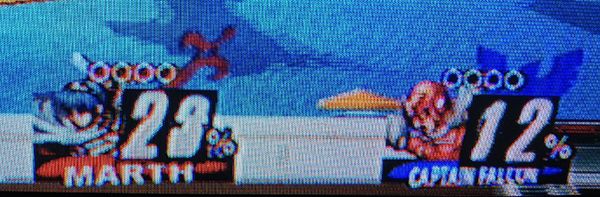
-New square stock options that look like this:

-Removed the colored line behind the names
-shun_one is a super epic guy

Update 11/27:
More clear stocks, new font.

shun_one' pid='113821' dateline='1353952084 said:
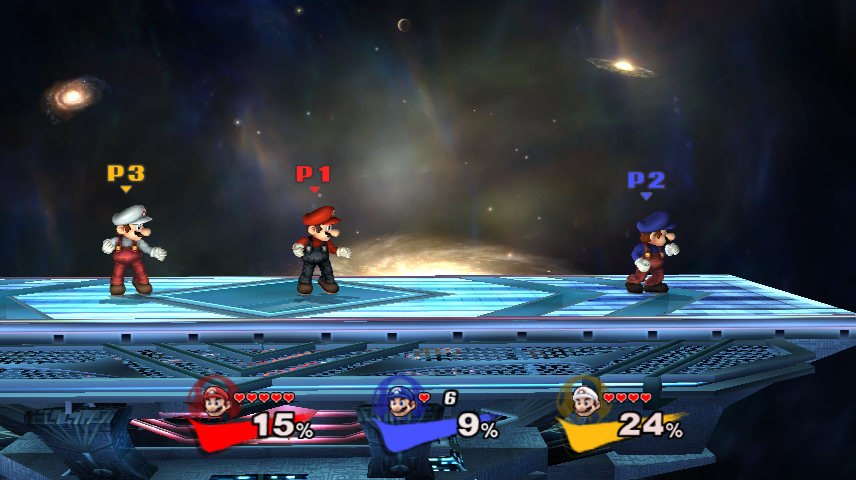
Version one holds defined, solid color circles with white or black borders (for Player 3). It has a new percentage font, and the battle portraits are cleaned up.

Credits to shun_one and jdaster64.
Y'all are epic.


Edit 11/15:
-New HUD progress

shun_one' pid='110611' dateline='1352927952 said:
Link to download of damage counter text redone without black boxes: https://www.dropbox.com/sh/5oq8485uiwp9x5g/aZAgWP-923
(Done by jdaster64)


Old goal mock-up:

Goal is this-ish, or at least to have the knowledge and freedom to make this:
CAC' pid='109594' dateline='1352596214 said:

Feel free to tell me if there's anything to correct.


Original post:

With Project: M seeming to further push itself from Brawl I think there are quite a few more changes that could happen in many things other than the game play.
For example the menu's have the new background and things like the character icons have changed, and stuff like the new font.
I've started to attempt to change it more and further separate the two games.

One thing that stood out to me quite a bit was when you selected a character the little Brawl check-mark icon thing flashed. I took it upon myself to change that to the M from the P:M symbol.

I found the check-mark thing in common5>common5_en>sc_selcharacter_en>MiscData[30]>Textures>MenSelchrCoinEff

Original:


Finished, but could probably be better centered to the button:


My next plan is to change the red and yellow flashing colors behind READY TO FIGHT to blue and purple, like P:M.

I've already set the character icons to sometimes be behind each other, like how Dr. Mario, Falco, Pichu, etc are set slightly back on the z axis compared to the rest of the cast.

Has anyone else done/made anything like this? Ideas?

(( Will update more soon, and with the reply logs! ))
 

hamyojo

Smash Ace
Joined
Mar 13, 2012
Messages
551
Location
DFW
Is the latest HUD compatible with vBrawl?
It's made for P:M with P:M textures and such, so it works, but a lot of it will be broken, probably.
I haven't tested it myself so I don't know for sure.
 

sGale

Smash Journeyman
Joined
May 14, 2011
Messages
253
Location
Sweden, Stockholm
NNID
sGaley
3DS FC
4484-8977-1421
Well, might as well request an vBrawl version :p Does Shun post on SWF?
 

hamyojo

Smash Ace
Joined
Mar 13, 2012
Messages
551
Location
DFW
Well, might as well request an vBrawl version :p Does Shun post on SWF?
I've seen 'em post once here, he probs will again.
And maybe I'll do a vBrawl one, Shun works too hard.
But if I do it it'll be a bit, I still have a lot of work to do on this thread.

Oh! And the Melee HUD works perfectly with vBrawl, to my understanding.
 

hamyojo

Smash Ace
Joined
Mar 13, 2012
Messages
551
Location
DFW

Shun_one

Smash Ace
Joined
Jan 2, 2013
Messages
910
Location
Addison, IL
NNID
not_shun_one
Thanks for the thread port, Hamy.

To those of you asking for a vBrawl pack, I'm working on it. The smashmods forums closing made me realize that a lot of my PM specific stuff would need to be ported for vBrawl use in the move to smashboards.

I went back to figure out a way to make a smaller HUD like this compatible with regular Battle Portraits and I've almost got a good solution. My progress might be slow for a bit, but I'm still hammerin' away.
 

hamyojo

Smash Ace
Joined
Mar 13, 2012
Messages
551
Location
DFW
Thanks for the thread port, Hamy.

To those of you asking for a vBrawl pack, I'm working on it. The smashmods forums closing made me realize that a lot of my PM specific stuff would need to be ported for vBrawl use in the move to smashboards.

I went back to figure out a way to make a smaller HUD like this compatible with regular Battle Portraits and I've almost got a good solution. My progress might be slow for a bit, but I'm still hammerin' away.
To those of you asking for a vBrawl pack, I'm working on it. The smashmods forums closing made me realize that a lot of my PM specific stuff would need to be ported for vBrawl use in the move to smashboards.
To those of you asking for a vBrawl pack, I'm working on it.
I'm working on it.
grr.

Thanks for the thread port, Hamy.
Mmhm ^.^


These are looking good! Nice work.

:phone:
P:M 2.6, y'all should put this in it.
I'll give you a hug~
 

Shun_one

Smash Ace
Joined
Jan 2, 2013
Messages
910
Location
Addison, IL
NNID
not_shun_one
Sorry, Hamy! But don't fret! The latest one is a stand-alone info.pac. I'm trying to x-out the need for remaking every single Battle Portrait. I'd be happy to have your assistance man (and anyone else interested)
 

#HBC | Joker

Space Marine
Joined
Feb 2, 2012
Messages
3,864
Location
St. Clair Shores, Michigan
NNID
HBCJoker
3DS FC
1864-9780-3232
This HUD looks incredibly sharp. I'm using it with the Pixelated portraits and the square stocks. Very stylish. With the Pixel portrait CSS, it all looks very uniform, and brings the whole "this is a new game" feel to full light for me.
 

iLink

Smash Champion
Joined
Oct 17, 2007
Messages
2,075
Location
NorCal
I liked how it looked with the names. It looks kind of incomplete to me without them.

They look nice none the less.
 

uCooL

Smash Ace
Joined
Jan 2, 2013
Messages
747
Location
Manteca, California
NNID
SuperMurio
I love the new HUD so far! Simple and clean. Ive always hated how big the vBrawl one was... it always seemed to get in the way of the action and make the screen more cluttered than it should be.(in my opinion).

On that same note, is there anyway to move the entire HUD lower on the screen? I know each graphic has a file size limit, but does it also have an aspect ratio limit? the reason i ask is maybe it would be possible to expand the canvas on each texture upward by 15 percent and fill the empty space with brawls transparency color? its magenta right?

on a similar, but different note, a really cool minimalist HUD idea i had is to remove the BP's entirely and make the number percentage text the same color as the corresponding player port/stock/shield color.

For example p2's percentage on screen would start very light blue, and as he took damage, the numbers would become darker and darker blue. same for p1's red color...ect.
 

Shun_one

Smash Ace
Joined
Jan 2, 2013
Messages
910
Location
Addison, IL
NNID
not_shun_one
For all those who enjoy it, thanks!

iLink, I haven't forgotten you! You'll have your version with Names before the week ends if all goes according to plan.

As for Murio's minimalist idea, I don't think it's possible to change the color of the damage % for each player individually.
 

uCooL

Smash Ace
Joined
Jan 2, 2013
Messages
747
Location
Manteca, California
NNID
SuperMurio
For all those who enjoy it, thanks!

iLink, I haven't forgotten you! You'll have your version with Names before the week ends if all goes according to plan.

As for Murio's minimalist idea, I don't think it's possible to change the color of the damage % for each player individually.
well thats too bad, maybe just leaving the red,blue,yellow,green streak (but accentuating it) behind the percentage numbers would work?

no names or bps. just a splash of the corresponding color for each player.
 

iLink

Smash Champion
Joined
Oct 17, 2007
Messages
2,075
Location
NorCal
For all those who enjoy it, thanks!

iLink, I haven't forgotten you! You'll have your version with Names before the week ends if all goes according to plan.

As for Murio's minimalist idea, I don't think it's possible to change the color of the damage % for each player individually.
Thanks a bunch. Take your time if you need to, I'm not in a hurry.
 

#HBC | Joker

Space Marine
Joined
Feb 2, 2012
Messages
3,864
Location
St. Clair Shores, Michigan
NNID
HBCJoker
3DS FC
1864-9780-3232
I just noticed something weird. The 0 in the numbers is smaller than all the other numbers. It looks kinda weird. Is it like that by design, or is mine just screwy? it doesn't look bad when it's 0%, or 30% or wutever, but when you're at like 105% or something like that, having the smaller number in between 2 bigger ones looks weird.

EDIT: watched the combo video demo thing, and their 0 is fine... I guess I'll try redownloading, unless it's just because the Square stock one is the only one that's like that?

EDIT2: yea I redownloaded it, and it's the same deal. I think the Square Stock version just has 0 at a smaller size than the rest of the numbers. To tell the truth, I would very much prefer ALL the numbers to be that size. I like the smaller size better.
 

Shun_one

Smash Ace
Joined
Jan 2, 2013
Messages
910
Location
Addison, IL
NNID
not_shun_one
Thanks for the catch PrivateJoker! It's not supposed to be like that.

The origin of that was an early version of the circle stock that got fixed, but I forgot to update the Square version. Either myself or Hamyojo will be able to fix it ASAP.

EDIT: Here You go. Replace the info.pac with this one (make sure to rename it properly),
 

hamyojo

Smash Ace
Joined
Mar 13, 2012
Messages
551
Location
DFW
I just noticed something weird. The 0 in the numbers is smaller than all the other numbers. It looks kinda weird. Is it like that by design, or is mine just screwy? it doesn't look bad when it's 0%, or 30% or wutever, but when you're at like 105% or something like that, having the smaller number in between 2 bigger ones looks weird.

EDIT: watched the combo video demo thing, and their 0 is fine... I guess I'll try redownloading, unless it's just because the Square stock one is the only one that's like that?

EDIT2: yea I redownloaded it, and it's the same deal. I think the Square Stock version just has 0 at a smaller size than the rest of the numbers. To tell the truth, I would very much prefer ALL the numbers to be that size. I like the smaller size better.
Updated the OP! Everything is (probably) correct now, thank you!
 

Comeback Kid

Smash Champion
Joined
Dec 25, 2009
Messages
2,431
Location
Parts Unknown
Is any work being done on the minimalist Meleesque Hud?

The fancy ones look nice but I think a less distracting, simple clean one with just the logo and damage % under the stocks would be an excellent change for me.

I don't wanna download it until the most up to date one is available though since it says it's still in beta.
 

hamyojo

Smash Ace
Joined
Mar 13, 2012
Messages
551
Location
DFW
Is any work being done on the minimalist Meleesque Hud?

The fancy ones look nice but I think a less distracting, simple clean one with just the logo and damage % under the stocks would be an excellent change for me.

I don't wanna download it until the most up to date one is available though since it says it's still in beta.
It will most likely forever be in beta.
Think of it like Project:M 2.5, it's the most recent beta but it's still pretty nice and could be considered a finished product.
 

Little Nemo

The Dream Master
Joined
Oct 18, 2012
Messages
357
Location
Moses Lake, WA
NNID
LockableFaceman
So simple and cleeeeaeaeaean.
I can't decide whether to use Melee once it releases of the new smaller BP style. I love the shape of the BPs now.
You guys have been giving me too many things lately.

:phone:
 

Comeback Kid

Smash Champion
Joined
Dec 25, 2009
Messages
2,431
Location
Parts Unknown
It will most likely forever be in beta.
Think of it like Project:M 2.5, it's the most recent beta but it's still pretty nice and could be considered a finished product.
Ok, just wanted to be sure it wouldn't freeze my game or have any outstanding issues related to it first.
 

Shun_one

Smash Ace
Joined
Jan 2, 2013
Messages
910
Location
Addison, IL
NNID
not_shun_one
Is any work being done on the minimalist Meleesque Hud?

The fancy ones look nice but I think a less distracting, simple clean one with just the logo and damage % under the stocks would be an excellent change for me.

I don't wanna download it until the most up to date one is available though since it says it's still in beta.
I still work on it, but I don't want to do anything more with it until I can get a really good solution for player recognition. The Beta version is basically the most up to date one at the moment.

Also: vBrawl Squares and vBrawl Circles are up for those of you who want them.
 

Kati

Smash Lord
Joined
Mar 22, 2010
Messages
1,471
Love the melee hud. One never has to worry about bp's matching custom character edits.
 

\Apples

Smash Journeyman
Joined
Jan 3, 2013
Messages
488
Location
Kirkland, Washington
There's an NES style HUD out there that uses hearts and I personally really like it. Not sure how well it'd go with this HUD though.
 

hamyojo

Smash Ace
Joined
Mar 13, 2012
Messages
551
Location
DFW
Sure, no problem, people mentioned it so I just decided to do so. What shape you guys want next?
Hearts and stars maybe not what I want next to do though.
Hearts we don't think quite fit the simplicity, but if you want to we may make Parallelograms, hexagons, diamonds, and maaaybe a smash icon if it'd fit properly.
 
Top Bottom