• Welcome to Smashboards, the world's largest Super Smash Brothers community! Over 250,000 Smash Bros. fans from around the world have come to discuss these great games in over 19 million posts!

    You are currently viewing our boards as a visitor. Click here to sign up right now and start on your path in the Smash community!

Wireframe - Revision 3 - Please Comment!

AlphaZealot

Former Smashboards Owner
Administrator
Premium
BRoomer
Joined
Jul 6, 2003
Messages
12,731
Location
Bellevue, Washington
Smashers,

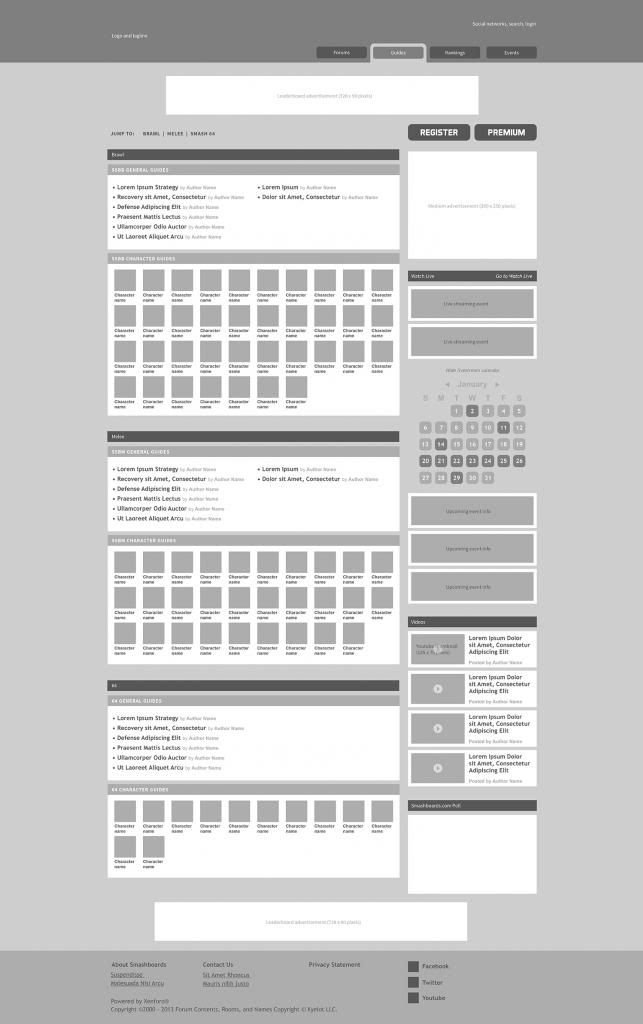
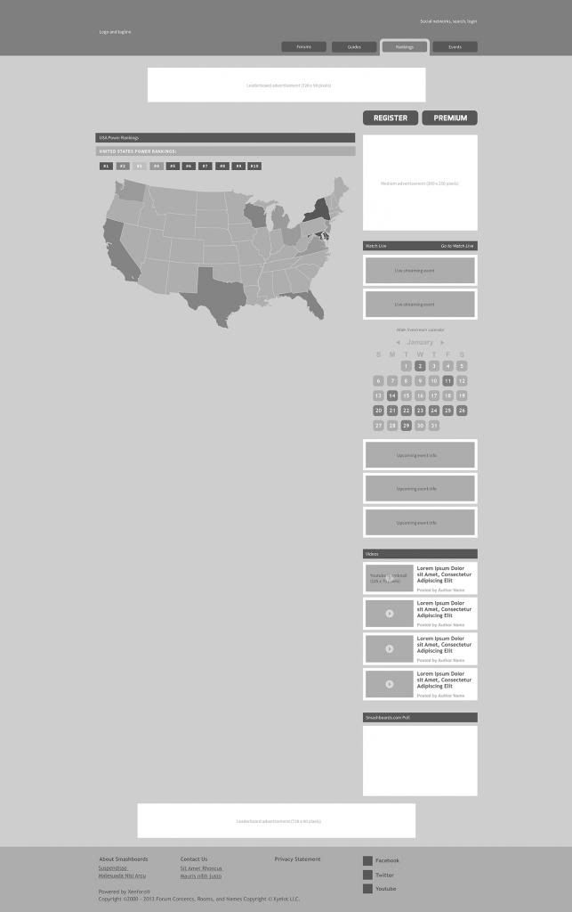
The following is a preview of the new Smashboards.com homepage. This is what is commonly referred to as a wireframe: it shows the layout and organization of the new site, without the graphics and look and feel added in. There is a lot that needs to be considered with the new front page: what content to focus on, where to put it, how much to feature, etc. There is still time to make changes to this - if you like something please let us know, if something is missing please let us know, and if something just looks plain wrong please let us know! Honest, thoughtful, well thought out critiques will be most helpful. This is "revision 3" so this is the last revision before we have a final design. We will only be taking input for a short time (likely less than a week), so speak up now!

This would also be a good time to suggest color preference: specifically light or dark.

Here it is:
 

Shadic

Alakadoof?
Joined
Dec 18, 2003
Messages
5,695
Location
Olympia, WA
NNID
Shadoof
Dark theme please.

Not much else to say at the moment, but dark themes are always superior. Plus basically all the current message board themes are dark, so it goes well with that. (Vibrant has that gigantic bar of eye-burning on the top that's white for some reason though.)
 
D

Deleted member

Guest
looks very tight. bit darker wouldnt hurt.
Im wondering, the image shows the forum selected but it looks more like a frontpage than the actual forum
 

Bones0

Smash Legend
Joined
Aug 31, 2005
Messages
11,153
Location
Jarrettsville, MD
Dark theme please.

Not much else to say at the moment, but dark themes are always superior. Plus basically all the current message board themes are dark, so it goes well with that. (Vibrant has that gigantic bar of eye-burning on the top that's white for some reason though.)
Yes, please. Are the current skins staying on the forums while just the homepage changes? I need my Smash Blue.
 

1PokeMastr

Smash Champion
Joined
Dec 10, 2009
Messages
2,251
The Paprika Killer has a point, even though forum is selected, it looks nothing like a forum.
Which concerns me somewhat, I like the way the forum directory is right now.
It's REALLY easy to navigate in my opinion.

I also have a question about the "guides" tab, because most guides would be in their respective forum, and there literally could be a guide on anything which would be too cluttered to be organized.

It's also a tiny bit too bright, I like the "rankings" idea too, because it's there, easy to access and I assume it'd have one for regions, as well as the respective smash games, and it would be updated on a weekyly/ monthly basis ?

If so.. this looks like it's going to be good ^-^
 

AlphaZealot

Former Smashboards Owner
Administrator
Premium
BRoomer
Joined
Jul 6, 2003
Messages
12,731
Location
Bellevue, Washington
Smashers have spoken - we will be going dark!

Forum shouldn't be highlighted when viewing the homepage, good catch, don't worry that tab will be for getting into the Xenforo section of the site - Xenforo being our replacement for vBulletin forum software.

Guide landing page (didn't upload it so unfortunately you can't zoom in on it like the homepage):


The guide section will essentially highlight and link to the best forum content. Think of it like a site map, but for Smash forum content.

We have a couple different options for rankings. At first we will be highlighting the content that already exists: power rankings, possibly the SWF rankings, etc. Should look something like this:


Overtime, since it will require quite a bit of development, I would like some type of tie in with tiopro so that users can actually have their profile link to specific tournament results and we could create a more sophisticated rankings based off of actual tournament data.

Bones: we will be losing all skins and this will occur before we even get a homepage because the skins are linked to vBulletin and we are switching to Xenforo in the next week or so.
 

thespymachine

Smash Ace
Joined
May 23, 2006
Messages
830
Location
Henderson, NV
I like the rankings page.

Question about the calendar: will it act just like our current one, just with major events/streams highlighted?
 

thespymachine

Smash Ace
Joined
May 23, 2006
Messages
830
Location
Henderson, NV
Theoretically - is there something else you would like to see?
As far as I can think of right now, not really.
The best thing I can come up with is similar to what Scar mentioned with streams having tags for players/regions, and you can set up your account to have certain tags for you to follow.

I just really like the calendar. And having it viewable on front page is great.
 

BlueXenon

Smash Lord
Joined
Jul 5, 2011
Messages
1,387
Location
New Jersey
NNID
Blueoceans26
3DS FC
3050-7832-9141
Can you please make the smashboards arena (for wifi players) easier to notice? so it can become more active.
 
Joined
Mar 15, 2008
Messages
10,050
How about making it so that the tournaments in your region are the ones that show up on the front page (along with Major tournaments)? You can use an IP to pick up somebody's location, but if you're not into that then you could just make it a member's only thing, and during registration, they choose one of the many regions we have (PacWest, Midwest, Australia, etc.).
 

1PokeMastr

Smash Champion
Joined
Dec 10, 2009
Messages
2,251
Would it be possible to see what the forum page would possibly look like ?
 

V-K

Smash Ace
Joined
Jan 26, 2009
Messages
540
Location
Germany
Looks very promising but please don't make it too dark, some of the Smashboards themes really hurt my eyes.
 

Vinylic.

Woke?
Joined
Jul 15, 2010
Messages
15,866
Location
New York, New York
Switch FC
SW-5214-5959-4787
Oh yeah, let me mention that I do not want gif avatars if the update does allow it.

I do not ever want them.

Ever.
 

Vinylic.

Woke?
Joined
Jul 15, 2010
Messages
15,866
Location
New York, New York
Switch FC
SW-5214-5959-4787
And also, regarding to the suggestions thread, it would be nice to add in a 3DS FC# in the "about me" section.
 

Ryuker

Smash Lord
Joined
Sep 16, 2003
Messages
1,520
Location
The Hague , Netherlands
Looks really clean, nice and easy to navigate. Big step forward.

Couple of questions:
I have my doubts giving these twitter acounts such a prominent spot, why not place a twitter stream on the side and then instead place the highlighted player accounts in the current top twitter spots? If your looking for someones twitter then you'll probably look for their account anyway. Your more likely to follow a twitter name if you see it's frequently active.

Whats upcoming event info? You already highlight the upcoming tournaments so how does this differ?

How do vid's show up in the widget on the right? Is this curated or does it scan vid discussion somehow?

It would be nice to have a live stream button next to the tournament. Perhaps an icon that links to a updated thread of the tournament since these are always made anyway.

Have you considered a newbie introduction page? With the arrival of smash 4 your bound to get a lot of new players still inexperienced with the game.

Wouldn't it be cool to embed the current top live stream on the top + chat(under the header ofc). Only when major tournaments occur.

What's planned regarding a chat? Ever since dc++ I feel everyone scatters over numerous chats and only really enters big chats during live streams.


Not related to the homepage but to the forum features:
Since I see all the social features, I was wondering if it would be possible to add a rivals option like on allisbrawl. I think if this works well it could provide extra motivation to improve for players that aren't close to top 5 yet.

Thanks for all the hard work.
 

SFA Smiley

The SFA King
Joined
Jan 19, 2010
Messages
2,640
Location
Virginia/Arizona
I'm really interested in the region aspect of it. Is it possible to inform us of smashers in our area or state registered here? and possible a tournament finder aspect that will show a tournament in your state and the date it's happening etc etc. That would really help scenes. And will sub PRs count as well? Like California has a NorCal and SoCal PR.
 

Isatis

If specified, this will repl[0x00000000]ce the
Premium
BRoomer
Joined
Dec 18, 2008
Messages
10,253
Location
San Francisco, CA
NNID
reverite
Bionic talks about it here: http://twitch.tv/vgbootcamp/b/362739584 - start watching at 1:35 or so.
I really regret not getting rid of the bedhead.

Looks very promising but please don't make it too dark, some of the Smashboards themes really hurt my eyes.
Things will be similar to the themes that are on Smashboards -- although yes, I'm trying not to make it as dark. There should also be a "light" theme if you don't like the default dark.

And also, regarding to the suggestions thread, it would be nice to add in a 3DS FC# in the "about me" section.
Noted.

Not related to the homepage but to the forum features:
Since I see all the social features, I was wondering if it would be possible to add a rivals option like on allisbrawl. I think if this works well it could provide extra motivation to improve for players that aren't close to top 5 yet.
This is a maybe, if SSBPD ever gets off of the ground again.
 

VA

Smash Hero
Joined
May 18, 2006
Messages
5,004
Location
Brighton, UK
I'm v hyped abt this. i think this change from basic text based forum to something with actual content will be a big step for the community. major damn well props for getting this to happen.
 

Orngeblu

Smash Ace
Joined
Sep 23, 2012
Messages
748
Location
Rock Hill, South Carolina
3DS FC
0104-1846-4809
Loool

Can you please make the smashboards arena (for wifi players) easier to notice? so it can become more active.
I totally agree with this. Maybe a button on the top saying "Smash Boards Arena".

Also, I can't wait to see the final product of this! :3 Getting better and better! I definitely like the idea of rankings.
 

Broshadian

Smash Rookie
Joined
Oct 27, 2011
Messages
6
Location
Toronto, ON
I think this is great, I think there are people like myself that aren't really good with forums and this will definitely be a lot less confusing. I'm still crap with forums which is kinda holding me back from participating in stuff, perhaps even tournaments.
 

hamyojo

Smash Ace
Joined
Mar 13, 2012
Messages
551
Location
DFW
I really like how that looks, but I'm not sure how much it fits Smash Boards.
When people think of Smash Bros they generally think of just one of the games, not all of them mixed together. And that's a good thing, it's super cool how unique each one is so far.
But on the front page it's all of 'em jumbled together and I don't see any "Brawl" or "Melee" buttons to go to that section of the forums. That should be the first priority, as, I'd imagine, most people don't go to see everything at once.

If I were designing it I'd put the featured news at the top, 'cause there's always news and people need to stay informed, then under that there'd be three squares. Each one would represent one of the games, (IMO going Brawl, then Melee, then 64.) Even though 64 is barely discussed, it still deserves a spot on the home page. It's the start of something amazing, after all. Oh, and each of the squares would say the name of the game, then have links to the sub-forums (General, character discussion, Media/Mods/etc.)

Of course Smash 4 is coming soon and I'd imagine with that Smash is going to become a more discussed topic, and we'll get more people coming for it. I'd just add another box, all the games still being in reverse chronological order. If adding Smash 64 at the end is too much, which is definitely understandable, I'd put it in a tiny box, and add Project:M under it in another box.

I'm biased towards Project: M as something I want on the front page, as I play it a ton, but it's probably too much to be right at the top with the other big games. At least for now.


If I typed in SmashBoards.com and that white and grey web page showed up I may think I'm on the wrong website. The black and orange theme is beautiful, please keep it ;-;

Oh and a link to an IRC chat on the front page can work wonders. It's scary to make a post on a forum, it stays there for ever, constantly being judged as the writer worriedly awaits a reply.
Stuff of nightmares, right there.
And, no matter how well your website is designed, people will always post in the wrong place, often asking for something that's just a click or two away. An IRC could fix a lot of that, allowing people to ask there instead of spamming up the forum.

These are all notes, the redesign looks great so far, there's just a few things like game distinction that needs to be shown more.
 
D

Deleted member

Guest
the only theme I can think of that has orange is oen of the DR skins but that doesnt really have black in it...
 

Giygacoal

Smash Lord
Joined
Apr 30, 2011
Messages
1,651
Yeah, let's get Project M noticed. It hasn't stopped having tournaments, so it's a worthy addition to the main page. PM is huge for the community, and if TF players come here after EVO out of curiosity, we need to show that PM is important (or at least will be soon) too.
 

Firestorm88

Smash Lord
Joined
Jun 4, 2005
Messages
1,249
Location
Vancouver, BC
Please at least have a light option. I absolutely hate dark themes and it's one of the reasons I visit SmashBoards less often than I used to. And if there's no light option, I think following the principles would be helpful: http://www.webdesignerdepot.com/2009/08/the-dos-and-donts-of-dark-web-design/

I personally don't believe dark is the right option given how the wireframe looks and what the purpose of the website is going to lean towards (content-heavy).

I think a lot of current users are used to this, but SmashBoards will continue to grow -- especially with Smash 4 -- and I think going with the option that the majority of the internet prefers is better than going with the familiar option.


hamyojo

Smash Ace
Joined
Mar 13, 2012
Messages
551
Location
DFW
WOT!? What black and orange theme!? :o Sounds interesting. I want to see it!

But really, I have no idea what you're talking about when you say black and orange theme.
Yeah, let's get Project M noticed. It hasn't stopped having tournaments, so it's a worthy addition to the main page. PM is huge for the community, and if TF players come here after EVO out of curiosity, we need to show that PM is important (or at least will be soon) too.
!!! My bad.
Er, I always thought the orange looked great with the default theme.
http://img832.imageshack.us/img832/1809/smashboards.png
See? Orange is there.

Please at least have a light option. I absolutely hate dark themes and it's one of the reasons I visit SmashBoards less often than I used to. And if there's no light option, I think following the principles would be helpful: http://www.webdesignerdepot.com/2009/08/the-dos-and-donts-of-dark-web-design/

I personally don't believe dark is the right option given how the wireframe looks and what the purpose of the website is going to lean towards (content-heavy).

I think a lot of current users are used to this, but SmashBoards will continue to grow -- especially with Smash 4 -- and I think going with the option that the majority of the internet prefers is better than going with the familiar option.

This is a completely valid point. But a darker theme is just... more fun. It just is!
There's no valid reasons to change the current colors of the site. They're good colors and many of us know them well.
Let alone the face that most sites have white back grounds, so why conform? Not to be a hipster, but that's just no fun.

I was thinking the site could take inspiration from whatever Smash 4's box art could be. But who knows what that will be, let alone how it'll vary from region to region.

So...anybody else questioning the usefulness of having a poll on the front page? I don't want that facet of AiB in my smashboards.
Dude.
Polls are the ****.
Everyone loves those things.
 

Juggleguy

Smash Grimer
Premium
Joined
Aug 16, 2005
Messages
9,354
Location
Ann Arbor, MI
I'd personally prefer a darker theme, and I'm also in the "frontpage polls are too AiB-like" camp.

I hope the rankings will be compatible with both TioPro and the old tio -- as it stands right now, 99% of the tournaments that have ever existed up until today are still in the old tio file format, and it would be a shame if we had to convert them all to TioPro.
 
Top Bottom