TheTrueBrawler
Smash Demon
Ike's renders in order from best to worst:
Smash Brawl
Smash Ultimate
Smash 4
Smash Brawl
Smash Ultimate
Smash 4
Last edited:

Welcome to Smashboards, the world's largest Super Smash Brothers community! Over 250,000 Smash Bros. fans from around the world have come to discuss these great games in over 19 million posts!
You are currently viewing our boards as a visitor. Click here to sign up right now and start on your path in the Smash community!
 : 7/10: Kind of ominous but that's really it.: 7/10: I like the new look but his pose seems to be more intimidating than heroic.: 5/10: Every time I see this one I feel like he's groping his sword. 8/10: a simple pose that completely nails the character. I really like it. 10/10: easily Mario's best render, pose wise. It's Mario's signature jumping animation, how could you go wrong with it? 4/10: easily Mario's worst render. What the heck is this karate-like pose? 5.5/10: I dislike this pose too. I generally don't like when Smash portrays Mario as this angry fighter. The fireball makes Mario even more aggressive and was totally unnecessary. 6.5/10: I generally don't love Ultimate's renders. They are too dynamic for a pose that should be how you conceive a character. This is no exception. Really n-air was the best way to portray Mario? Mario is still angry in this render but luckily not as much as in Sm4sh's...<<<<< 7/10: this render is... awkward. It's fine but not very DK-ish. 6/10: not a big fan of this render either. It's once again too weird and not faithful to DK. 8/10: there we go! This render highlights DK's muscle and strength, two traits he will often boast about. A bit too angry for my taste, but we get those. 7.5/10: where is DK going? He seems in a hurry. I kinda like this pose, but I preferred the one from Brawl. 9/10: a great render. The grin is unparalleled and DK's powerful body is shown off greatly in this pose <<<< 5.5/10: not going to lie, even the 2D style doesn't save this pose (and I love the 2D style they used in Smash 64). It's just too basic. 8/10: how do we improve from the previous render? We make Link stepping forward. Cool. They created a great render in just one simple step (pun intended). This render has Link way readier for the fight. 5/10: Smash 64 remastered. But in 3D. 2/10: WHAT?!? Why did they make Link jump in his official render? It's like the one thing he never did before Breath of the Wild! It also looks really bad on the amiibo. 8.5/10: how do we improve from Melee's render? We make Link more battle ready. Great! I love blue, it's my favorite color, so I naturally like BotW style for Link. If only he were still left-handed, like me...<<<<< 7/10: references Super Metroid's artwork. It's good. 7/10: still references Super Metroid's artwork. It's still good. Has virtually no difference from the one from Smash 64. 7.5/10: slightly better. It's more battle ready without being too dynamic either. 8.5/10: great render. It's perfect with her Other M suit. I like how it looks like she's coming out from a save point. 8/10: the only thing I would have liked more is Samus's design from Metroid: Samus Returns. A bulkier suit would have looked better with this pose.=<<< 3/10: good Lord what did they do to you? This... isn't Yoshi. no rank. I hate Yoshi's model from Melee. It's the worst in all of Smash. I can't rank Yoshi's Melee render properly. 7/10: aw it's cute. 9/10: it's so cute and charming! I love how he walks away but still looks at the camera. 8/10: it's in between Brawl and Smash 4. I like it less than Smash 4 just because he used to walk away and I found it more charming. a very long string of <<<<<< 8/10: hi Kirby, how are you? It's simple and effective, I love it. 7.9/10: nearly identical to 64's, but I like it a very tad bit less. Maybe it's the proportions? Or the 3D style? I don't know. 8/10: despite being very different from Smash 64 I can't help but like both renders the same. I love Kirby 11/10: Kirby sitting and resting is the cutest thing I've ever seen in a video-game console. 10/10: I will admit it, I love Kirby's Ultimate render despite its "dynamicity". How a Pink Puffball can make me change my opinions so quickly.<=<< 2/10: it's bad. It's weird. I don't like it. 6.5/10: it's decent, I guess. I can't appreciate Fox too much, sorry. 7.5/10: one of Fox's best render. I like the expression. 4/10: it's awkward. And he's going to dab. I don't like it. 8.5/10: it's brilliant. How do you make a good Fox render? Simply put him like he's going to shoot! I'm surprised they never made a render where Fox contacts the base with his headgear.<<<< 9/10: we already have a great one. I love the smart yet cute expression.4/10: I thought I liked fat Pikachu until I saw this render.5/10: not too bad, but very awkward. What is it doing with the front legs?6/10: it's too basic. Pikachu is standing like it was saying: "Come here, bro."8.5/10: I want to carry this Pikachu with me for the rest of my life. Also, did you know that Pikachu Libre is a girl?<<<<< 8/10: not gonna lie, I really like this artwork and in my opinion nails the character. He's goofy and is like: "What am I doing here?" 8/10: hilarious. A bad render but really funny.8/10: despite all three renders being very different, I like them equally. This one nails Luigi's character as well, being calm. I love Luigi's rolled pants legs too. 1/10: terrible. What is this? 4/10: it's very funny and all, but why? Luigi is no weirdo, Luigi is shy, Luigi is fearful, but not a weirdo. I'm afraid Sakurai sees him as such, and the last two renders confirm it.<<<== 8/10: rosy cheeks, a baseball bat and a small child. How could you go wrong with it? 6/10: I'm not completely sure I understand what he's doing. 5/10: remember when I said I dislike when renders are too dynamic? This is the exact opposite. This render is too static to be enjoyable. 8/10: the way he's pointing is cute. I like it. 9/10: Ness's best render. I like the confident pose and the baseball bat. It's a pity they never did a pose with the yo-yo.<<=< 8/10: I gotta say it: the 2D style fit Falcon better than anyone else. Maybe it's just because I love superhero comic books. A side note: this is the coolest stock icon in the series IMO. 7/10: quite weird, can't lie. But fits the character. 9/10: the signature military salute. It took them too many years to realize it is a good pose.6/10: why do they do this? They do a good render then they do a weird one. This kick is nowhere to be found in Falcon's moveset! 8/10: a great pose, looks like he's winding up a Falcon Punch (Faruconi Panchi for the Japanese)<<=<== 2/10: I'm not gonna bother ranking the same render three times. This is just straight up lazy. And so I'm going to be lazy as well. 7/10: Jiggs's spinning. Yay. 7.5/10: despite being similar to the first three renders, I think I like this one a bit more than Smash 4's. It must be the fact that Jigglypuff is tilted compared to the floor. It makes the character even goofier.==<<<<:7/10:8/10:9/10
 > 7.5/10: I really like Peach, so to me, 7.5/10 is a low score. However, the pose seems kinda off to me. I don't know, maybe it's the placing of the hands. 8.5/10: a very good render that nails the character to the point. I like the static yet elegant pose of the hands and the mild expression. 9/10: a more dynamic approach to Peach. I love this render too, more than any other one seen before. The only thing that prevents it to get the perfect score is the face. It has something... off... I don't know how to describe. 10/10: perfection. I think Peach's render in Ultimate may be the best in the game and one of, if not the best, in the entire series. Everything is great: the pose, the expression, the dress, the parasol. It's a dynamic render but still greatly shows the character. I could go on and on.<<< 3/10: gross. What is this? Godzilla? Why are all the colors so weird? And should those short arms remind me of a t-rex? Because to me, t-rex are just weird dinosaurs with very, very short and underwhelming arms. 7/10: I like this render way more. But here we have a problem with the character itself. Sakurai envisions Bowser as a beast, not in line with the current Mario games and I like the latter representation more than Sakurai's. So it does a great job representing Bowser as a beast, but... I don't like it.7/10: I give this render the same score as the previous one because I think that this one's colors are much better and more in line with Bowser, but I still prefer Brawl's pose and expression.5.5/10: I don't like this render. It's just too savage to me. Just look at Bowser's spirits and you'll get why I dislike this render.<<<= 5/10: the Climbers are too far away from each other, making the duo more like a sum of two individuals. That's what they should avoid when rendering Nana and Popo. 8/10: cool (pun intended)! They coupled Nana and Popo so that they appear as a true duo. They're focusing on the same target. The only thing off in how Nana holds the hammer because it makes it hard to see which color will she use. 7.5/10: this is a good render, make no mistake, but the two Climbers are too far away from each other. That's why I like Brawl's render a bit more.<<< 7/10: I kinda like this render, but it greatly shows why I don't love dynamic renders: they make it hard to see your character. Luckily, you'll never get to see this render in the CSS. 6.5/10: Sheik does this weird sidestep. It looks like she's dancing. I don't like this render too much because, again, it's too dynamic. Plus, the positioning of her arms makes it really hard to see the character. 6/10: why do they always put Sheik's arms in a weird way? They got it right with Greninja (spoiler alert)! Jokes aside, the same critics seen in the previous point apply here. But somehow I like this render less. 8.5/10: this is a great render! The right arm is in this weird position, but it doesn't cover her whole body. In addition to this, Sheik's new design is great, I really like it! She even got one of her best player's signature piece of clothing!<<< 8.5/10: look, I know that the render is supposed to be a reference to a moment in OoT, but simply the fact that she doesn't face the camera pisses me off. But after all, she's a princess, she can do it. So that's why I like the render so much. It has everything right about Zelda (from OoT, at least, the best is yet to come). 9/10: holy moly. TP had the best designs for both Zelda and Ganondorf IMO. This render represents Zelda's royalty greatly and elegantly. Unlike for her alternate persona, the arms are the best part here. Particularly, the positioning of the hands. 10/10: where do I begin with? Take the previous entry and multiply everything you read x10. There's virtually nothing wrong with this render. Also, should I be concerned, because my favorite renders are the princesses' ones? 6.5/10: I hate Zelda's redesign for Ultimate. Did we need a second Peach? AND I LOVE PEACH! But Zelda used to be stern. Now she's just... a bimbo. And the render even fails to represent it.<<<
 7.5/10: first and foremost why is Dr. Mario in the game? Secondly, I kinda like this render. It's fun. It shows a doctor, but it's definitely more Mario. It's mind blowing that Doc's Melee render represents Mario better than his render from Brawl onwards... 4/10: good lord Mario, calm down! This render is kinda scary: how angry is Doc? After all, it's not my fault if I'm ill. And in the US, this is a good chance to get some money, right? This render represents neither a doctor nor Mario. 8.5/10: this render is hilarious! I love the "Dr. House" vibes it gives me! The serious expression, the concerned pose, and the hands all make a great render that, this time around, is more about a doctor than Mario. And this might be a good thing. If only there was a render about Mario in Ultimate...<<<< Basic. I'd like if his head was turned a bit, though.Again, overcomplicated poses in Ultimate. Is he trying to grab a ledge? Is he trying to be Spoink? I didn't really like this pose at first but it's grown on me. Pretty boring, but nails her personality.Like the parasol, but I don't like how spread her dress is. At all.I guess they tried to make her look elegant, but all I see is cockiness. The ugly dress also takes points off. Really like the battle damage colour scheme. Adds to his evilness shown in this render.Just like Peach's SSB4 render, this one has grown on me. The brightened colors look good, too.He looks like an idiot. I guess they tried to make him look savage, but they completely failed. He just......looks to the side. Points of for the anorexia, too. is awful, he looks so ****ing weird- 8/10: very cute, I love how he looks very similar to Pikachu's render in Ultimate. The way it spreads its arms like it was trying to hug me is lovely. 9/10: even cuter than Melee's render! First of all, I want to acknowledge Pichu as the "forgotten" veteran I wanted the most. When they ask me why I show them this render (and I give out other reasonings about breeding in Pokémon). It looks like it was spinning with its foot, how adorable. < 7.5/10: the best part of this render is the fact that Falco isn't even looking at the audience. It greatly conveys the idea of a cocky space ace. Something I kinda dislike however is the positioning of its left hand. It looks... weird... 9.5/10: a fantastic render. Take everything I said about Falco's render in Melee except for the weird hand and multiply it by 50 times. That cocky smile, those smug crossed arms, and the solid overall frame make for a fantastic render. dab/10: weird. Next. 3/10: what were they thinking? Really, this is no improvement from the previous one. Where do I even begin with? The arms? The legs? Everything about this render is weird, to say the least. =<<<< 7/10: it's a basic render. It's solid. Says almost nothing about the character, but it's good enough. 8/10: an overall improvement from the previous render. How much can be achieved by just change an arm and the camera angle... 9.5/10: man! That's great! I'm being very generous lately, but they keep hitting me with good renders! The stance is great! The way he holds the sheath is wonderful and I love the flow of the cape. AND THEY MADE MARTH MANLY! Seriously, back when I unlocked Marth in Brawl I thought he was a woman indeed... 7.5/10: lately, a common theme has been the fact that I dislike how they position a character's arms. And this holds true this time around as well. The worst part is the way Marth holds the Falchion. It seems unnatural to me.<<< 6/10: this a very low score for one of my favorite characters, but the way he's holding his sword and his shield... They look off to me. We get to barely see the edge of the Kokiri Sword and the Deku Shield covers too much of his body. Not bad, but certainly not good either. 8/10: another character I was really glad they added back. This pose reminds me of the ending of the Spin Attack. That's a nice reference, but I don't really love this render either.< 4.5/10: look, I know the story. But this Ganondorf is definitely based on his OoT appearance. So why in the holy name of moly did they give him the sword? OoT is the only game in which Ganondorf DOESN'T USE A SWORD! The render itself is pretty solid, but the sword REALLY pisses me off. 9/10: a definite improvement. Both in positioning and in style. I love TP designs for Ganondorf and Zelda. They look incredible. The face and the arm make me think of a real villain when I see this render. Great job! 8.5/10: and they kept going with good renders! This render conveys the idea of power that is really connected with Ganondorf. The solid body-frame help making a good render. And the icing on the cake is definitely the chest wound they mysteriously didn't add in Brawl. Man, I can't wait to see Ganondorf's render in Ultimate! After a rough start, they certainly learned how... 6/10: oh. Ocarina of Time. Definitely didn't expect that. But what is he doing with those hands? Is he buying an apple? I will admit it, though, the red cape is nice. <<<< 5.99/10: good Lord how bad has this render aged. I think that maybe due to the "realistic" style Melee's graphics aged much worse than most GC games (take Super Mario Sunshine or The Wind Waker as examples). Actually, the pose itself isn't that bad. It's EVIL enough. The fingers are weird, though. 8/10: that's great. It's Melee render! But done right! Both with the model and with the camera angle itself. It's polished. I like this render. 7.5/10: somehow, I like Mewtwo's Ultimate model less than its Smash 4 one. I feel like this pose is also less representative of the character, despite being much clearer to see. That's why it gets just 0.5 points less than Smash 4.<< 6.5/10: it's a very basic render. I have no other word. 6/10: they didn't make the same render twice in a row, right? Well, they did it three times for Jiggs... I honestly didn't like that they made Roy this heavy and armored. I prefer his design in Melee. 2/10: one of the weakest renders in Ultimate, at least to me. Why did they opt for a pose as weirdly specific as his side tilt? Why not up air or down smash at this point! I think that with Ultimate they tried to create dYnAmIc renders for everyone, but I'm afraid the sometimes failed... And Roy is a glaring example.<<<< (side note: I think that, by far, Roy had the worst renders in the series).= 7/10: well. For a character that is essentially an amalgamation of short mini-games, they did more than enough. I rated those renders together because they're the exact same. I will say I like G&W's Melee stock icon more though. 7.5/10: I appreciate the effort. They did a "unique" render of G&W. But it's not that interesting. 3/10: really, the flagman? Now? In Ultimate? Where everything they said about G&W was that he changes model in order to replicate the sprite that appeared in the original games? <<=<
 > : 7: 9: 7: 6: 8: 4: 6: 8 (The first one that doesn't give off a "Imma come in yo house and murder you" face): 7: 8: 5: 6: 8: 7: 7: 5: 7: 8: 5: 9: 5: 8: 7: 6: 8: 7: 8: 8: 10: 7: 5: 7: 8: 6: 7: 6: 8: 7: 7: 7: 7: 7: 6: 5: 6: 8: 6: 7: 7: 9: 9: 6: 8: 6: 9: 6: 6: 5: 8: 7: 7: 6: 7: 9: 6: 6: 8: 9: 7: 7: 7: 6: 7: 6: 7: 7: 7: 7: 8: 6: 7: 8: 7: 9: 7: 8: 6: 9: 9: 6: 7: 7: 8: 8: 10: 6: AHM GEH/10: 10: 9: 7: 8: 8: 7: 9: 7: 7: 6: 6: 8: 7: 8: 6: 7: 8: 5: 7: 8: 7: 7: 9: 9: 9: 4: 8: 5 (Meh, Looks Kinda Flat): 8 (MUCH Better
It's the second stage of the first grass starter, the second Pokemon in ANY Pokedex, and the second part of the trainer trio: #34 Ivysaur
Brawl:
Image Link
We have our standard render here for Ivy. It's not much, pretty static, though I like how it's position. It doesn't do a great job of showing the back legs, though it's still clearly quadrupedal. It does fall in line with all the art of Ivysaur up to this point. What I don't like is those weird, dark creases around the eyes. Like who did your makeup, Ivysaur? Ganondorf? It doesn't work with a non-villain character (not to mention it doesn't even have that in all its other portrayals).
5/10
Ultimate:
Larger Image Link
That's a bright, colorful, expressive Ivysaur! Also, love the presence of the vines in the render. The render itself is super dynamic, it almost resembles Ivysaur's "handstand" taunt. I like how cartoonish it looks though, a great style for the mon. Also, I just realized the nails on the legs in the Brawl render look real nasty compared to the nails in this render, and I mean nasty in the not-good way. I also like that it's mouth is open in the render, more diverse in expression as opposed to "super serious I'm in Brawl" face.
7.4/10
One over the other:
What do you guys think of Ivy's renders?
::Better idea: badger Sakurai until Reggie becomes a fighter and then rate his actual renderI got an idea for a Bonus Round since he is all over today.
We should do one for Reggie.

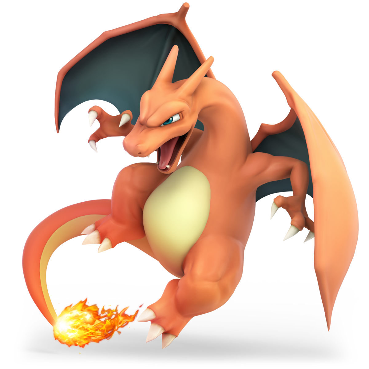 > > : I think this render fits Charizard the best, it has that Dragon look while still retaining that cartoon style that it should have.: The colors on this render are probably my favorite they really pop, but Charizard looks far to clumsy.: There isn't anything I can say about this one I just don't like it. 7.5/10: MK is a character I have some trouble rating just because he is so weird: he hails from the Kirby series and yet he is so dark and dramatic. I think that this render achieves the result of representing well MK by just adding the wind effect. However, it's a little too basic, at least to me. 8.5/10: those wings are incredible. I love them. This render is dynamic but in the best way possible. It isn't too dynamic and yet it conveys the idea of movement and speed. Oh, and it's quite menacing as well! 8/10: to me, it's a direct improvement from the Brawl one. They exaggerated the wind effect and made MK more dynamic but I like it. It makes him more ready for the fight.<<8.5/10: this is actually a great render! Maybe it's because they built Pit's personality on his Brawl persona, but I feel like this render greatly conveys Pit's character. He's slightly smiling, boasting a battle-ready stance and yet he's not too serious. Great job! 9/10: I could totally see Pit in this pose right before an important fight, like against Medusa or Hades. You can say Pit's landing, but he may also be ready to fly again. He's serious and concerned and maybe, and just maybe, if he smiled I would have given this render a hot 10/10. 6.5/10: don't get me wrong. This render ain't bad. It's just... awkward. Why is Pit posing in this way? As a side note, I've always liked Palutena's Bow as a complete bow rather than to separate blades, to this render has this flaw too.<<< 7.5/10: is it just me or did they give Sheik and ZSS, the two "transformation" characters, very similar renders in Brawl? However, ZSS's version is much more polished and lacks the weird arm-thingy Sheik is doing. It's an overall solid render. 7/10: it's an ok render. I don't really like the positioning of the legs and how her face is turned. 8.5/10: that's a nice render! I love the overall positioning of ZSS: it looks like she's been spotted and she's retaliating. It's great: it's quite dynamic but not too much and any of her limbs is in a weird pose (something Ultimate's render tend to do often).<< 7/10: Wario's pose is quite standard, but it does the job pretty well. It conveys Wario's personality pretty well. It's solid. 8/10: fantastic. I love this render: you can tell that THIS is Wario. If only Sakurai didn't stick to the weird WarioWare aesthetic and moves and used more classic Wario Land references... 2/10: what's Wario doing? Is he flexing? Is he jumping? Is he uncomfortable? All these questions show how bad this render really is. 9.5/10: one of the best renders in the series. They got everything right. The dynamicity, the double "W" sign, the huge mouth and the grin. Ever since I saw it, I loved it. <<<<< 2/10: Snake stands there. He does look pretty bad and unreliable. I really dislike this one and his face looks like the one of a low-level criminal. 7.5/10: a great improvement and yet they could do something more. There's not a lot to say (paradoxically I think that we can spend more time on a 5 rather than on a 7), but I like the way he's turned. But why is he trying to measure his heartbeats?<<< 8/10: a solid render. You can tell you will play with a burly swordsman. The only thing I don't really like is the fact that he holds Ragnell with two hands. 9/10: Ike's huge in this render. He's still. He means no joke. You'll get no sympathy from him. 5/10: why does he look like a dancer? Why do they have to take one step forward (with Smash 4) and then 4 steps back? And I want the name of the GODDAMN PERSON THAT LOVES TO WEIRDLY POSITION LIMBS. Seriously, the left-hand doesn't work at all!<<< 6/10: it's basic. It's decent. It's not great, taken alone, but you should look at it with the three Pokémon. That way he would look better (I think). 8/10: neat! They used a very simple yet effective improvement: the pointing hand. He has a determined expression that goes really well with the character, even though Pokémon Trainers are known for their abysmal personality. 8.5/10: I think I like Leaf a little more than Red though. She is so cute and happy I can't resist her. Actually, I can. I never pick Leaf, as she uses weird colors for the Pokémon. But as for the trainer herself, Leaf is stellar!<<< 7/10: despite its very basic appearance, I like this render. Squirtle looks cute and kinda happy. I also like how it's trying to do its best impression of Bowser: a huge menacing turtle and a cute little one. 5.5/10: Squirtle is doing this weird leap: how is it positioning its legs and arms? It's also weirdly turned. I have to admit I like the color more than in Brawl though.< 7.5/10: it's very similar to Squirtle's render, but I like this one slightly more because, at least to me, it looks like Ivysaur's Gen 1 artwork. I'm a huge fan of Ivysaur so maybe I'm slightly biased. But it's solid and still. 4/10: why in the holy name of God is Ivysaur leaping in this weird way? I have to say that I like the whips. Without them, it would have probably been a harsh 2.5.<< 5/10: the worst part of this render is the huge head of Charizard. Other than that, it's pretty basic, much like the rest of the PT team renders. But the huge head is a big drawback. 7.5/10: Brawl's render done right. As a bonus point, they made Zard stomping. It's good. 9/10: COOL! I'm no Charizard fan, but this render is great and makes me wonder why isn't Charizard a Dragon-type Pokémon. It's aggressive. It's flying towards its victim looking for an opening. I like the beastly vibes this render gives to me.<<<>>

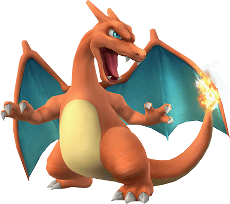
 > > 5/10 10/10 5/10 10/10 6/10 7/10 10/10 8/10 10/10 6/106/10 he’s just standing there9/10 swoop7/10 deadly, fierce and ****ing pissed6/10 angry but not deadly9/10 he’s pissed and is going to dive bomb you and ****ing burn you and your family to ash (haha ash ketchum) (also is it me or does charizard’s body texture look a lot rougher and more angular in brawl and ultimate than in smash 4)5/10 classic pose but looks kinda weird on its own10/10 red got an anime face and a perfect pose10/10 great pose for a better alt but not as dynamic (also holy **** her skirt and socks are very detailed)
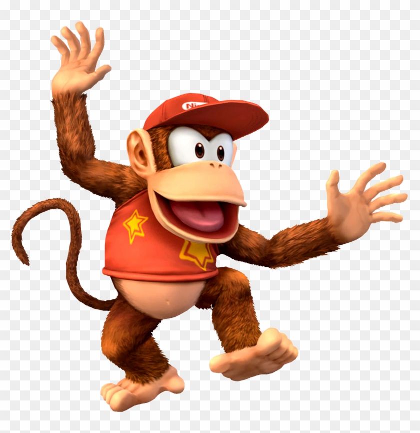
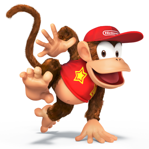
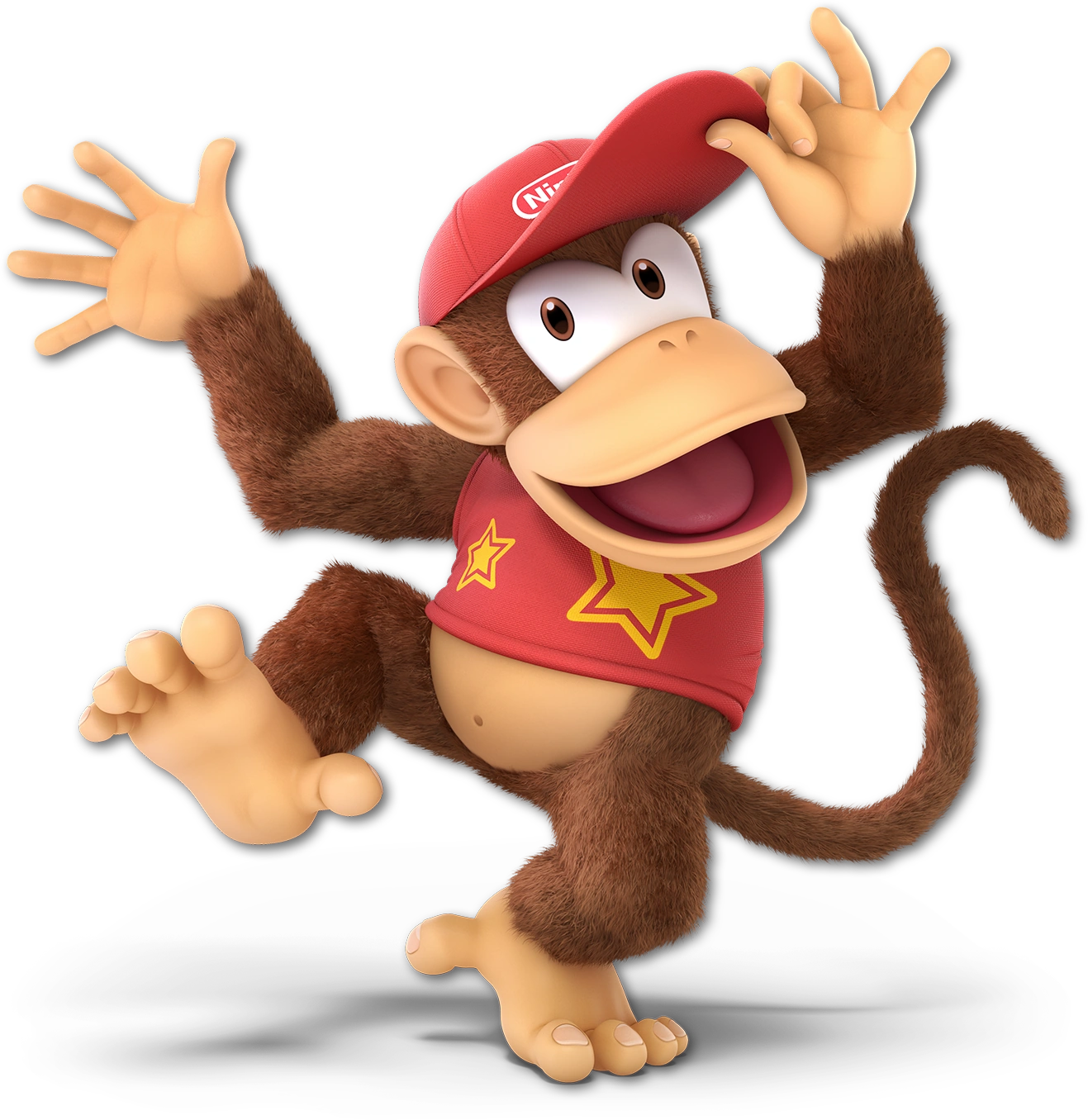 > > #1 This one has grown on me and I feel it fits him the best. #2 Not the best, but one of his taunts so I give it points.#3 His cap? Seriously?>>: 7/10, ****ing crazy monkey: 6/10, I’m conflicted, the pose is rad but everything else just looks so off, I think it might be the bright red clothes and hat mixed with the fur effects, it just looks strange: 9/10, trés bien.