
I gaze out into the distance. Something approaches, a small outline on the horizon gradually growing. Could it be? Have we been waiting long enough?

Indeed, it is true! THE AWYP RESULTS ARE IN!
And here we are, at the end of another contest. I would like to congratulate all the participants for entering; it really is the hardest part of any contest, to find the self motivation to voluntarily compete. I would also like to make fun of Jungle because he didn't enter and he likes little Asian girls that are part squid. So without further ado, let us get to the winners!
1st: Anjila and Geist
3rd: Meno
First time I ever remember a tie for first place in any contest we've run here! If you guys want, I can personally judge both and tie break. Your decision; shared first sounds perfectly fine to me and you'll both get the same prize. Meno, I'll give you the 2nd place prize due to the odd circumstances Now for the judges scores and comments!
Anjila

Prompt: 15/15
Geist

Prompt: 15/15
Global-Wolf
Prompt: 15/15
Meno

Prompt: 15/15
PurDi

Prompt: 14/15
Snuc
Prompt: 13/15
And that is that! I would like to thank all the judges for putting in the time and effort into this contest; it's an arduous task to score, comment, and compile. I hope all that entered enjoyed both the process and the end result. And until the next contest remember to always...
ART WITH YOUR POWER!
Indeed, it is true! THE AWYP RESULTS ARE IN!
And here we are, at the end of another contest. I would like to congratulate all the participants for entering; it really is the hardest part of any contest, to find the self motivation to voluntarily compete. I would also like to make fun of Jungle because he didn't enter and he likes little Asian girls that are part squid. So without further ado, let us get to the winners!
1st: Anjila and Geist
3rd: Meno
First time I ever remember a tie for first place in any contest we've run here! If you guys want, I can personally judge both and tie break. Your decision; shared first sounds perfectly fine to me and you'll both get the same prize. Meno, I'll give you the 2nd place prize due to the odd circumstances
Now for the judges scores and comments!Anjila
Prompt: 15/15
Chronodiver Lokii - Oh my that is so adorable o A o
Neon Ness - ‘Tis a knight’s duty to slay the dragon.
ZIO - A knight fighting a dragon. We already assume this dragon is the NEMESIS of the bat. Well done.
Skill: 13/15Neon Ness - ‘Tis a knight’s duty to slay the dragon.
ZIO - A knight fighting a dragon. We already assume this dragon is the NEMESIS of the bat. Well done.
Chronodiver Lokii - I love your style. It’s so colorful and clean. The cel-shading is gorgeous and the image really pops! And it’s so fun! You really know how to take full advantage of SAI and the nice pen tool.
Neon Ness - This is all very well rendered. It’s a pretty weird perspective but almost everything lines up nicely. I especially like the shadows cast by the carrot sword, really impressive. The dragon’s anatomy is surprisingly complex and full of awesome details, and I love the blur on the left wing. I might darken the shadow on it some more but I like what you were going for there to create space. The linework is very clean and professional looking. The knight’s arm is a little long and a few shadows could be refined more, but on the whole this is solid work.
ZIO - This work just shows your experience in digital works, and it seems to be alot. Nothing is terrible to look at, quite the opposite. The work almost has the eye walk around the whole work constantly, but, while a nice effect, the blurred wing on the bottom right is distracting.
Ingenuity: 14/15Neon Ness - This is all very well rendered. It’s a pretty weird perspective but almost everything lines up nicely. I especially like the shadows cast by the carrot sword, really impressive. The dragon’s anatomy is surprisingly complex and full of awesome details, and I love the blur on the left wing. I might darken the shadow on it some more but I like what you were going for there to create space. The linework is very clean and professional looking. The knight’s arm is a little long and a few shadows could be refined more, but on the whole this is solid work.
ZIO - This work just shows your experience in digital works, and it seems to be alot. Nothing is terrible to look at, quite the opposite. The work almost has the eye walk around the whole work constantly, but, while a nice effect, the blurred wing on the bottom right is distracting.
Chronodiver Lokii - Such a cute idea! I can so relate! Good luck on your quest of defeating the sugar dragon :D
Neon Ness - I will freely admit that I’m easily swayed by loud, ridiculous colors, and they look great in this. It feels just like a storybook fantasy of your traditional knight’s tale. The candification of the whole thing is superb. Peppermint talons, candy corn teeth, ice cream hills, jellybean scales… all of the details really complete this. I can’t help but find humor in the fact that this huge, imposing dragon is made of foods and snacks that I normally associate with children. This little knight is literally fighting the urge to eat junk food.
ZIO - Bright colors that just jump at you. Two themes at once (Health vs. Sweets and Knight vs. Dragon). You pulled off the NEMESIS theme very well, and pulled off a delicious fantasy world full of life all in one piece.
Aesthetics: 15/15Neon Ness - I will freely admit that I’m easily swayed by loud, ridiculous colors, and they look great in this. It feels just like a storybook fantasy of your traditional knight’s tale. The candification of the whole thing is superb. Peppermint talons, candy corn teeth, ice cream hills, jellybean scales… all of the details really complete this. I can’t help but find humor in the fact that this huge, imposing dragon is made of foods and snacks that I normally associate with children. This little knight is literally fighting the urge to eat junk food.
ZIO - Bright colors that just jump at you. Two themes at once (Health vs. Sweets and Knight vs. Dragon). You pulled off the NEMESIS theme very well, and pulled off a delicious fantasy world full of life all in one piece.
Chronodiver Lokii - It’s colorful, fun, and eye-catching. The background is cute and simple, but so effective! The colors of the dragon were what caught my eye the most. The bright neon hues can either be obnoxious or really awesome, and you did the latter! Great job!
Neon Ness - The colors are probably the best part of this for me. It really has that fantastical look of storybook tales where you would find knights battling dragons. They’re, incidentally, also the kind of colors you would see on packaging and advertisements for the kind of sweets you have depicted here. I could see this being on a poster hung in some elementary school teaching kids about eating right.
ZIO - Aye. These colors, themselves, are delicious. Very pleasing to look at for me. This piece was well done, I wish I could say something to help improve it, but it’s all good as it is already.
Overall: 57/60Neon Ness - The colors are probably the best part of this for me. It really has that fantastical look of storybook tales where you would find knights battling dragons. They’re, incidentally, also the kind of colors you would see on packaging and advertisements for the kind of sweets you have depicted here. I could see this being on a poster hung in some elementary school teaching kids about eating right.
ZIO - Aye. These colors, themselves, are delicious. Very pleasing to look at for me. This piece was well done, I wish I could say something to help improve it, but it’s all good as it is already.
Chronodiver Lokii - I can’t stop gushing on how cute this piece is (haha). Love the colors, the idea, and your style! It’s great to see a new face enter AWYP, and I really hope you stick around in the AE and show off your work!
Neon Ness -
ZIO -
Neon Ness -
ZIO -
Geist
Prompt: 15/15
Chronodiver Lokii - Duuuuuuuude.
Neon Ness - Well, they’re definitely not friends.
ZIO - Pretty clear here there’s going to be a confrontation, and the opponent in the distance doesn’t look nice.
Skill: 14/15Neon Ness - Well, they’re definitely not friends.
ZIO - Pretty clear here there’s going to be a confrontation, and the opponent in the distance doesn’t look nice.
Chronodiver Lokii - Well. There really isn’t much I can say without sounding like a total fangirl. The details are astounding. The piece has a nice flow to it. I am very jealous of your digital painting skills. Yeah, I’ll avoid fangirling and give a tl;dr. Astounding.
Neon Ness - The demon cloud... thing is great. You have a knack for rendering smoke forms in the demon; it matches the background very well. I’m just amazed by the sheer amount of detail that it has. I can see a line on the left of the demon where it separates your foreground and background though. The composition is very nice with the way the man is small and in the corner, looking helpless. Somehow I don’t quite get the feeling that he’s a great distance away from his adversary. It could be because the explosion of dirt near the demon’s base is the same black as the grass around the man’s feet. Altering the hue of one of them could give the impression that they’re on separate planes. There are some odd lighter areas on the bottom left that look like the ground vanished for some reason, I might blacken those out. Some of the blades of grass also look like they’re floating somehow.
ZIO - Looking at your WIPs, it’s pretty clear you know what you’re doing. The eye is drawn all around the piece, which is good. And the whole demon cloud looks awesome all around. I believe I have no suggestions here.
Ingenuity: 14/15Neon Ness - The demon cloud... thing is great. You have a knack for rendering smoke forms in the demon; it matches the background very well. I’m just amazed by the sheer amount of detail that it has. I can see a line on the left of the demon where it separates your foreground and background though. The composition is very nice with the way the man is small and in the corner, looking helpless. Somehow I don’t quite get the feeling that he’s a great distance away from his adversary. It could be because the explosion of dirt near the demon’s base is the same black as the grass around the man’s feet. Altering the hue of one of them could give the impression that they’re on separate planes. There are some odd lighter areas on the bottom left that look like the ground vanished for some reason, I might blacken those out. Some of the blades of grass also look like they’re floating somehow.
ZIO - Looking at your WIPs, it’s pretty clear you know what you’re doing. The eye is drawn all around the piece, which is good. And the whole demon cloud looks awesome all around. I believe I have no suggestions here.
Chronodiver Lokii - I’ll say the same thing for you that I said to PurDi: current events and humanity vs nature. Even if it wasn’t inspired by current events, I’m from the Midwest, so I’ve seen what they can do. Very unique.
Neon Ness - I have to give you credit for depicting man vs. nature in an outrageous way. Definitely more interesting than just showing a man facing a tornado or something in the distance. I get a sense of helplessness and paranoia from the little dude on the left. That monster is somehow familiar, like something from Lord of the Rings lol. You took a natural phenomenon and made it fantastical, which is great.
ZIO - This conveys very well the helplessness one gets when facing nature. I had to face this recently when a series of 60 some odd tornadoes touched ground near me over the course of one day. So I can relate. You did well.
Aesthetics: 14/15Neon Ness - I have to give you credit for depicting man vs. nature in an outrageous way. Definitely more interesting than just showing a man facing a tornado or something in the distance. I get a sense of helplessness and paranoia from the little dude on the left. That monster is somehow familiar, like something from Lord of the Rings lol. You took a natural phenomenon and made it fantastical, which is great.
ZIO - This conveys very well the helplessness one gets when facing nature. I had to face this recently when a series of 60 some odd tornadoes touched ground near me over the course of one day. So I can relate. You did well.
Chronodiver Lokii - The piece flows really nicely. The color choices fit the piece very well. The muted warm tones with the very bright firey colors work very nicely together. Only thing that really ‘bothers’ (that’s not the word I wanted to use, but I’m no good with synonyms) me is the bottom left corner, and it honestly looks great.
Neon Ness - The colors are very nicely balanced. The sunset scheme really matches the fiery hues coming from within the demon. Those dark green and red tones in the upper left clouds are really striking and awesome, I would like to see more weird contrast like that throughout. It feels very otherworldly. As a side note, saving as PNG generally produces better quality than JPEGs.
ZIO - The piece is soft on the eyes although it gives off a hard and angry atmosphere. Everything works well with each other, and I believe the Demon really makes the whole piece. Menacing.
Overall: 57/60Neon Ness - The colors are very nicely balanced. The sunset scheme really matches the fiery hues coming from within the demon. Those dark green and red tones in the upper left clouds are really striking and awesome, I would like to see more weird contrast like that throughout. It feels very otherworldly. As a side note, saving as PNG generally produces better quality than JPEGs.
ZIO - The piece is soft on the eyes although it gives off a hard and angry atmosphere. Everything works well with each other, and I believe the Demon really makes the whole piece. Menacing.
Chronodiver Lokii - I will kidnap you and steal your skills. Great job. Your skills seriously astound me. Speechless.
Neon Ness -
ZIO -
Neon Ness -
ZIO -
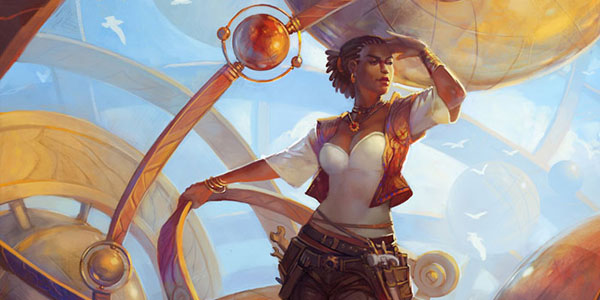
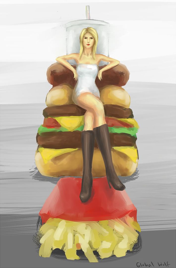
Global-Wolf
Prompt: 15/15
Chronodiver Lokii - Haha I love it. So true, so true.
Neon Ness - A common enemy a lot of us can relate to.
ZIO - Yes. Food will always be my nemesis. So this relates to me always. Very good choice.
Skill: 10/15Neon Ness - A common enemy a lot of us can relate to.
ZIO - Yes. Food will always be my nemesis. So this relates to me always. Very good choice.
Chronodiver Lokii - As one of the younger members of the AE, we’ve watched you grow as your style has been progressing. All I can say is, I love it. Your painterly style is very pleasing to look at. The quick looking strokes look very nice. I especially love the collarbone. The detail is astounding. The one thing that stuck out to me was the perspective. Perspective is obnoxious, but you had the guts to try it, and I commend you. It looks a tad awkward, but doesn’t take away from the piece. Practice makes perfect :D
Neon Ness - I’m a fan of the painterly style. I really enjoy the different hues and shades you included in the skin tones; it’s really dynamic, and I think it turned out better than if you had just used lighter/darker variations of the same color. Some of the markmaking looks unfinished, though. The background ‘gradient’ is clearly chopped up into separate sections of gray which is slightly distracting from the main image, and it’s hard to understand the spatial logic there. The brushwork in the fries (which could use some more shading by the way), the background, and the shadows could be refined so that we don’t see those frayed edges in each stroke.
The anatomy is stylized but convincing for the most part. The rendering of the hair is great. Her fingers are a little small though, and her legs are… enormous. Human anatomy is incredibly difficult—using a real life/photo reference definitely helps in getting proportions and symmetry to look right.
ZIO - I like the expressive strokes in this. Perspective seems skewed some, such as just where her hips meet the buns. I understand how difficult digital painting can be, so your color choices worked well with each other. I like where this went, if only it went further.
Ingenuity: 13/15Neon Ness - I’m a fan of the painterly style. I really enjoy the different hues and shades you included in the skin tones; it’s really dynamic, and I think it turned out better than if you had just used lighter/darker variations of the same color. Some of the markmaking looks unfinished, though. The background ‘gradient’ is clearly chopped up into separate sections of gray which is slightly distracting from the main image, and it’s hard to understand the spatial logic there. The brushwork in the fries (which could use some more shading by the way), the background, and the shadows could be refined so that we don’t see those frayed edges in each stroke.
The anatomy is stylized but convincing for the most part. The rendering of the hair is great. Her fingers are a little small though, and her legs are… enormous. Human anatomy is incredibly difficult—using a real life/photo reference definitely helps in getting proportions and symmetry to look right.
ZIO - I like the expressive strokes in this. Perspective seems skewed some, such as just where her hips meet the buns. I understand how difficult digital painting can be, so your color choices worked well with each other. I like where this went, if only it went further.
Chronodiver Lokii - Humanity versus gluttony. Unique and very effective. Good job :D
Neon Ness - I really like the idea of conquering a bad habit. I can tell by her pose and facial expression that she has a triumphant air about her, and she’s even made a throne and footstool out of her ‘nemesis’. The painting style really matches the idea since the composition is reminiscent of European royal portraiture.
ZIO - Yes. Her sitting on the food seems to imply that she owns her NEMESIS. Pretty clever.
Aesthetics: 10/15Neon Ness - I really like the idea of conquering a bad habit. I can tell by her pose and facial expression that she has a triumphant air about her, and she’s even made a throne and footstool out of her ‘nemesis’. The painting style really matches the idea since the composition is reminiscent of European royal portraiture.
ZIO - Yes. Her sitting on the food seems to imply that she owns her NEMESIS. Pretty clever.
Chronodiver Lokii - Once again, gotta say that I love your work. The brushiness is just pleasing. The colors are bold without being obnoxious. And, the piece flows nicely. Once again, only things that stick out to me are the perspective, and the hands. But yeah, hands are difficult, especially small hands, and making painterly small hands seems like a difficult task. BUT YOU TRUCKED THROUGH IT LIKE A BOSS, GLOBAL!
Neon Ness - Your paintstrokes have a lot of great color interactions. The lack of a background is odd though. I think you could’ve gone all out and set this inside of a fast food themed castle or throne room. That way the environment could have included more colors that referenced fast foods/fast food restaurant interiors, for instance. Something about the character also feels lacking. Her body language exhibits dominance but the way she’s dressed could have contributed to the idea of overcoming her eating habit. She looks a little plain.
ZIO - I feel if the background was, at least darker, the piece would have been easier to look at. Being that it’s so bright, it tends to distract the eye from the actual subject matter. That being said, the actual subject matter works well with all that is in it what with having similar hues and values.
Overall: 48/60Neon Ness - Your paintstrokes have a lot of great color interactions. The lack of a background is odd though. I think you could’ve gone all out and set this inside of a fast food themed castle or throne room. That way the environment could have included more colors that referenced fast foods/fast food restaurant interiors, for instance. Something about the character also feels lacking. Her body language exhibits dominance but the way she’s dressed could have contributed to the idea of overcoming her eating habit. She looks a little plain.
ZIO - I feel if the background was, at least darker, the piece would have been easier to look at. Being that it’s so bright, it tends to distract the eye from the actual subject matter. That being said, the actual subject matter works well with all that is in it what with having similar hues and values.
Chronodiver Lokii - Welp, you rock girlie. Keep on making amazing work!!!! I loved the concept, loved the details, and loved the amount of skill and effort you put into this. You are truly amazing and will only keep improving.
Neon Ness -
ZIO -
Neon Ness -
ZIO -
Meno
Prompt: 15/15
Chronodiver Lokii - Woahhh. Meno is getting risqué :’D
Neon Ness - There’s tension in a creepy sort of way.
ZIO - I believe a faun creature resembles lust? If this is so, this certainly follows the prompt. As this obviously show lust trying to seduce the man. lol
Skill: 13/15Neon Ness - There’s tension in a creepy sort of way.
ZIO - I believe a faun creature resembles lust? If this is so, this certainly follows the prompt. As this obviously show lust trying to seduce the man. lol
Chronodiver Lokii - Seriously astounding. You never cease to amaze, Meno. Linoleum prints are difficult, but your piece turned out great! I love the sketchy quality to it. And very interesting perspective on the guy on the right. It’s a difficult angle, but you did very well. And a very unique medium. I applaud you.
Neon Ness - Very nice linework. Linocuts are tough, so I’m surprised at how much detail you worked into this. The sketchy contours of the anatomy look great. I only wish the marks inside of the horns were a little more deliberate. It also gets confusing in some areas like beneath the “victim’s” chin, I can’t really tell what’s going on there. If anatomy becomes an issue, make sure to find a real life reference to work from. The creature’s head looks compressed in certain areas and some features appear slightly misplaced, but those are mostly minor flaws.
ZIO - If linocuts are what they think they are, this certainly was difficult in itself. I like its sketchy feeling, but I think less lines could have helped you. Also, the implied weighted lines on the man’s left cheek in the right would have looked awesome throughout the whole piece.
Ingenuity: 12/15Neon Ness - Very nice linework. Linocuts are tough, so I’m surprised at how much detail you worked into this. The sketchy contours of the anatomy look great. I only wish the marks inside of the horns were a little more deliberate. It also gets confusing in some areas like beneath the “victim’s” chin, I can’t really tell what’s going on there. If anatomy becomes an issue, make sure to find a real life reference to work from. The creature’s head looks compressed in certain areas and some features appear slightly misplaced, but those are mostly minor flaws.
ZIO - If linocuts are what they think they are, this certainly was difficult in itself. I like its sketchy feeling, but I think less lines could have helped you. Also, the implied weighted lines on the man’s left cheek in the right would have looked awesome throughout the whole piece.
Chronodiver Lokii - Interesting take on man vs man. I did not see that one coming for sure. :’D Meno, your work is always surprising and wonderful.
Neon Ness - Unique medium choice. The creature looks like something out of Greek mythology. The look of the linocut makes this very jarring combined with what’s happening. Somehow the feeling of nemesis isn’t completely there though. I can tell from the title that the creature is exerting some sort of dominance or pressure on his victim, but the latter’s expression is somewhat ambiguous. The longer I look at it, the more I can see it as him enjoying what’s happening. He’s not quite frowning or resisting in a conspicuous way so it’s tough to tell whether or not they’re really enemies.
ZIO - Considering the sketchy lines, this piece already makes the scene pretty uncomfortable to watch. To leave your comfort zone is also pretty brave of you and you did well for what’s provided.
Aesthetics: 12/15Neon Ness - Unique medium choice. The creature looks like something out of Greek mythology. The look of the linocut makes this very jarring combined with what’s happening. Somehow the feeling of nemesis isn’t completely there though. I can tell from the title that the creature is exerting some sort of dominance or pressure on his victim, but the latter’s expression is somewhat ambiguous. The longer I look at it, the more I can see it as him enjoying what’s happening. He’s not quite frowning or resisting in a conspicuous way so it’s tough to tell whether or not they’re really enemies.
ZIO - Considering the sketchy lines, this piece already makes the scene pretty uncomfortable to watch. To leave your comfort zone is also pretty brave of you and you did well for what’s provided.
Chronodiver Lokii - Okay, for one, the sketchiness. It looks so gorgeous. Secondly, I will now gush about the contrasts. The black of the ink as the background color is awesome. It makes the image pop nicely. It just looks so nice. The balance is shifted heavily to the left. A little more on the right might look nice, but I’m not entirely sure.
Neon Ness - This was a bold medium to work with since you’ve essentially limited yourself to only 2 colors. Overall I enjoy the black ground, white figure aesthetic since it’s the opposite of what you normally see in the traditional drawing. The scratchy lines were a nice choice and they were pulled off well. The composition is odd in some areas—there’s negative space to the right of the victim’s head, but the left side of the creature’s been cropped off. I think it would’ve been better to provide negative space on either side. The upper right is also strangely empty. Somehow it feels cramped with the way the characters fit in the frame.
ZIO - Definitely gets across a message like “You don’t want to mess with this.” A good way to convey how one copes with their NEMESIS (which could mean, be unable to cope at all, but concede). There’s a tad much of nothing on the top right, which is distracting, though.
Overall: 52/60Neon Ness - This was a bold medium to work with since you’ve essentially limited yourself to only 2 colors. Overall I enjoy the black ground, white figure aesthetic since it’s the opposite of what you normally see in the traditional drawing. The scratchy lines were a nice choice and they were pulled off well. The composition is odd in some areas—there’s negative space to the right of the victim’s head, but the left side of the creature’s been cropped off. I think it would’ve been better to provide negative space on either side. The upper right is also strangely empty. Somehow it feels cramped with the way the characters fit in the frame.
ZIO - Definitely gets across a message like “You don’t want to mess with this.” A good way to convey how one copes with their NEMESIS (which could mean, be unable to cope at all, but concede). There’s a tad much of nothing on the top right, which is distracting, though.
Chronodiver Lokii - Meno, keep making art forever please? I love looking at your work because every piece is so unique. You use different medium that some artists are afraid to use. No matter how difficult the medium or idea, you create really awesome looking stuff. Keep it up, man.
Neon Ness -
ZIO -
Neon Ness -
ZIO -
PurDi
Prompt: 14/15
Chronodiver Lokii - So sad!
Neon Ness - I get an incredibly hostile feeling from this.
ZIO - Obviously something here is our NEMESIS. Lol
Skill: 10/15Neon Ness - I get an incredibly hostile feeling from this.
ZIO - Obviously something here is our NEMESIS. Lol
Chronodiver Lokii - You have a nice grasp on perspective, which I really like. Looking through your WIPs is what really helped to sell the final piece. Your initial sketch was very nice, and you recreated it nicely in a digital format. Though, I believe you could add a lot more detail and try a lot trickier stuff. You have the skills to do so :D
Neon Ness - The sense of perspective is mostly good. The separate echelons on the buildings stand out to me especially. Some of the image quality suffers nearer the background though, like the outline of the sun. Also, when working with architecture uniformity is a key aspect. Every line on the road should appear the same length/width, and the contours of buildings generally don’t curve like clay when destroyed, they crack or break off. The overlayed texture on the buildings is a nice touch. I would like to see more evidence of disaster—fire hydrants, wrecked vehicles, broken glass on the ground. There are a ton of details that could go into creating a disaster scene, but when there aren’t enough it looks a little bit too ‘clean’. There is hardly anything in the streets besides the single tree.
ZIO - Everything follows the general perspective, but I do like how some of the finer lines, such as where the windows would be, don’t quite follow the perspective set out. Everything else is clear, and then the red sun in the background is not. It feels out of place.
Ingenuity: 13/15Neon Ness - The sense of perspective is mostly good. The separate echelons on the buildings stand out to me especially. Some of the image quality suffers nearer the background though, like the outline of the sun. Also, when working with architecture uniformity is a key aspect. Every line on the road should appear the same length/width, and the contours of buildings generally don’t curve like clay when destroyed, they crack or break off. The overlayed texture on the buildings is a nice touch. I would like to see more evidence of disaster—fire hydrants, wrecked vehicles, broken glass on the ground. There are a ton of details that could go into creating a disaster scene, but when there aren’t enough it looks a little bit too ‘clean’. There is hardly anything in the streets besides the single tree.
ZIO - Everything follows the general perspective, but I do like how some of the finer lines, such as where the windows would be, don’t quite follow the perspective set out. Everything else is clear, and then the red sun in the background is not. It feels out of place.
Chronodiver Lokii - Totally did not see this coming. Great work using current events. And the natural world vs humanity thing is really interesting, since when most people think of enemies, they think of the people they hate most in the world. So awesome!
Neon Ness - The limited color palette really sets the tone for this. The gray landscape seriously looks like a deserted, hopeless world. And that giant rising red sun is plainly a deliberate symbol for Japan, which is interesting because without that I feel this city could be anywhere in the world. You’ve really created a narrative using symbolic language. That grainy texture gives the look of an old movie or something, but because we recognize it as a real world event it’s a really eerie contrast.
ZIO - The gray tone, aside from the red sun, really provides that sense of loss. This view on how a destroyed city looks really pulls through in the sense of destruction. It’s unique, and the red sun’s implication is a pretty strong one.
Aesthetics: 9/15Neon Ness - The limited color palette really sets the tone for this. The gray landscape seriously looks like a deserted, hopeless world. And that giant rising red sun is plainly a deliberate symbol for Japan, which is interesting because without that I feel this city could be anywhere in the world. You’ve really created a narrative using symbolic language. That grainy texture gives the look of an old movie or something, but because we recognize it as a real world event it’s a really eerie contrast.
ZIO - The gray tone, aside from the red sun, really provides that sense of loss. This view on how a destroyed city looks really pulls through in the sense of destruction. It’s unique, and the red sun’s implication is a pretty strong one.
Chronodiver Lokii - It’s a little plain at first glance, but the sun in the background is a great focal point. It’s a very clean perspective, and a very simple looking piece. And no, simple isn’t bad. It get’s the point across without needing complicated details.
Neon Ness - I really appreciate the perspective of looking between the two buildings toward the sunrise. Overall, the placement of objects is good but the objects themselves need more refinement. There are points in the architecture that should be straight, and fuzzy edges that needs cleaning as well. I’m also not entirely convinced by the cracks in the buildings, it looks like they were simply overlayed onto the scene. In order to make them look like they are a part of the architecture, they should change direction more drastically where the surface changes direction in relation to the vanishing point. Work from a reference of cracks that travel across different faces of an object to understand how to make them more convincing. Developing an understanding of vanishing points will help keep your architecture more convincing as well. The grayscale look is really powerful combined with the red sun, I like all of your color choices.
ZIO - I feel maybe the sun is a little too distracting to the whole piece. But the rest of the piece looks great and works well with the style you set out.
Overall: 46/60Neon Ness - I really appreciate the perspective of looking between the two buildings toward the sunrise. Overall, the placement of objects is good but the objects themselves need more refinement. There are points in the architecture that should be straight, and fuzzy edges that needs cleaning as well. I’m also not entirely convinced by the cracks in the buildings, it looks like they were simply overlayed onto the scene. In order to make them look like they are a part of the architecture, they should change direction more drastically where the surface changes direction in relation to the vanishing point. Work from a reference of cracks that travel across different faces of an object to understand how to make them more convincing. Developing an understanding of vanishing points will help keep your architecture more convincing as well. The grayscale look is really powerful combined with the red sun, I like all of your color choices.
ZIO - I feel maybe the sun is a little too distracting to the whole piece. But the rest of the piece looks great and works well with the style you set out.
Chronodiver Lokii - Great job. This was a really interesting piece! Current events are hard to work with in these types of contests, but you were able to pull it off. I can’t say enough about the nice use of perspective. Though, I want to see you do some more complicated pieces and post them more often, okay? :D
Neon Ness -
ZIO -
Neon Ness -
ZIO -
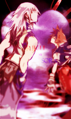
Snuc
Prompt: 13/15
Chronodiver Lokii - Kinda obvious I guess. Sora and Riku are nemeses, so it’s self explanatory
Neon Ness - They can indeed be considered enemies. I think even someone who doesn’t know the story can tell from this.
ZIO - Unfortunately, those unfamiliar with the franchise will have difficulty guessing whether these guys are enemies or not. The only thing giving that away is the prompt.
Skill: 7/15Neon Ness - They can indeed be considered enemies. I think even someone who doesn’t know the story can tell from this.
ZIO - Unfortunately, those unfamiliar with the franchise will have difficulty guessing whether these guys are enemies or not. The only thing giving that away is the prompt.
Chronodiver Lokii - I love the fact that you went with a graphic art theme. Mad props, especially since many people did drawing/digital/Meno art. But, I don’t think you took much advantage of the medium. The blur that was used doesn’t really add a lot to the piece. Also, the placement of the people is a tad awkward. And finally, the font, the placement of the font, and the colors of the font. It takes away from the piece, in all honesty. Next time, I’d use the font to accent the piece instead of placing it in the center as a focal point. (Sorry, I’m a stickler on fonts)
Neon Ness - The Riku and Sora renders are nice, but there are a few issues with them. It looks like you used a filter on them, which looks… choppy in some areas. I appreciate the effect you went for, making them abstracted/blurring their faces. But filters rarely get the job done right, so that takes away from it. The result would probably have been cleaner if you had manually blurred or blocked out deliberate areas with the pen tool.
ZIO - I feel maybe you relied too much in filters and other resources. But, if you enjoyed doing it, then the best thing is that you learned from this.
Ingenuity: 7/15Neon Ness - The Riku and Sora renders are nice, but there are a few issues with them. It looks like you used a filter on them, which looks… choppy in some areas. I appreciate the effect you went for, making them abstracted/blurring their faces. But filters rarely get the job done right, so that takes away from it. The result would probably have been cleaner if you had manually blurred or blocked out deliberate areas with the pen tool.
ZIO - I feel maybe you relied too much in filters and other resources. But, if you enjoyed doing it, then the best thing is that you learned from this.
Chronodiver Lokii - I will be frank with this one: the whole pre-existing canon nemeses takes away from the originality.
Neon Ness - A unique idea, seeing as how they turn out as allies in different points in time. It’s a strange contrast, because the heart in the background seems to hint at some sort of friendship or alliance, but their stances suggest that they’re opposed to each other. The text is redundant, though. It’d look better if the image spoke for itself.
ZIO - I hate to be harsh, but like I said, I think you relied on Photoshop filters too heavily. The renders are of another’s works, just altered. Then the text is hard to read at one point, and seems out of place in another.
Aesthetics: 7/15Neon Ness - A unique idea, seeing as how they turn out as allies in different points in time. It’s a strange contrast, because the heart in the background seems to hint at some sort of friendship or alliance, but their stances suggest that they’re opposed to each other. The text is redundant, though. It’d look better if the image spoke for itself.
ZIO - I hate to be harsh, but like I said, I think you relied on Photoshop filters too heavily. The renders are of another’s works, just altered. Then the text is hard to read at one point, and seems out of place in another.
Chronodiver Lokii - First off, there isn’t much flow in the piece. It kind of just goes off to the top right corner. Sora specifically is too cut off. And, the background images above the heart look a little awkward.
Neon Ness - I do like the color scheme. The reddish tint throughout suggests a state of anger or frenzy. I can tell you put some thought into the color choices, I see mostly reds and lavenders/violets throughout. The more I look at it the more I appreciate how well the colors look.
I don’t get why Sora and Riku are different sizes. Were you trying to make Riku appear dominant over his adversary? I kind of get that feeling, but their size relationship is awkward. If that’s the case I think it should be emphasized more so we know it’s deliberate. They both look cramped in the canvas; maybe a more spacious horizontal composition would have been better.
I wish there was a clearer focal point as well. Almost everything here is fuzzy or blurry in some way. If their faces were sharpened and visible, that would draw our eyes to the space between them. As it is now my eyes wander into all of these fuzzy nebulous regions. The angle at which they’re tilted makes the blurring odd as well. Are their legs blurred because they’re far away or nearby? I can’t tell. Make sure the blurring is logical in regards to the image. Just takes practice.
The words look out of place. When low opacity words are stuck on top of an image they compete with it. Make sure the words are placed in a way that doesn’t distract from the imagery. I don’t think text was necessary, but maybe they could have been placed more strategically. They’re also much brighter than all of the other colors, which breaks some of the color harmony.
ZIO - Certainly the collective palette is cool, so it’s easy to look it and my eye is drawn around the piece, so composition seems tight. I believe the blurred renders push the viewer away only because they aren’t too relatable unless you are a fan of the series, or rather, know who the characters.
Overall: 34/60Neon Ness - I do like the color scheme. The reddish tint throughout suggests a state of anger or frenzy. I can tell you put some thought into the color choices, I see mostly reds and lavenders/violets throughout. The more I look at it the more I appreciate how well the colors look.
I don’t get why Sora and Riku are different sizes. Were you trying to make Riku appear dominant over his adversary? I kind of get that feeling, but their size relationship is awkward. If that’s the case I think it should be emphasized more so we know it’s deliberate. They both look cramped in the canvas; maybe a more spacious horizontal composition would have been better.
I wish there was a clearer focal point as well. Almost everything here is fuzzy or blurry in some way. If their faces were sharpened and visible, that would draw our eyes to the space between them. As it is now my eyes wander into all of these fuzzy nebulous regions. The angle at which they’re tilted makes the blurring odd as well. Are their legs blurred because they’re far away or nearby? I can’t tell. Make sure the blurring is logical in regards to the image. Just takes practice.
The words look out of place. When low opacity words are stuck on top of an image they compete with it. Make sure the words are placed in a way that doesn’t distract from the imagery. I don’t think text was necessary, but maybe they could have been placed more strategically. They’re also much brighter than all of the other colors, which breaks some of the color harmony.
ZIO - Certainly the collective palette is cool, so it’s easy to look it and my eye is drawn around the piece, so composition seems tight. I believe the blurred renders push the viewer away only because they aren’t too relatable unless you are a fan of the series, or rather, know who the characters.
Chronodiver Lokii -
Neon Ness -
ZIO -
Neon Ness -
ZIO -
And that is that! I would like to thank all the judges for putting in the time and effort into this contest; it's an arduous task to score, comment, and compile. I hope all that entered enjoyed both the process and the end result. And until the next contest remember to always...
ART WITH YOUR POWER!


