• Welcome to Smashboards, the world's largest Super Smash Brothers community! Over 250,000 Smash Bros. fans from around the world have come to discuss these great games in over 19 million posts!

    You are currently viewing our boards as a visitor. Click here to sign up right now and start on your path in the Smash community!

SWF Member Tutorials

Undrdog

#1 Super Grimer!
BRoomer
Joined
Aug 24, 2004
Messages
5,587
Location
Aberdeen
This thread is dedicated to sharing ideas and skills in computer graphics.

Share your thoughts and ideas on how you create banners and other images. have a design you like and you think others will enjoy it? Post it! Have some fonts and brushes that are unique and want to share, Post it!

This thread was made for, but not restricted to, the use of photoshop and imageready.

Here are the rules...

- Only post tutorials here. If you have any questions please pm the creator of the particular tutorial. Don't ask about them here. It will become to cluttered and confusing if you do so.

- We do not "give away" free software. If you want photoshop or other non-freeware program you will have to obtain it yourself.

- Unless your tutorial is very simple, please post pictures of the steps whenever you can. This makes it easier for others to read and understand your tutorial.

- As there may be a lot of images for tutorial steps, please turn off your signatures when posting.

- Please seperate your tutorials by steps. short and easy guidelines that anyone should be able to understand.

- If you want to share brushes, fonts or what-not, please give credit to the creator if you didnt make them yourself. It is understandable if you do not know who made them, but please remember to give credit where it is due.

- If there is a particular font or brush you wish to share, it must be hosted outside of SWF.

- Dont link to other tutorials. This topic is for the members of SWF to share what they know. If you do come across good tutorial websites, PM them to ThunderMistress so that they can be added in to the tutorial and resources topic.

- Don't forget to check the main page often. New rules may be added or edited. please keep this in mind.

- As always, all Artwork Emporium and Global Rules apply.


hope you all enjoy! ^_^,b


TM: Hey Undr, hope you don't mind, just cleaned up the rules a little to make them neater ;3 Took out the 'don't post offensive things' rule since it's a global rule and an AE rule also already. Thanks for getting the topic started up
 

ExMachina

Smash Journeyman
Joined
Feb 29, 2004
Messages
282
Location
Northern Virginia / UVA
First off, mad props to Undr for coming up with this idea and getting this thread started. I guess I'll start us off with a random theory-ish thing on layering backgrounds...

Here's an overview of how to make layered but balanced backgrounds using copy and paste and various blending modes.

Example >>


File >> http://img152.exs.cx/img152/4459/bgtut7hz.jpg

Download the file provided... it's just a Filter > Render > Clouds BG run through a million filters and a bunch of large swirly letters on top that I made for the purpose of this tutorial.

To make a BG similar to the example above's, simply copy and paste a part of the giant swirly picture into your sig or whatever gfx you're making. Set this bottom layer to Normal. Then, copy and paste other parts of the pic, stick them on top of that first layer, and set them to various blending modes to pile on more details and complexity.

The theory I want to get across is that you want to balance light and dark elements within your background so that one doesn't overwhelm the other. So, a good rule of thumb on deciding what blending mode to pick for each layer is to alternate between modes that darken and those that lighten a pic.

Group 1 - Darken, Multiply, Color Burn, Linear Burn
Group 2 - Lighten, Screen, Color Dodge, Linear Burn
Group 3 - Overlay, Soft Light, Hard Light, Vivid Light, Linear Light, Pin Light, Hard Mix

So, you would use a layer with a blending mode from Group 1, then on top of that, one from Group 2, and then next back to Group 1, etc. Layers with Group 3 blending modes you put just about anywhere because they do different things than just lighten or darken.

In the example, my BG layers look like this...

Color Burn (Group 1)
Overlay (Group 3)
Hard Light (Group 2)
Normal (base)

You can continue this pattern indefinitely. ...1, 2, 1, 2... throw in a 3 occasionally. With this and the ability to take different parts of the giant swirly BG, you can achieve an infinite number of variations using that one large picture.

...


Um yeah. Did that make any sense whatsoever? Bah, I need sleep. I'll probably edit this later when I'm coherent...
 

Undrdog

#1 Super Grimer!
BRoomer
Joined
Aug 24, 2004
Messages
5,587
Location
Aberdeen
Techy Borders

-or-


Programs needed - Photoshop

Step-1
first you wanna make a new image. ( ctrl N ) make it out to any size you wish. I chose 600 x 100 for this particular tutorial.
Step-2
Hit ( crtl J ) to duplicate the layer.
Step-3
make sure the top layer is selected. fill it in black with your paintbucket tool.

Step-4
now you need to place your mouse over the lasso. right click it. now choose the polygon lasso tool.
Step-5
now click in one corner of the banner. hold down shift and create a border around the banner.

Step-6
press the delete button to delete the inside of the banner.

Step-7
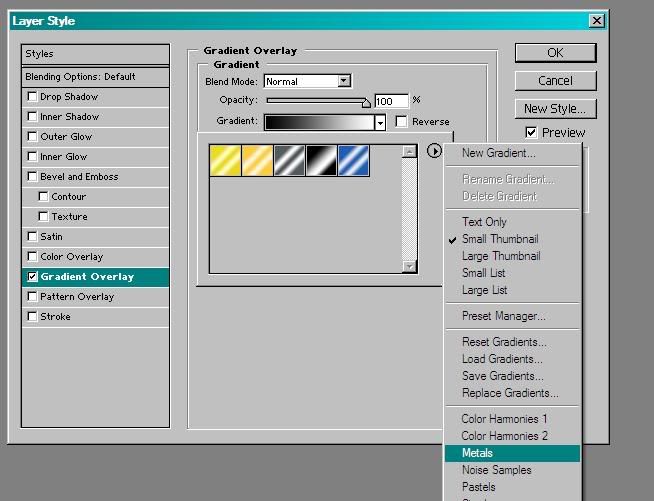
double click on the top layer to bring up this window. choose Gradient Overlay. in the dropdown menu click the little arrow. in the next dropdown menu choose the metal option.

choose the silver.
Step-8
Drop Shadow
Step-9
Inner Shadow. change the distance to 1 and size to 0.
Step-10
Click Bevel and Emboss and then Contour.
Step-11 Optional
this step is optional, if you want to make your border to be of a darker metal then you may also choose to use Satin.
Step-12
click OK. yeah, real hard right?
Step-13
now you need to cut out parts of the border. you can use any tool to do this. you can use the Polygon Lasso tool, or rectangle cut outs. you can right-click the rectangluar marquee tool you can get more options. just have fun with it, dont get too carryed away.


your done! if you want to add more to your border then just continue on.


*The next set of steps are optional.*

Step-14
if you want to spruce this border up even more, add another layer. (ctrl-alt-N).
Step-15
move this layer under the first one.
Step-16
now on this layer repeat all the steps you did for the first border. exexect this time, make sure to do Step-11 aswell.
Step-17
now, change the Gradient Overlay to either Brass or Gold. in my example I went with Brass.

Your final result should be simular to this...


if you are having any issues PM me and I'll see what I can do to help ^_^ Hope you enjoyed!


TM: Hmm, don't forget your own rules and keep checking back at the rules ;3 No signatures please.
 

FalseFox

Smash Cadet
Joined
Sep 24, 2004
Messages
50
Location
Canada
Great job on the tutorials so far Ex, and UndrDog.

I'll be sure to post what I come out with when I try them!:D

TM: Read the rules. ONLY tutorials in here. NO signatures.
 

Undrdog

#1 Super Grimer!
BRoomer
Joined
Aug 24, 2004
Messages
5,587
Location
Aberdeen
Orb

Orb


Ok, just to clear things up. This is only to learn how to make the orb. not the rest of the banner.

Step-1:
open a new image at any size you want. and make a circular marquee at any size you want.

Step-2:
fill in the circle with any color you want. (this will be the color of your orb.)

Step-3:
double click the Layer and use these settings.
Stroke - outside, 42% opacity, 1px BLACK.
Gradient: opacity 75%.
Inner Glow: change blend to normal, change the color to the same color as the orb but a little darker shade.
Satin: turn invert off.
Inner Shadow: change Blend to normal! make the color lighter then the actual shade of the color.

Step-4:
create a layer underneath the layer with the orb. then hit (ctrl E) to merge the two layers.

Step-5:
copy layer, ( hit ctrl J ).

Step-6:
now we need to add a Chrome Filter. (Filter>Sketch>Chrome). Set the settings to Detail - 10, and Smoothness - 0.

Step-7:
Copy the chrome layer and set the bottom one to soft light and the top one to overlay with 60% fill.

And your done! it really isnt that hard, but it looks relly nice!
 

Undrdog

#1 Super Grimer!
BRoomer
Joined
Aug 24, 2004
Messages
5,587
Location
Aberdeen
Tranparent Gifs


Step-1:
First off, hit D on your keyboard to make sure you have your default pallet on. then color your image in black. Use your Polygon Lasso tool to cut out the size and shape that you want for your banner.


Step-2:
Hit D on your keyboard to make sure your at your default colors. now hit X on your keyboard to swap the colors on your pallet.

Step-3:
Choose the Paint Bucket tool and color in the middle of your cut out. it should now be white.


Step-4:
Now, choose your Magic Wand tool and highlight the black part of your image. once its highlighted, delete it. you should now have a "checkboard" pattern where the black was. this means that there is nothing there at all. its a good thing...


Step-5:
make the white part the color you want your banner to be.


Step-6:
Double click on the layer and use these settings:
Drop Shadow
Inner Shadow
Outer Glow
Inner Glow
Bevel & Emboss
Satin


Step-7:
Now this is where this differs from other images. its time to Save the Image. but you dont do it the same way you normally would.
goto: File < Save for Web ( alt ctrl shift S )


Now that its saved your done!
 

Jamo

Smash Journeyman
Joined
Jul 25, 2002
Messages
266
Location
U.S.A.
Inset Sphere
---------------

Step #1: Create a new Document. I use 600x600

Step #2: Select the ellipse tool.

Step #3: While holding shift on your keyboard, drag a circle near the center of your document.

Step #4: Select a light grey color (I use RGB Color Code# D6D6D6) for this shape by double cliking the color to the right of the ellipse shape in the layers panel.

Step #5: Duplicate this layer (right click the layer and press Duplicate Layer). Now go to Edit > Transform Path > Scale.

Step #6: Hold Ctrl+Shift+Alt, and while, drag in on one of the corners until you have a small rim around the inner circle.

Step #7: Select a Blue Color (I use RGB Color Code# 486E9D) for this inner Shape.

Step #8: Rasterize both of the shape layers (Right Click Layer > Rasterize). Now Right click the grey circle layer and go to blending options.

Step #9: Go to Gradient Overlay, and set it up like this.


----

For the color in the gradient on the left and right sides use RGB Color Code# AEC2D5

Step #10: And in the Bevel.


Step #11: Click OK to apply these changes._ Hold Ctrl and click the blur circle layer._ Now while your grey circle layer is selected, press ctrl+x._ Go back into the blending options and add a drop shadow with these settings.


Step #12: Select the Elliptical Marquee Tool.

Step #13: While Holding shift, make a selection like this in your image.


*Click for Fullsize*

Step #14: Select your gradient tool.

Step #15: Choose the default gradient preset from the preset manager that goes from foreground color to transparency. (Make sure your foreground color is 'White')._ Now fill in this selection in a new layer over all of your other layers._ Be sure that when you are filling it, you are draggin a line while holding shift, and you are dragging from top of the selection to the bottom.

Step #16: Now Select your dodge tool from your main toolbar.

Step #17: Give your brush the following settings..

Hardness is 0%

Step #18: Brush in a circular motion on the blue circle layer so that you get a similar effect to this.

Step #19: Now, make your brush size 200, and click 2-3 times at the top and bottom of the blue circle layer.

Your done!!!

*Click for full size*

Now spice it up and you got a killer sphere.


*Click for full size*
-------------------
 

simpson man

Smash Apprentice
Joined
Oct 2, 2003
Messages
90
Location
a land far away
SOrry no steps, its kinda simple.
May as well try and get known so hberes the sprite tutorial no images so far
This tutorial will show you the easiest way to recolor and edit a sprite into another character. The easist program to do this in is undoubtfully MS Paint. I had an editing shop up here but since it didn't do good ill unveil my secrets.


Of course your going to need a sprite. Go to the following web address for Nintendo/Sega/Capcom/Square Enix sprites. www.spritersresource.com After you have your sprite open up MS Paint or Paint. Then go back to the site. After youve done that right click save picture as. Then hit open in MSP ( Ms paint ). Look for the sheet. After youv'e opened it hit Ctrl+G to toggle the grid. If your going to edit all the sprites, get ready for boggled minds. IF you see what pose your going to edit, draw a line by it. Then zoom in X8. Look for the line then your sprite. Use the rectangle select tool to select it. Then after you have the box around it hit Ctrl+C. Then open up a new file, hit Ctrl+V to paste the sprite. After the sprite has been pasted, zoom in X8 again. Select what color you are going to edit your sprite. Now is tricky, the shading . This can take forever. use the color select or dropper tool to copy that exact color. Since most colors have 120 as there base it will be easy to shade it perfectly. Afetr you see your color in the bottom left, double click black on the bottom left. The color it shows at the top left in the new windo is the shaded color even though its probably not close to it. Hit define co,lors. You should see boxes that have RGB values. Remember them. Then back track to what color your sprite is going to be ( e.g. red ). then correctly memoirze the RGB values from define box. ( since its red it will have a lower or higher LUM value ). Edit the LUM value to what the define box had. Your color will be your sprites new color and perfectly shaded as the sprite before it. Continue doing this and you will have a custom sprite in no time!!

If you go for more trouble, you'll go to pillowshading . Pillow shading is when dark lines get lighter and lighter til they reach the sprites color. I can't help you on this because i've never tried it.

Once your sprite is completely done it will be yours, even though it is still (C) its orignal owner. Please give feedback, report bugs, and show off your cool new sprite.
 

ExMachina

Smash Journeyman
Joined
Feb 29, 2004
Messages
282
Location
Northern Virginia / UVA
Abstract backgrounds from random landscape images and text. No fancy brushes or textures needed. =) Mind you, it's not a very structured, strict set of guidelines, it's more like an overview to give you guys an idea of how I make some backgrounds.

1. Download this image and open it up in Photoshop. (don't worry, this is a completely free photograph which you can use in commercial and personal graphics. :))

2. Duplicate the layer multiple times (CTRL+J) and rotate/flip them around. Arrange them randomly and set all of their blending modes to Overlay.

http://gallery.otakumedia.com/d/51734-2/002_G.jpg

http://gallery.otakumedia.com/d/51731-2/002_2.jpg

3. Merge everything into one layer.

4. Use the Clone Brush Tool set to 300 pixels, soft edges, 100% opacity to grab corners and edges (ALT+left click) and brush in random parts of the pic (left click). Keep cloning random corners/edges/areas in the middle of the pic that have already been clone brushed and brushing all over the place until you get a crazy mix of textures and tones.

http://gallery.otakumedia.com/d/51736-2/004_G.jpg

5. Make a new layer, use the Paintbucket Tool to fill it with one color, then set its mode to Color. Merge down. Hit CTRL+A then CTRL+C.

http://gallery.otakumedia.com/d/51738-2/005_G.jpg

NOTE -- Be sure to save this image somewhere safe. You can use it as a base for future backgrounds.

6. Create a new file that's sig sized (I set mine as 400x100 pixels in this tut). Hit CTRL+V to make a new layer with the background you copied from the other file. Move it around/resize it till you find something you like.


7. Hit CTRL+V again to paste it again. Move this around, resize it, mess with its blending mode...


8. Repeat step 7 until you're satisfied. If you have no idea what blending mode to pick, Overlay is usually a good choice.

9. Make a new layer, fill it with the Paintbucket tool with a solid color, then hit CTRL+U. Mess around with the Hue and Saturation sliders till you find something you like. Merge the color layer with all the background layers at the same time, not one by one.


10. Image > Adjust Brightness/Contrast if you lost some contrast (increase both sliders a little bit).


11. Set your Foreground Color to Black. Go to the Text Tool. Set your font size to 400-600 pt, anti-aliasing to Crisp, and font to Edwardian Script, Porcelain, or some other appropriately intricate, swirly font. (if you don't have one, I'll post up a link to places where you can download such a font)

12. Type in a random capital letter, like X. Right click on the layer and hit Rasterize Layer.

13. Repeat step 12 with random letters.

14. Arrange the letters so the swirls fill up most of the sig's foreground. Change each of their opacities till you get something that looks like this:


15. Throw on another filled color layer to get rid of the little bit of gray you get from the text. Stick in some random pic, throw on a border, put in text, and voila... sig.


Now, the results aren't too spectacular... but you've created another texture to employ in future sig backgrounds. Just keep making more textures and elements by following tutorials and try combining them for new results. You'll be making crazy bgs in no time. :) A simple example...


(the swirl is from FalseFox's tutorial thingy he posted in Undr's thread... it's good stuff, go check it out!)
 

Bedi Vegeta

Smash Master
Joined
Apr 7, 2002
Messages
4,668
Good stuff Ex...I don't think I've ever done anything like that before...

This isn't a tutorial or anything, but I just wanted to add something to Ex's thing...around about step 7 you could start to make copies of the bg and start adding filters...you could mebbe add some kind of distortion to a layer and set it to overlay or soft light or something like that...that will give you a bit more variety in the bg and it will look a bit less flat...
 

simpson man

Smash Apprentice
Joined
Oct 2, 2003
Messages
90
Location
a land far away
Sprite Comic (way i do)

1. Open up two MS Paint, its easy and can vget the job done simply
2. Go get your sprite from www.spritersresource.com or search on www.google.com
3. Get the backround pf level or do it maunually by yourself.
4. Place the sprites were they look like the backroung
5. Theres a box in Paint such as overlap or transparent backround select trasnparent, otherwise a white box will be around your sprite
6. Contuine this with the Grid Ctrl+G and youll have it done in no time

DO's
1. Use the grid its your freind
2. Give credit to the people that made the sprites
3. Make sure you have the Copyright of the owners of the characters
DONT
1.STeal this Guide :p
2.Use photoshop or any other program then MS Paint, its simple and gets it done easily
3.Make speach bubbles before the text
4.Don't Steal ANY SPRITES AND CREDIT YOURSELF

This has been a messge from Simpson Man ar 12:53 PM
 

ExMachina

Smash Journeyman
Joined
Feb 29, 2004
Messages
282
Location
Northern Virginia / UVA
Basics of creating custom brushes and secrets of "teh plus brush!!11!" --


Open the above image up in Photoshop, hit CTRL+A, and then go to Edit > Define Brush Preset.

Then, open up the Brushes window and mess with Brush Presets.

Under Shape Dynamics, change Angle and Size Jitter to anywhere between 30-60%.

Under Scattering, change Scatter to around 150 - 250 %, keep Count at 1.

Under Other Dynamics, change Flow Jitter to around 50-75%.


Hit the "New" button in the bottom right corner to save a new brush with these settings.

And you should now have something like this:


This is really general knowledge and I take no credit whatsoever in having discovered or invented this method. The tutorial is more like a friendly reminder to everyone to not forget the wonderfulness of Photoshop's brush controls, because they rock. A lot. :D
 

ExMachina

Smash Journeyman
Joined
Feb 29, 2004
Messages
282
Location
Northern Virginia / UVA
Using Renders in Backgrounds and Basic Depth / Lighting --

In this tutorial, you'll be learning how to make a sig with some basic lighting/depth using renders in Photoshop.

1. Get some stock that you want to build your sig around. Cut it out, and place the focus of it (usually the head or whatever point the energy will be originating from) nearish to the middle/side. To enhance the stock, I usually duplicate it, gaussian blur it by around 3.0 pixels, then set the duplicated layer's mode to soft light.


2. Select a midtone and black as your background and foreground colors. Put down a gradient in a layer behind your stock with the bottom being the color and the top being black. Here, I chose a purple that I eyedropper tool'ed off of Talim's scarf.


3. Now it's time to build a background with some renders. Here are a few low-res versions of renders I've made that you can use for the purpose of this tutorial or whatever you want:


Open up the render image in Photoshop. You can select the render without the black background by using the magic wand tool on tolerance 25, antialiasing on, and contiguous off. Magic wand the black, then hit CTRL+Shift+I to invert your selection and select all of the render. Copy and paste your selection into your sig.


4. Paste the render onto a layer behind the stock. Set its blending mode to screen, then mess around with its levels and/or brightness/contrast till you get something that looks like this:


5. Paste in 1 or 2 more renders and repeat step 4. Be sure that you focus most of the bg behind the stock, centered around whatever you've chosen as your focus (for me, I picked Talim's head).


6. On top of your renders/bg but still under the stock, paste in any of your favorite abstract filtered stuff that you've made from another tutorial (I used this swirly mess I made a while back).


Desaturate this layer, set its blending mode to overlay, and up its contrast a little till you get something that looks like this:


7. Make a new layer on top of everything. Select the gradient tool, set it to radial gradient. Make your foreground color white, your background color black. Make a gradient on this new layer that is white wherever you want the focus of your lighting to be, and black near the edges of the sig. Then set this layer's blending mode to soft light, and turn its opacity down to 70% or so. You may have to erase bits with a softedged brush if it washes out the stock in the center.


8. Create a new layer directly underneath the stock, set its blending mode to linear dodge. Create another radial gradient, this time making a small white circle wherever your focal point is (here, it's sort of like haloing Talim...).


9. Select a size 1-3 brush, set your foreground color to white. Create a new layer directly underneath the stock. With quick, single left-clicks, draw a couple dots around the stock (mainly near the focal point). Double click the layer to access layer properties, then turn on outer glow, set it to 100%. Duplicate this layer, resize it, and put it on top of the stock so you get a variety of sparkly things.


10. Throw a color balance layer on top of all this, mess around with the sliders... then add a border and some text, and voila.


Feel free to throw in some fractals and/or smoke brushing etc. for more energy effects.
 

BladeMarth

Smash Ace
Joined
Dec 15, 2002
Messages
583
Location
Yes Please!
oh wow!!! Ex, thats awesome ^^. ahah , i know im not supposed to talk here but i have to say its great. Do a tut on like how to do a sig that used all your lil vectory shapes and stuff ^^ if you know what i mean ahah...
 

ExMachina

Smash Journeyman
Joined
Feb 29, 2004
Messages
282
Location
Northern Virginia / UVA
Shapes and Patterns
-- Adding those extra touches to your sig...

Well, Since BM asked... it's not a very good tutorial, because I'm not sure how to explain it... just basically outlines a few techniques to make those 'vector-ish' shapes, it's really up to you people to find a use for them and determine placement and layout.

1. Make a basic sig (haha, I'm so good at giving instructions, aren't I? =P), nothing fancy, just a stock on top of a decent background. It's good if it has a lot of negative space to fill up.


2. Select the custom shape tool. Load All so that you have access to all the custom shapes that Photoshop has to offer.


Now use the tool and put one in (left click and drag, hold down shift to constrain its proportions, then let go)! I'm partial to the nuclear sign thing myself. It's usually easiest to just make the fill color white and change the layer's opacity, but you can experiment with different fill colors for different feels. You can also make symbols with symbol fonts, like Webdings, Wingdings, etc. and even just plain old circles, rectangles, and normal shapes like that can look cool as well.


3. Another good element to put in your sig are random dotted lines. These are really easy... just select your text tool, and type in a bunch of periods, then lower its opacity just a bit. Depending on the font, you can get various shapes, from circles, to squares, to God knows what... A good basic line of dots would be Arial font, size 18 or so, which I used to get the following:


4. Pixel patterns can also make some cool random elements... a basic thing you can do is make a pattern from a diagonal pixel line (make sure the white stuff is transparent and the only thing that's opaque is the pixel line, CTRL+A to select all, then Edit > Define Pattern):

Make a pattern from this...

Then make a new layer. Use Fill > Pattern, and set the color to either white or black. Then grab your rectangular marquee tool, select the bulk of the pixel fill stuff except for a thin strip at the top or bottom, then hit CTRL+X to cut it out, and then lower the opacity a bit if you want.


5. Add some text and repeat steps 2-4, using different shapes / symbols / whatever (like for 3 instead of periods, try backslashes, colons, these things: <<<, etc) at various opacities until you've got something you like.


Don't forget that you can also use Free Transform > Rotate to put stuff at an angle and spice stuff up... and that holding down shift contrains the rotations to specific angles and any linked layers all get the rotation applied to them, so it's easy to make everything line up at the right angles.

Also, if you want to erase parts of text and shape layers, just right click on them and hit Rasterize Layer, then you can edit them with brushes.

Um yeah, that's about it. Just experiment... there's really not that much to adding random elements, just mess around and go with your instincts. Mess with colors and gradients for more excitement!
 

BladeMarth

Smash Ace
Joined
Dec 15, 2002
Messages
583
Location
Yes Please!
Pixel Stretch Colouring Tutorial!

Alrighty guys, this is my first tutorial ever so go easy! ^^
This tut will show you how to get a background that’s similarly coloured to your render of choice, it’s quite useful ^^. Here goes...

Step 1: Make a new sig sized document. (I usually go around 400x130). Now drag your render onto the new document like so. I chose this Yuna render because its nice and has lots of colours, but obviously you can choose whatever you want, just as long as its not too monotonous.


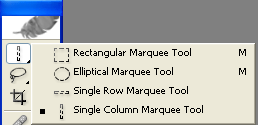
Step 2: Select your Single Column Marquee tool. If you can’t see this tool, then click and hold on the Rectangular Marquee Tool. Just so you know, this tool selects a very thing (1 px) vertical strip. Now with the tool, click anywhere on your render, preferably in a place where there’s lots of colour along the line selection.


Step 3: Now hit Control + C (Copy), and then Control + V (Paste).


This pastes the 1 px vertical selection onto a new layer. Now hit Control + T (Free Transform)...


...and drag the middle ‘handle box’ first to one side as far as your sig goes...


then do the same to the other side.


Step 4: Now move this layer stretched layer under your render...


...and you’re done! ^^. You now have a background that matches the colour of your render! If you didn’t get the colours you wanted, select a different part of your render with the Column Marquee tool. Just mix and match, see what works for you ^^. Now you can finish of your sig! Add some sexy brushing and colouring, and you’ve got a killer look.


Here’s my final result.


Hope that was easy to understand! I know there’s a lot of pics for simple instructions, but I know some people that get confused pretty easily lol. Any questions, PM or msn me ^^.
 

BladeMarth

Smash Ace
Joined
Dec 15, 2002
Messages
583
Location
Yes Please!
Full Sig Tutorial

1. Alrighty, create a new document, any size you want. I’m using 375x125. Now there’s many ways to start a sig; like going Filter> Render> Clouds, but for this one I’m just going to fill the background with black, or simply hit Control + I to invert white to black.


2. Ok, to go any further, you’re gonna need some brushes. There are tonnes of brush sites, but you can get some good ones at www.deviantart.com. Once there, go to ‘Browse’, then look for ‘Resources’, then in the sub-category, select ‘Photoshop Brushes’. Then just choose and download a set that looks good. I recommend getting any of Destiny’s sets, they’re quite useful ^^. When you save brushes, save them to this folder: C:\Program Files\Adobe\Photoshop 7.0\Presets\Brushes. Of course, not everyone has Photoshop 7 like me, but the important thing is to save in the Presets > Brushes folder.

3. Now, press ‘D’. This switches your colours back to black and white. Now press ‘X’. This switches the background and foreground colours, so now white should be your foreground colour. Create a new layer by clicking the New Layer button in the Layers Palette.


4. Load your downloaded brushes. To do this, click on the brush tool (shortcut key: B). Now, where it says ‘Brush:’ and has an icon of the currently equipped brush, click the little drop down arrow, then click on the little blue arrow. A list will come up, and all your have to do is choose a brush set ^__^.


5. Now start brushing! Only give the brushes a few click as you don’t want to overpower the sig with white. There are many different ways you can brush, but I’m going to use the Alternating method here. Once your first brushing layer is done...


Create a new layer on top of that brushing layer. Now hit ‘X’ to swap your colours around, making your foreground colour black. Now brush again, using black! It is a very good idea to use a wide variety of brushes, and also swap brush sets, so you get more differed results.


6. Now you should have 2 brushings layers, one white, one black. Keep on creating new brushing layers, alternating between black and white as you go. Do this as many times as you want. After all the brushing, here’s my result:


7. Colouring time. Theres many ways to colour, but for this tut lets just use some simple colour balancing. On the Layer’s Palette, you’ll see a circular button that looks a bit like a Yin-Yang symbol. Click it, then from the list choose Colour Balance.


Play with the sliders to your liking. Make sure you change the setting in the Shadows and Highlights sections, too. The highlights are especially important for creating vibrant colours. I cant’ remember the exact balance numbers I used for this sig, but you can just choose whichever colours you like. For a more multi-tonal, you can add multiple colour balance layers. Here, I’ve used 5. To make sure one colour balance doesn’t overpower another, click on the white rectangle next to each colour balance, and go Filter > Render > Clouds.


If you think one colour balance is too strong, lower its opacity. Also, feel free to add a Curves or Levels layer over the top of all layers. You can do this the same way you added a colour balance layer.

8. *OPTIONAL* For an extra touch of colour, you use a gradient layer. Here, for my foreground and background colours I have chosen orange and red-orange respectively. Create a new layer under all the colour balances but above the brushing. Now get your gradient tool and draw a line across your sig. Change the blending mode of this layer to Colour, and layer the opacity as you like.


Result:


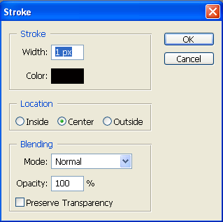
9. Time to add a border. For this, let’s just use a simple 1px black border. Create a new layer above all the colour balance. Now hit Control + A. This selects the edges of the sig. Now go Edit > Stroke.
I used these settings:


10. Finally, time to add some text. I’m not very good with text, so I’ll go with something simple. The font used here is a default one called Century Gothic. Add an outer glow to it if you like, I did. Don’t be afraid to use different coloured text.


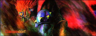
11. Add any more desired sexiness effects, and you’re done! I hope you enjoyed this tut! Here’s my final result:


Whoa, that took 5 hours lol. If you do it, feel free to post results in Critique Topic ^^
 

ExMachina

Smash Journeyman
Joined
Feb 29, 2004
Messages
282
Location
Northern Virginia / UVA
1 Sparkly Render = Sig!
>> shows you how to make a sig using one render, from start to finish

1. Make a new PS document, sized somewhere around 400x100 or larger ('tis better to start out large-ish then crop down if you have too much negative space).

2. Take a stock that you want to be the focus of your sig... I picked this wizard lady from Grenado Espada, because GE has some good lookin' art. =P


2. Paste your stock into the PS file, then create a new Layer Set and put the stock layer into that. Now, select the stock layer and go to Edit > Transform > Rotate. Tilt it to some random angle and hit the check mark to finalize your rotation. Then, go to Edit > Transform > Scale and size it down so you get a good portion of the face / upper body within the dimensions of the sig.


3. Now comes cutting... put a Layer Mask on the Set that contains the stock. Select the Layer Mask, grab a soft, small black brush, and start erasing...


4. Time for stock enhancing! Duplicate the stock layer, hit Filter > Sharpen > Sharpen. Make the sharpened layer 30% opacity or so and merge it down with the original stock layer. Duplicate the stock layer, hit Filter > Blur > Gaussian Blur (set to around 3.5 to 5 pixels) and set it to Soft Light.


5. Now time for a background... Make your background color black and use the Eyedropper tool to pick up a color from the stock. Select the Gradient tool, set it to Linear Gradient, and then put down a gradient on the background layer. You might see some stray bits of background from your cutting, so get rid of those by selecting the Layer Mask of the stock set and using a black brush to eliminate them.


6. Now... for the fun part. Get a render of some sort...


...and copy and paste it into your .psd. Put it underneath the stock set and set it to Screen. Hit CTRL+U, make sure "Colorize" is checked on, and mess around with the Hue and Saturation sliders. Then go to Image > Adjust > Brightness/Contrast and mess with that till you get something you like. At this point, you're just laying down some texture in the bg so it's not just a boring gradient.


7. Copy and paste the render in again, this time on top of the stock set. Set it to Screen and size it down so that you get more little dots inside the sig and repeat the Hue/Sat and Brightness/Contrast stuff that you did in step 6. You can use a soft-edged eraser to get rid of bits that overlap in weird places on the stock or are too bright. I made this render red because I noticed there was some reddish stuff on her arm-band thing... =P It's always good to pick colors that you see on your stock because it'll make sure that the elements and background harmonize pretty well with it and helps you get some 'interesting' (aka crazy) color schemes...


8. Repeat steps 6 and 7 as you like, if you feel there are areas that need to be more dense, but also don't be afraid to erase parts when you want negative space. I just added in some purple layers here (because I saw purple on her arm band too =P).

9. Now, for some random tilted elements... Eyedropper a color from the stock and grab your Rectangle shape tool. Make a long, thin rectangle across the sig and move its layer underneath the stock set. Hit Edit > Transform Path > Rotate and angle the rectangle similar to the direction/tilt of the stock. Right click on the layer and Rasterize it. Duplicate it a couple times and use CTRL+U to get some variance in color. Just move them around until you find a good place for them... Feel free to put in dotted lines and whatnot tilted in a similar manner as well.


10. Take your Text tool, type in some random cool text related to your subject matter (I took some lyrics from "Black Magic Woman," because I'm cheesy like that... =P) and tilt it to the same angle as the rectangles. It doesn't have to be completely legible, just cool looking. xD Use a clear, simple font, make it smallish (though variation in size and color is good), and mess with its opacity.


11. You can throw on a Radial Gradient (white in the center, black on the edges) layer (set to Soft Light and around 33% opacity) wherever you want some lighting. Throw a border on top of all this (make a new layer, hit CTRL+A, go to Edit > Stroke set to 1 pixel thickness, Inside, and color black). Then put a Color Balance layer on top of everything... and you're done! At this point, just look at the thing, and if you see any stray bits of renders that look funny or a place for another rectangle or dotted line, fix it. =P


If you have any questions on locating tools / commands that I mentioned in this tutorial or on any of the steps, feel free to ask...
 

BladeMarth

Smash Ace
Joined
Dec 15, 2002
Messages
583
Location
Yes Please!
The rules on the first post say that people can share their brushes, so here goes! ^__^

http://www.deviantart.com/deviation/20602073/

Thats my first brush set ever. I feel so special, coz i made the brushes from pics of clouds i took just this afternoon. Feel free to use them guys, just credit me where its due hehe. Dont forget to comment there, or god forbid +fav ahah.
 

GreekWonder

Smash Cadet
Joined
Sep 17, 2005
Messages
44
Location
SmashBoards
Sig render tutorial in photoshop

i thought that I would make a good render tutorial for sigs

First your going to want to start out with a cool render that you are going to use for your sig I chose this render of Roy

then your going to want to duplicate the layer (Layer>duplicate layer) On the duplicated layer go to Filter>blur>gaussian blur set it to 2.5-3.0 it should look like this

the last thing is a choice you can either set the blured layer mode to lighten or darken I chose lighten ond it turned out like this

loos alot better for your sig ehhh?
 

Doggalina

Smash Lord
Joined
Jul 25, 2005
Messages
1,958
Location
Chicagoland (NW Indiana)/Purdue West Lafayette
I saw that there was a question on Coloring and I decided to answer it (Fierce Diety Vegeta deserves most [ie essentially all] of the credit, but I do it slightly differently)

This tutorial will teach you how to color 3-D characters, like the Roy pic below (this is the black Roy from GreekWonder's previous post)[EDIT: The Black Roy pic disappeared!]


1. Select the magic wand tool (press w)

(In the "COLORING" thread, FierceDietyVegeta said to use the Polygonal lasso tool, but I prefer the Magic Wand.)(The polygonal lasso tool is more accurate, but the Magic Wand is easier and in most cases, faster.)

2. Okay, now click on an area of the color you want to change. The Magic Wand will select all of the pixels that are of similar color (I believe that that's what it does...). If you wanted to change Roy's armor and such to pink, use the magic wand to select and area of his armor. To add area's to your selection (trust me, you will want to), hold "Shift" and click. If you select something that you don't want, Undo. If you want to get rid of it later (to a point where undoing will make you Magic Wand all over again), then right click on the area you want to get rid of, then choose "Subtract from selection.

3. Okay, once you've selection your color changing area, hold Ctrl+u. This will bring up the Hue/Saturation screen (it can also be accessed by going to Layers>New Adjustment Layer>Hue/Saturation). Okay, now check the colorize box.


4. Now just mess with the Hue, Saturation, and Lightness Boxes until you get what you want.

5. Here's my final result with Pink Roy (I changed the cape to yellow as well)

A true girly man

Thanks again to Fierce Diety Vegeta for telling me how to do this. He really deserves the credit. I only colorized the Roy picture and took the screen shots. And thanks to GreekWonder for the Roy pic (I reused it from his tutorial)

(I use Photoshop Elements 3.0. I'm almost 100% that this works the same in Photoshop 7.0 and the like)

I'm a n00b at Photoshop. This isn't very hard to do.
 

ExMachina

Smash Journeyman
Joined
Feb 29, 2004
Messages
282
Location
Northern Virginia / UVA
Storm Warning - Basic Sig Tutorial

No brushing, no renders. Just good ol' Photoshop defaults. =P In this tutorial, you'll be learning how to make sigs like these:


The steps cover everything from making the background to extracting your stock, with a bit of blending/lighting thrown in for good measure.

1. Create a new document that's 600x600 pixels. Create three new layers on top of the background layer (either go to Layer > New > Layer or click the flipping-page looking button at the bottom of the Layers window). Make sure your foreground and background colors are set to black and white, respectively.

2. Click your bottom most layer and hit Filter > Render > Clouds. Then click on the layer on top of that and hit CTRL+F to repeat the filter. Do this again with the top most layer as well. Now you should have three different layers of black and white clouds.


3. Make the top 2 layers transparent (click the Eyeball icon to the left of their icons in the Layers window). Left click to select the bottom cloud layer. Go to Filter > Artistic > Dry Brush, and you can leave it on its default settings and simply hit OK.

4. Select the next cloud layer and go to Filter > Artistic > Plastic Wrap. Use the following settings:


Then set the layer's blending mode to Overlay.

5. Select the top-most cloud layer and go to Distort > Wave. Use the following settings:


Then set this layer's blending mode to Overlay as well. Go to Layer > Flatten Image to merge everything together. You should now have something like this:


Select everything by using Select > All or CTRL+A, then hit Edit > Copy or CTRL+C. Hide this file by minimizing the window.

6. Create another new document, this time with sig dimensions. I used 400x100. Hit Edit > Paste or CTRL+V to put in the filtered stuff you made. Move the layer around till you find something that you think will be a good basis for your background.


8. Here's the step which makes the difference between a randomly filtered abstract BG and one that actually looks good. Look around for large areas that are mostly dark or light; those are the one you'll want to fill up with more detail. Hit Paste to make a new layer again, but set this new layer's blending mode to Overlay. Resize it so that it's a little smaller and/or rotate it and move it around until you get more detail in the areas that were empty-looking before. Any areas that lose detail (like it becomes too dark or washed out), select the Eraser and use a soft-edged brush sized at around 100 to fix it. Keep repeating this (Paste, set to Overlay, resize/rotate, move, erase) until you get a good amount of detail all around the whole background.


9. Now, get the stock that you want to put into the image... there are two methods for extraction and placement.

If you have a stock with a solid background...

-- Open it in Photoshop.

-- Select the Magic Wand tool, use the following settings.


-- Left click on all the bits of background that you want to get rid of... (if you mess up and accidentally select part of the stock, simply hit Edit > Undo or CTRL+Z then continue)


-- Go to Select > Feather > 1 pixel radius.

-- Select > Inverse or CTRL+SHIFT+I.

-- Edit > C or CTRL+C

-- Then go back to your signature file and hit Edit > Paste or CTRL+V.

-- Create a new Layer Set (Layer > New > Layer Set or hit the folder icon at the bottom of the Layers window).

-- Put the stock layer into the layer set. Load the layer selection (Select > Load Selection or hold down CTRL while left-clicking on the layer), then select the Layer Set that it's in and create a Layer Mask (Layer > Add Layer Mask > Reveal Selection or hit the white circle in a gray box icon at the bottom of the Layers window). And you can rotate/scale the Layer Set itself if you want to change how the stock fits in the sig.

-- You should now have something like this:


If you have a stock with a complex background...

-- Open up the stock in Photoshop.

-- Select > All / CTRL+A then Edit > Copy / CTRL+C.

-- Paste it as a new layer into your sig document.

-- Scale it/rotate to however you want it to be.

-- Create a new Layer Set, put the stock in it. Left click to select the Layer Set and create a new Layer Mask on it. Left click on the Layer Mask (the white box connected to the Layer Set by a chain looking icon).

-- Select the Polygonal Lasso tool and click around the edges of the stock, select the background that you want to get rid of.


-- Select a large black brush and brush all of your selection. That background parts of the stock layer should now be transparent. Make sure you do this with all parts of the background you want to get rid of (in the case of the Ichigo stock, I had to select the left side background, brush that with black, then polygonal lasso the stuff to the right of him and brush that as well).


-- You should now have something like this:


10. Now, you want to modify your stock so that it doesn't pop out too much and fits with the sig. Create a new hue/sat layer inside the set and on top of the stock layer (Layer > New Adjustment Layer > Hue/Saturation or click on the half white / half black circle icon at the bottom of the Layers window and select Hue/Saturation). Slide the Saturation slider to the left to around -30 to -50. Leave the other sliders alone and hit OK.

11. Create another adjustment layer on top of the stock and the hue/sat layer, but this time, make it a Color Balance layer. Mess with the sliders until you bring out some of the stock's colors...


12. Now you're going to add some colors to the background that correspond to your stock. Create a Color Balance Layer on top of your background layers but not inside the Layer Set. Pull the sliders to the extremes till you get a color that resembles one in your stock (I picked a red/magenta thing that resembles the color of Ichigo's jacket).


Select the layer mask next to the Color Balance layer, make sure your BG/FG colors are black and white, and hit Filter > Render > Clouds.

13. Create another Color Balance layer on top of the last one, pick a different color for the BG, and repeat the Layer Mask / Cloud filter business from step 12. Do this one or two more times...


14. Now, you might want to blend in the stock a little... Go back to the stock layer and duplicate it (Layer > Duplicate Layer or CTRL+J). Select the bottom stock layer and set its blending mode to Hard Light. Select the second stock layer (the duplicate) and move its opacity down to around 50% or so.


14. On top of everything else, create a new layer. Make sure your foreground color is white and your background color is black (a simple case of pushing D then X) and select the Gradient tool. Select radial gradient, foreground to background...


...then place a gradient on the empty layer with the center (white) wherever your stock is and black on the edges. Set its blending mode to Soft Light and opacity to around 30%.


15. Duplicate the gradient layer and move it underneath the stock layer set... And now you've got some basic lighting/focus.


16. Add a border and text and you're done!


That's it. If you have any questions on any of the steps or tools (I know it's a lot to pack into one tutorial O.o), just post and I'll try and help you out. ^^
 

purple_hamster101

Smash Rookie
Joined
Oct 13, 2005
Messages
8
Brushes...

Um... I have trouble understanding the brushes concept. There are pictures with the brushes and says you can use it, but I was like...HOW?!!? >_< So can someone tell me how to use the brushes?

----------------------------

Draw+Sleep=Me
 

BladeMarth

Smash Ace
Joined
Dec 15, 2002
Messages
583
Location
Yes Please!
Nice to see some new tuts.

I think I'll expand on Doggalina's tut and post a few more ways to change the colours of images.

Nice tut ex ^^. Doesnt look as good as renderwhore, but its bloody awesome for defaults.

Purple Hamster: Brushes are basically just stamps which you can apply however you like to your document. When you download them, save them in the Adobe > Photoshop > Presets > Brushes director. Then when you open photoshop, click the Brush tool. Up the top, on the Brush toolbar, theres a small icon of the currently selected brush . Click dropdown arrow next to it, then click the blue arrow. Choose your brush set from the list, and away you go ^^
 

ExMachina

Smash Journeyman
Joined
Feb 29, 2004
Messages
282
Location
Northern Virginia / UVA
Smudging/Brushing Tag Tutorial

No tablet or renders used for this tag, 2 things which I usually rely on to no end in my pieces. XD

The final product looks like this:


Brush Set --
http://dc1.4shared.com/download/386180/99b.../smudgeset.html

Now before you guys give me flak about handing out a brush set... they're not really hard brushes to make at all, it just saves me a whole lot of steps/explaining putting them up instead of having to tell people how to make the brushes. I just did Define Brush on some polygon crap or used the infamous leaf brush and mucked around with brush settings.

PSD --
http://dc1.4shared.com/download/386181/7e9c73b6/kakashi.html

Tutorial --

http://www.deviantart.com/deviation/24365503/
 

darkshadows

Smash Journeyman
Joined
Oct 5, 2005
Messages
495
Location
In Melee discussion, being nice and keeping topics
text-image.com

I'm just pointing this out, not really a tutorial, but (might) enhance your graphics...

Make a picture, any picture.
I just took Blademarth's sig of Yuna


...and took the picture to Text-image.com
-Go to convert-html
-Find your image on BROWSE
-type in your characters. For this I did BLADEMARTH (and in sequence)
-Make your image as big as you want
-Show it in colour
-Make the backround your color of choice (i like black)
-Web brower...whatever you have
Convert!
-If you don't want to copy the HTML (view-source), hit Print Screen and paste onto Photoshop or whatever and edit it there and save.

The picture will now be in colored letters (or numbers) that run in sequence (or in a random order if you chose that)

here's my result:


cool, eh?


anyway, great work on all the tutorials, undrdog, ex, blade, and anyone else's name I didn't remember! (I'm trying em out atm)
 

ValiantDeftone

Smash Apprentice
Joined
Aug 28, 2005
Messages
128
Location
Central Florida
that would probably look better for a picture that doesn't have too much detail. nice find though.

EDIT: oops, don't think comments are allowed here are they. well, sorry guys. my bad.
 

REFUSEDx

Smash Apprentice
Joined
Nov 27, 2005
Messages
183
Brush Work Tut

Ok this is just a basic way of how sometimes I do brushwork in PS7 or higher.

Make a new doc fill it with a completly unsaturated gradient like a dark gray to a lighter gray or black to white or what ever you want.

Next Get a soft brush and set the flow anywhere from 15%-70% somewhere in the middle should be good for this.

Make a new layer then put a dot or two with your soft brush on there.

Next get out your smudge tool and choose a brush with a irregular shape, or If you have made random brushes out of basic Irregular shapes use those doesnt matter.

To make things easy use the Leaf brush.

Goto your brush tab in the top right of the PS window and click the word shape dynamics.

Move the sliders around all you want to get some cool effects. Just experiment.

Then choose the size you want.

Then put the smudge on 100% and start smudging away to get some basic brush work.

NOTE: You dont have to use this brush or these settings its just what came off the top of my head.

Well so far it may look good but theres no color.

Next make a color balence layer on top of all other brushing layers.

Change the midtones and highlights or it, Try different combinations like maybe giving the midtones a redish color and the highlights a yellow for a nice red yellow and orange scheme, theres alot you can do.

Remember this is just basic tips, theres so much you can do in terms of brushing just experiment.
 

ExMachina

Smash Journeyman
Joined
Feb 29, 2004
Messages
282
Location
Northern Virginia / UVA
Lighting and Stock/BG Interaction

I think my most common comment nowadays is "make the stock interact with the lighting/bg," so I figure that a tutorial is called for. xD

Anyhoo, I've deliberately chosen an anime-style stock that really doesn't have strong lighting or contrast to show that it can still be made to work with a strongly lit background. Here's the stock if you want to give it a shot as well:

http://www.people.virginia.edu/~aov2x/mustang/00.jpg

And, onto the tutorial!

1) Put your stock in and cut it out... Sharpen/clean it up a little... I slapped a Levels adjustment layer on this as well and mucked around a little with the contrast and increased the green/blue sliders to bring out some turqoise-y color.


2) Eyedrop a light and dark color and put a radial gradient down on a new layer underneath the stock (this step getting familiar to you folks? xD). The center of the gradient should be where the light source is.


3) Now, take a look at your lighting... the parts where it's directly behind the stock, you'll get a washed out effect that sort of obscures the edges. So, create a new layer on top of everything and grab a soft-edged circular brush at 100% opacity and a large-ish size (~70-150px), set your color to white... Then brush a little over the edges of the stock's side that is closest to the lighting. Take a smaller (~30-75px) soft-edged circular brush set to erase and at a lower opacity, like ~60%, and shape the white brushing so that it's concentrated right along the stock's edge.


4) The side that's away from the lighting will get a "silhouette" effect. So, create a layer underneath the stock and brush some lighting spilling out from behind it. Use the same soft-brushing method in step 3 to put down the white.


Next, to really bring out that "silhouette" effect, CTRL-click your stock so that you create a selection from it. Make a new layer and hit the Layer Mask button to create a mask from that selection. On this new layer, brush some black over the side of the stock that's away from the light. Set its blending mode to Soft Light. If you don't think the shadow's intense enough though, just duplicate that layer of black and you can accentuate it.


5) And now to enhance the overall lighting... last but not least, time for the trusty gradients set to Soft Light (tm). xD Duplicate that first gradient layer from the bottom with CTRL+J and move it on top of everything else. Then set it to Soft Light.


6) Now, you've basically set up the strongest lighting affecting the stock, but don't forget that any more shiney effects or elements will have light reflecting off of the stock (and the background...) as well. As I add some renders to give the BG some texture, notice that I let some of it overlap the stock in places where light would logically fall.


Also, if you place something so that it doesn't overlap and impose its color on the stock but gets very close to it, feel free to throw in another brushing layer to add in that light manually. Eyedrop the new element's brightest, most saturated color, create a new layer, and use the soft brush / eraser method from steps 3/4 to apply the color. Set the blending mode to Soft Light or Hard Light (or Vivid Light or Overlay... experiment with those blending modes!), depending on how strong you want the coloring to be.


7) Now, I throw down a bit of smudging that is the same color as the sparkly render elements along the edges because it resembles light being reflected off of the BG, see?


8) Add some typo, put in one last Levels adjusment layer... and voila.


There you folks go. Just remember these 3 guidelines when you're setting up your stock/lighting --

1) Light can bleed over the edges / overlap stocks

2) Strong light creates a "silhouette" effect along the edges of an object that fall into shadows

3) Any elements that you put in, especially if they have bright, shiney surfaces, will reflect light onto the stock in some way.

And here's the .psd of the tag I made in this tut if you want to take a look:

http://www.people.virginia.edu/~aov2x/mustang/mustang.psd

EDIT: Had to tweak the sig a little... because I'm weird like that. xD Added a darken layer of yellow on top of everything, with bits erased here and there, plus a bit of a dark blue/green render in the main lighting area to tone it down / give a little texture there.

http://www.people.virginia.edu/~aov2x/mustang/mustang2.png
 

8000

Smash Lord
Joined
Aug 2, 2005
Messages
1,458
Location
Canada eh!
Detailed Pixel Stretch & Motion Blur Tutorial

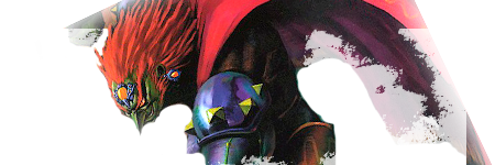
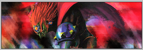
alright let's start off with this render. This isn't the origional render that i cut out, it's a bit more rough and blotchy but it doesn't make that much of a difference with this tutorial. Now this is in a 400x150 size document, you can choose whatever size you like but i'm comfortable with this. Let's get started, here's the render.


Now select the Single Column Marquee tool and place it where you think is the most colour. Press ctrl+c to copy and ctrl+v to paste. This will automatically be placed on a new layer.


Press ctrl+t and move both ends of the object to fill up the banner. Then take your render and place it ontop of all the other layers.It should look like this.


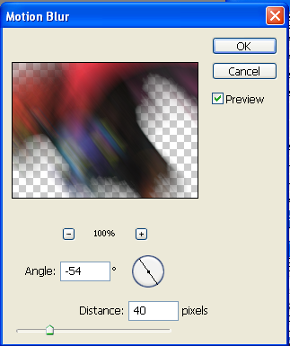
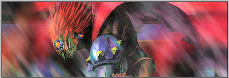
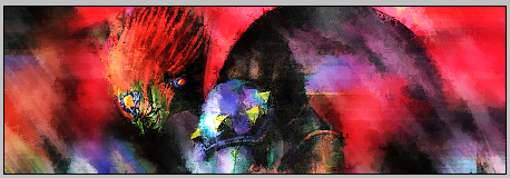
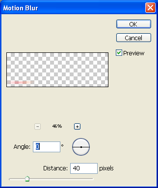
Now we're going to enhance our background by using a motion blur. Go to filter>blur>motion blur. I used these settings.


Make 2 more copys of this layer by pressing ctrl+j 2 times. Then move the copied layers around until they surround your render. Move your render layer to the top so it looks like this.


Now we're going to make this banner a bit lighter. Create a new layer.


Now lets select a brush to use.


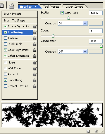
brush around the darker spots of the image on your new layer until you find yourself satisfied. You can change the settings of the brush by clicking on brushes in the top right corner of the screen. Use these settings.


Now set the layer to soft light.


Next go to filter>blur>motion blur. You can keep the same settings as you used for your render. It should look like this.


Create another new layer and go to image>apply image. This will post a merged sig on this new layer. Set this new layer to overlay


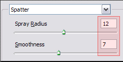
Now go to filter>brush strokes> splatter. I used these settings.


You banner should look something like this now.


Now lets duplicate the layer with your render. Drag that layer up to the top. It should look something like this.


Now we're going to add some text. Click on the text tool and start typing. I used colours that were already in the image. It looks like this.


Now duplicate the layer and go to filter>blur>motion blur. Use these settings.


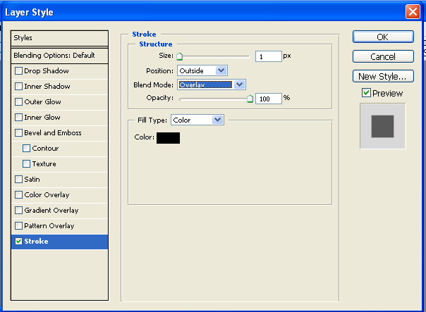
Drag you first layer of text and right click on the layer. Select blending options and click on stroke. Put in these settings.


Create a new layer overtop of everything else and press ctrl+a. This selects the whole image for you. Now go to edit>stroke. I used this.


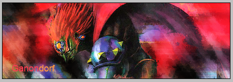
Now you're done, you have text a boarder and a background that matches your render. This is optional but you can choose to move some things around, change the contrast and brightness, and use some colour balances. This is my final product, i hope this was helpful.


Bedi Vegeta

Smash Master
Joined
Apr 7, 2002
Messages
4,668
At Uni, I have been doing a small unit dealing with designing with photoshop and stuff. I don't usually get much out of these things, but I do occasionally pick up a few new tips and uses for tools I had never considered. My lecturer is a professional graphic design guy or whatever, so he showed us a few tricks of the trade and stuff...

This is just a little simple trick he showed us for sharpening and enhancing images without using the sharpen tool and ending up with grainy crapness...

1. Duplicate the layer you want to sharpen.

2. On the new layer, do Filter > Other > High Pass. This basically greys out the whole image except for the smaller details, depending on the radius you set it to. For something like this, set it to about 3 or 4 or something, although I guess it depends on the image. Experiment.

3. Desaturate the layer.

4. Set this layer's blending mode to Soft Light, and adjust the opacity to whatever you want. If you want even more of this effect, duplicate the layer.

This will not perfectly sharpen crappy images, but it does make things look much clearer and more crisp, and will not screw up your image like using the sharpen tool or filter. My lecturer was using this when he did some work for Sony, and they were quite impressed.

I have a couple of extra tricks I want to share, but I'll post them later when I have time to do a full tutorial with pictures and stuff.
 

8000

Smash Lord
Joined
Aug 2, 2005
Messages
1,458
Location
Canada eh!
When you use the high pass the lower the number is the sharper the image will become right?
 
Top Bottom